

联动上篇.
Week 4
Colour preference
Hurlbert and Ling explain colour preference as a physiological phenomenon of human colour vision based on the cone-opponent process (red-green L-M and blue-yellow S-(L+M):
we are hard wired to prefer one colour over another.
Palmer and Schloss’s research Consisted of two phases, beginning with determining a participant’s colour preferences out of a range of 37 hues.
For the second phase, participants identified colours in the same way as in the first phase, but then were requested to add verbal descriptions of objects that they associated with that particular colour.
These descriptions were then presented to the participants who decided if the object was positive or negative.
Surprisingly, the participants’ colour preferences during both phases was fairly Consistent.
Also, there was Consistency across four different categories: fully saturated, lighter or tinted, muted or more neutral and dark hues.
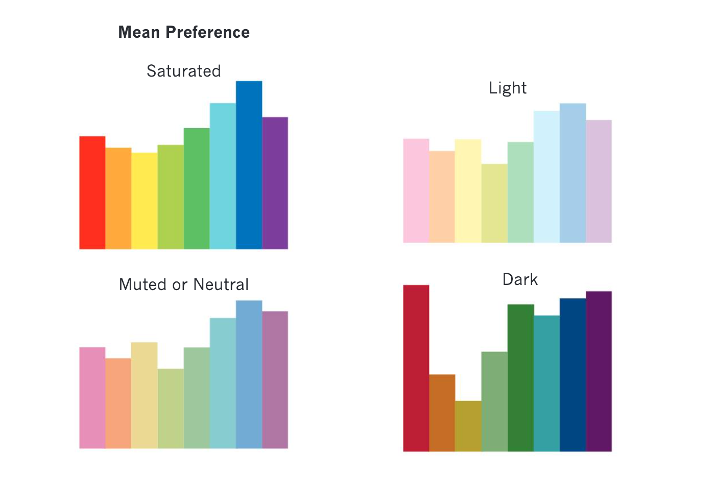
The pattern of mean preference showed that red was preferred over orange or yellow but that the most favoured colours were cyan and blue with green following close behind.
According to the authors, the data implies that people’s particular aesthetic responses to colours are caused by their affective responses to objects and situations associated with that colour.’
Colours and emotions
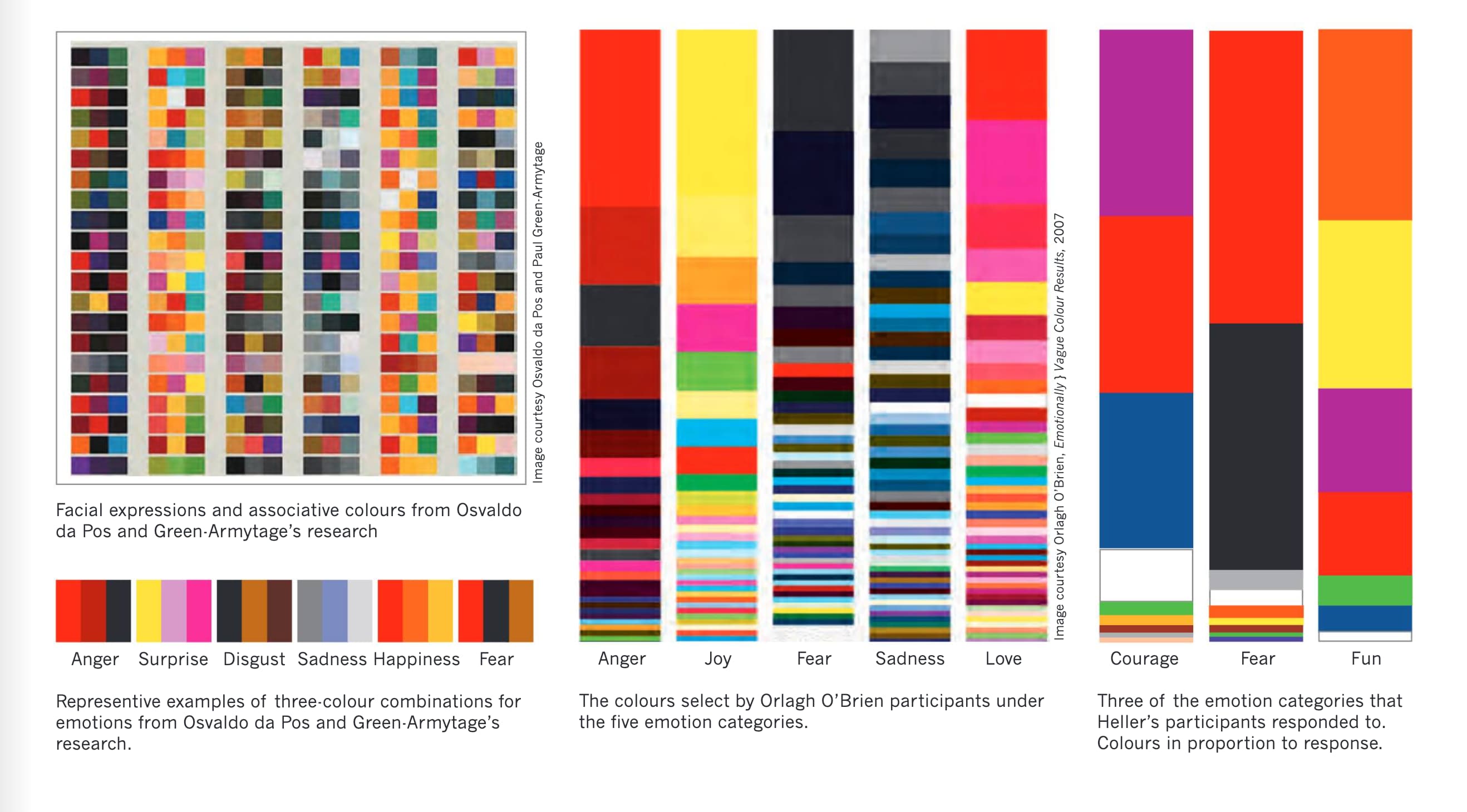
Lighter valued hues for the emotions of happiness, surprise and fear;
Mid-range value hues for sadness and disgust;
Darker valued colours such as black and red for anger.
Desaturated or neutral colours were selected for sadness and fear while happiness, surprise and anger were associated with highly saturated colours.
Their study also found that no one colour was Consistently used for each emotion, but there was an overwhelming choice of dark red hues for anger and that happiness was yellow and red.
People associate higher saturated colours with active emotions (happiness, surprise and anger) and increase the observer’s arousal independent of the hue.
Another finding was that the warm hues of yellow, orange and red indicate active emotions.

Colour meaning index
Yellow
Sunshine.
Pros
- joy
- happiness
- intellect
- energy
Cons
- jealousy
- cowardice
- deceit
- caution
Cultural Associations
- Native American-Apache: East-where the sun rises
- China: nourishing, royalty
- Egypt: colour of mourning
- Japan: associated with courage
- India: symbol of merchants or farmer
- East: proof against evil, for the dead, sacred, imperial
- West: hope, hazards, cowardice
- Feng Shui: yang, earth, auspicious, sun beams, warmth, motion
Physiological Effects
- produces a warming effect, energizes, relieves depression, improves memory, stimulates appetite
- speeds up the metabolism
- yellow against black is highly visible and is often used to issue a warning
- attention getter (why taxicabs are often yellow)
- overused, it may have a disturbing effect
- babies cry more in yellow rooms
Uses
- often associated with food
- in design and advertising it is used to promote children’s products and items related to leisure
Dull yellow: associated with caution, decay, sickness, and jealousy
Light yellow: intellect, freshness and joy
Orange
Autumn, citrus fruits.
Pros
- joy
- sunshine
- tropics
- enthusiasm
- energy
- happiness
- creativity
- sociability
- attraction
- success
- stimulation
Cons
- crassness
- loudness
- aggressive
Cultural Associations
- Ireland: Protestant religion
- Netherlands: House of Orange
- North America: Halloween (with black), creativity, autumn
- Hindu and Buddhist religions
- China and Japan: happiness, love
- Feng Shui: yang, earth, strengthens conversation, purpose, organization
Physiological Effects
- gives off the sensation of heat
- speeds up metabolism and oxygen supply to the brain
- produces an invigorating effect and stimulates appetite
Red
Fire, blood, sex.
Pros
- energy
- strength
- power
- determination
- passion
- love
- desire
Cons
- war
- anger
- aggression
- danger
- revolution
Cultural Associations
- China: good luck, celebration, Prosperity, happiness
- Native Americans-Cherokees: success, triumph, represents the East
- Hebrew: sacrifice, sin
- India: purity, soldiers symbol
- South Africa: dark red is used for mourning
- Russia: Bolsheviks and communism
- East: worn by brides, happiness and Prosperity
- West: excitement, danger, love, passion, stop
- Feng Shui: yang, fire, good luck, money, respect, recognition, vitality
Physiological Effects
- enhances metabolism, increases respiration rate, and raises blood pressure
- high visibility, used for stop signs, stoplights and fire equipment
- people appear heavier in red clothes
- red cars get more speeding tickets and are stolen more often
Uses
- red type and images advance to the foreground
- use as an accent color to stimulate people into action
- in advertising, red is often used to evoke erotic feelings
- in signage, red is used to indicate danger
Light red: joy, sexuality, passion, sensitivity and love
Pink: used as appetite suppressant in diet therapy and to calm people in prisons, relaxes muscles, romance, love, feminine qualities
Dark red: blood, anger, rage, vigor, willpower, courage, longing, malice and wrath
Reddish-brown: harvest, fall colour
Violet
Royalty, power, spirituality.
Pros
- bravery
- luxury
- nobility
- sophistication
- wealth
- wisdom
Cons
- exaggeration
- excess
Cultural Associations
- Egypt: virtue and faith
- England: colour of royalty
- Iran: forecast of what is to come
- Japan: ceremony, enlightenment and arrogance
- Latin America: indicates death
- Thailand: colour of mourning for widows
- East: wealth
- West: religious associations
- Feng Shui: yin, spiritual awareness, physical and mental healing
Physiological Effects
- according to some research, purple is the favourite colour of almost 75 percent of pre-adolescent children
Uses
- in advertising and design purple is good for prompting luxury products
- attractive for children’s products
- rarely found in nature and to some appears artificial
Light purple: feminine design and nostalgic feelings
Dark purple: gloom and can cause frustration
Blue
Sea, sky.
Pros
- depth
- knowledge
- peace
- masculinity
- loyalty
- stability
- trust
- wisdom
- heaven
Cons
- depression
- coldness
Cultural Associations
- Native American-Cherokees: defeat, trouble
- China: immortality, colour for little girls
- Iran: heaven, spirituality and mourning
- Mexico: colour of mourning
- East: wealth, self-cultivation
- West: depression, sadness, Conservative, corporate business
- Feng Shui: yin, water, calm, love, healing, relaxing, peace, trust
Physiological Effects
- slows metabolism, and produces a calming effect
- people are more productive in blue rooms
- there has been success treating disorders like eating disorders, impotence and depression under blue light
Uses
- blue is a masculine colour
- associated with tranquility
- products and services related to business or cleanliness
- promoting high-tech products
- avoid when promoting food products and cooking
Light blue: health, healing, tranquility
Dark blue: knowledge, power, integrity and seriousness
Green
Vegetation, natural environment.
Pros
- fertility
- money
- growth
- healing
- nature
- youth
Cons
- envy
- greed
- nausea
- corrosion
Cultural Associations
- North American-Apache: south
- China: cheating wife, exorcism
- India: stability
- Islam: paradise
- Ireland: symbol of country and Catholic religion
- North Africa: corruption
- Japan: life
- East: eternity, family, health, Prosperity, peace
- West: go, Saint Patrick’s Day, spring, new birth
- Feng Shui: yin, wood, growing, nurturing, balancing, healing, health, calming
Physiological Effects
- most restful colour on the eyes
- used in hospitals to relax patients
- claimed to aid in digestion
- green means go
Uses
- correspondence with safety
- suggests stability and endurance
- used extensively to promote environmentally friendly (green) products
- because of its association with American money it is used in the financial world and banking
Dark green: money, ambition, greed
Yellow-green: sickness, discord
Aqua: emotional healing, protection
Olive green: traditional colour of the olive branch and peace
White
Light, purity, cleanliness.
Pros
- innocence
- perfection
- truth
- virtue
- wedding/marriage
Cons
- fragility
- isolation
Cultural Associations
- China: death and mourning, metal, west and autumn
- India: unhappiness
- Japan: a white carnation is a symbol for death
- Native American-Apache: north
- Native American-Cherokee: peace, happiness, south
- East: funerals
- West: weddings and brides
- Feng Shui: yang, metal, death, mourning, spirits, ghosts, poise, confidence
- Worldwide: white flag symbol of truce or peace
Physiological Effects
- assists in mental clarity
- in its most brilliant form can cause headaches
- evokes fresh beginnings and purity of thought
Uses
- in advertising white is used with cool clean products
- in design white is associated with modernism and simple, clean lines and forms
- white can be used to promote hospitals, or the medical profession
- associated with low weight or low-fat food and dairy products
- used for charitable organizations
Grey
Neutrality.
Pros
- balance
- classic
- intelligence
- knowledge
- maturity
- refine
- wisdom
Cons
- boring
- dull
- moody
- foggy
- indecision
- uncertain
Cultural Associations
- Asian: helpful and travel
- Native Americans: honour and friendship
- North America: industry
- Feng Shui: yin, metal, dead, dull, indefinite
- Worldwide: associated with money and silver
Physiological Effects
- unsettling
- creates expectations
Uses
- use grey to make surrounding colours appear brighter
Brown
Colour of the earth.
Pros
- stable
- reliable
- approachable
- natural or organic
Cons
- sadness
- isolation
Cultural Associations
- North American: Thanksgiving is represented by brown and orange.
- Japanese: the word doesn’t exist in their language, instead they use ‘tea,’ ‘fox,’ or ‘fallen-leaf,’ to describe brown
- India: colour of mourning
- Native American: represents the power of self-discipline
- Feng Shui: Yang, earth, industry, grounded
Physiological Effects
- feeling of warmth, comfort and security
- supplies a feeling of wholesomeness
- stabilizes
- provides a connection with the earth
- gives a sense of orderliness
Uses
- men are more apt to say brown is one of their favorite colours
- in Colombia brown discourages retail sales
Light brown: implies genuineness
Dark brown: is similar to wood or leather
Black
Night, death, power.
Pros
- authority
- elegance
- mystery
- sophistication
- stylishness
Cons
- evil
- fear
- negativity
- remorse
- secrecy
Cultural Associations
- Australian Aboriginals: colour of the native people
- China: colour for young boys
- England: taxi cabs are all black
- Latin countries and Greece: widows wear black for the rest of their lives
- Native Americans-Apache: west, where the sun sets
- Thailand: bad luck, unhappiness, evil
- East: associated with career, knowledge, and mourning
- West: traditional colour for death and mourning
- Feng Shui: yin, water, money, income, career success, emotional protection, power, stability, bruises, evil
Physiological Effects
- people think a black box is heavier than a white one of equal weight
- evokes a restful emptiness
- black clothing makes people look thinner
- associated with fear and the unknown
Uses
- black type on white backgrounds provides the highest contrast and visibility and white type on a black background diminishes readability
- use black to make surrounding colours appear brighter
Week 5
Digital colour
Digital colour is that it is device dependent.
Every digital tool that is being used: camera, scanner, monitor, printer and so on, will use a different colour notation to describe the same image.
There are a number of elements and key terms associated with digital images, which include resolution, pixel, raster, vector, bit, byte and compression.
The term resolution is used to describe the image’s size.
A pixel (abbreviation of ‘picture element’) is a single dot or component in a bitmap or raster image (created with pixels).
Resolution depends on the size of the pixel.
The smaller the size of the pixel the higher the resolution and the greater the information and detail the image contains.
The terms DPI (dots per inch) and PPI (pixels per inch) are often confused or used interchangeably, but they do have different meanings. DPI generally refers to the resolution of the output device that prints the file and PPI is the resolution of the digital file.
Resolution and Image Quality
Ideal resolution for superior image quality depends on final image size (8.5 × 11, 18 × 24, etc.), the substrate and the output device.
The basic rule of thumb is to use the same resolution as your final output device.

If you are printing on a CMYK offset press then the file resolution should be 300 DPI.
For an inkjet printer it may only require 200 DPI, and for the web or any other digital format, 72 DPI is adequate (all files should be at 100% and not scaled up in size).
(web竟然是72dpi吗大震惊!)
Colour Conversion from RGB to CMYK
When converting from one colour space to another, especially to one that is smaller, the results can be disappointing and hard to anticipate.
The gamut range for RGB is considerably larger than CMYK and therefore colour information is lost when a file is converted.
This is especially true for fully saturated colours, most notably in the blue, green, yellow-green, red and orange areas.

If that same file is converted back to RGB from CMYK then not much information will change. There are standard charts used by software programs in the conversion.
Some programs use the CMYK colour profile default of SWOP v2, which is not the best colour space so to ensure the best quality use the Coated GRACol 2006, which is currently the ISO standard (International Organization for Standardization).
Vector and Bitmap
The two different types of image graphics used on the computer are vector and bitmap (also known as raster).
Images that are scanned or captured by means of a digital camera are bitmaps that consist of tiny squares of information or picture elements, called pixels, arranged in a grid.
This grid of bitmap information is considered to be resolution dependent, meaning that the more picture elements can fit into a square measurement (either ppi or dpi) the sharper and more detailed the image.
It is difficult to increase or decrease the size of bitmaps without sacrificing some degree of image quality.
When a bitmap image is decreased in size, pixels are irretrievably thrown away and the computer software will resample or resize the data.
If the image is increased, the software creates new pixels by estimating the colour values of the neighbouring pixels and injecting new ones beside them. This process is known as interpolation.
Vector images are created through object based editing software programs such as Adobe Illustrator and consist of many individual objects, each of which is defined by a mathematical statement, and has been assigned its own properties.
Vectors are considered to be resolution independent because vector images can be enlarged or reduced to any size without a loss of quality.
Because of the mathematical coordinates that describe the individual objects, vector images are smaller in file size, take up less memory, and are faster to process than bitmaps.
The one disadvantage of vector files is that they contain solid areas of colour or gradients and cannot depict the subtle and nuanced tones found in photo-realistic images.
Digital Colour in Bits, Bytes and Pixels
In the digital world, everything from type and images to colour is converted to a series of numbers that contain all of their essential characteristics and the features needed to describe them.
Two important concepts to understand with regard to digital images are that the resolution or sharpness is usually dependent on pixels per square inch or PPI (the higher the PPI the better the image qual-ity) and that colour fidelity is dependent on bit depth.
(大概早年游戏机就是这样的颜色组成吧.)
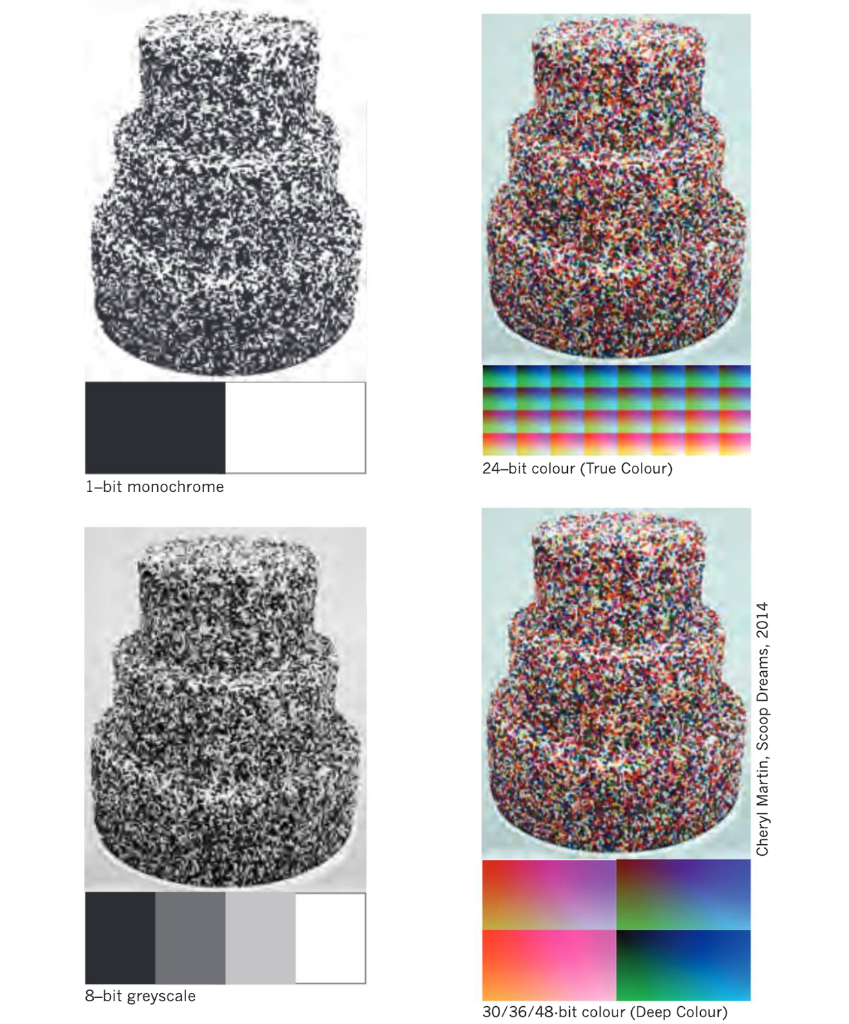
1-Bit Monochrome
For bitmap or monochrome images each pixel requires 1 bit that would be either black or white, which makes it suitable for graphics and typography.
8-Bit Greyscale
In greyscale each pixel requires 8 bits or a byte and may be one of 256 shades of grey including black or white.
8-Bit Colour
In this form 8 bits describe the red, green, and blue values of image information (8 bits:
3 red, 3 green, 2 blue).
15/16-Bit Colour (High Colour)
This spectrum range provides life-like colours, and on the MAC it is known as ‘thousand of colours’.
24-Bit Colour (True Colour)
This is the spectrum range that comes close to the human eye with a capacity of representing 16,777,216 possible colour (24 bits: 8 red, 8 green, 8 blue).
30/36/48- Bit Colour (Deep Colour)
High-end production workstations required for CMYK printing use this much.
Gamut
The gamut is a term that describes the range of colour that can be detected, represented and reproduced by humans or machines.
Compression
Compressing an image requires the use of mathematical algorithms.
There are two types of algorithms in this context: lossless and lossy.
The advantage of lossless compression is that when the image has been compressed into a much smaller file, and then later restored to its original size, there will be no loss of image quality.
However, in lossless compression, the compressed file is not as small as when using a lossy compression.
With lossy compression, unnecessary information is discarded, thus significantly reducing the file size.
But in so doing, the original image is irretrievably altered, and cannot be recovered.
Image Formats
GIF: Graphics Interchange Format
Widely used on the internet for graphic icons and blocks of preset text.
This format is limited to an 8-bit palette (256 colours) and uses lossless compression.
Simple animations can be created using GIF files and it is widely used on the web to create moving banner advertising.
JPEG: Joint Photographic Experts Group
Is a compression method that uses mostly lossy compression by removing the least noticeable colours.
With multiple levels of compression available, file sizes can be greatly reduced.
JPEG is ideal for web applications or for emailing files, but if intended for later modification such as editing and saving, they will suffer degradation with each generation resulting in noticeably visible flaws.
PNG: Portable Network Graphics
PNG are an alternative open source format to GIF.
PNG files are more versatile than GIF and support truecolour (16 million colours) and work well when large areas of a single colour are used.
RAW: The raw image file format available on some digital cameras contains data that is largely untouched and neither formatted nor compressed.
The format is not standardized, and can differ among camera manufacturers, but it is possible to use Adobe’s Photoshop and other similar graphic software programs to read, manipulate, and convert the data into other file formats.
TIFF: The format most graphic professionals tend to use is the Tagged Image File Format, because of its flexibility for file formatting, its compression abilities, and the number of software programs and operating systems that support it.
Files can be saved in 8 to 48 bit formats and can be compressed as either lossy or lossless, although in the latter in-stance, file sizes tend to be quite large.
Another advantage of this format is that the layered images created in Adobe Photoshop can be retained during storage or transfer.
Week 6
Light and lighting.
Sunlight, Daylight and Ambient Lighting
According to Susan Winchip, author of Fundamentals of Lighting,
‘It is essential to distinguish between sunlight and daylight.
Direct sunlight can produce glare, excessive heat and fading of materials.
Daylight is the term that describes the desirable natural light in a space’.
Working or producing designs under direct sunlight is undesirable and unrealistic because of the shifting lighting patterns as the sun rises and sets and the harmful qualities of ultraviolet rays that can cause artwork and fabric to fade.
However, working under daylight is desirable because of the even distribution and quality of the light, which reveals the true nature of colours, objects and surfaces.
Ambient lighting is a term that refers to the uniform lighting conditions of a space and can be a mixture of many different sources including sunlight, daylight and artificial lamps.
You can think of it as a general level of light that fills an entire scene, regardless of the objects and their locations in that scene.
Ambient light, being everywhere, has no position or has no position or direction, only colour and intensity’.
Spectral Power Distribution
High noon, in direct sunlight, is the best time to experience the full range of the spectrum from infrared to ultraviolet, and this is the ideal lighting condition for creating and viewing colour art or design work.
The full spectrum of visible light is from 380 to 780 nm with hue being fairly even distributed with some drop off in the lower wavelength, or violet end.
To consistently work under those conditions however is unrealistic, so artists and designers strive to recreate or approximate this light in order to maintain colour fidelity.
Continuous Spectrum Light Sources
Artificial light sources fall into two different categories, continuous and non-continuous.
The continuous light sources provide a wide and relatively even distribution of wavelengths that generally provide a balanced colour effect.
These continuous light sources would include incandescent, tungsten, halogen and daylight-balanced fluorescents lamps.
For high-end photographers there are also very expensive hydrargyrum medium-arc iodide lamps or HMI.
Non-continuous light sources may or may not provide a full spectral range and they peak in certain areas.
Lamps that fall into this category include fluorescent, mercury vapor, metal halide, high and low pressure sodium lamps.
Two very important features of light that can be measured and affect our perception and experience of colours, objects and spaces, are correlated colour temperature or CCT and colour rendering index or CRI.
Correlated Colour Temperature (CCT)
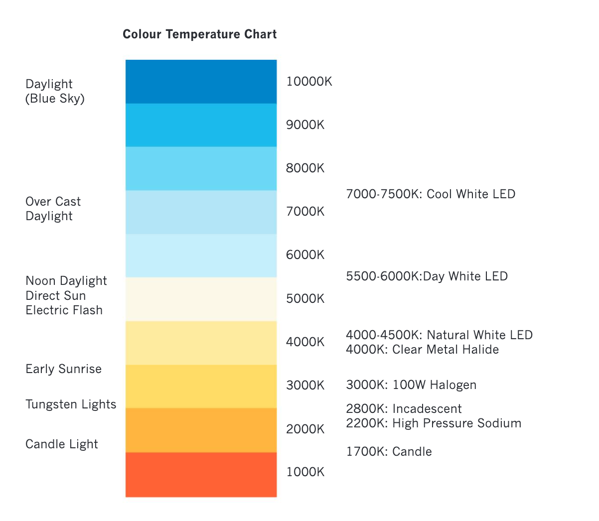
Colour temperature is one of the features of visible light from a source, and is categorized by terms such as warm, moderate or cool.
The colour temperature names warm and cool refer to the temperature of fire, where a blue flame is the hottest and a yellow flame the coolest, which is the reverse of our normal cultural associations with these hues.
Visually, we consider blue to be a cool colour, but in the context of colour temperature, blue light is hotter than red light.
The colour temperature refers to the temperature of a ‘black-body’ emitter.
A blackbody is a source of continuous light, and the spectral distribution of its emitted light depends only on its temperature.
As a blackbody is heated, it goes through colour changes, from red, to orange, to yellow, to white and finally blue-white.
The colour temperature of light is measured in degrees Kelvin (K).
A candle that emits a warm light is rated at 1,700 K (Kelvin) while an LCD screen, which is cool, can range from 5,500 to 10,500 K.
Colour Rendering Index (CRI)
The definition for colour rendering used by the International Commission on Illumination (an authority on all issues dealing with light) is
‘the effect of an illuminant on the colour appearance of objects by conscious or subconscious comparison with their colour appearance under a reference illuminant’.
Colour rendition is a term used to describe the ability of a light source to accurately reproduce colour. It is a quantitative measurement using the colour rendering index or CRI, which compares a particular light’s ability to reproduce colours as compared to an ideal light source.
CRI scale is rated from 1-100 with a lower number indicating less accurate colour reproduction.
Lighting Terms
There are a number of important terms that need to be understood regarding lighting.
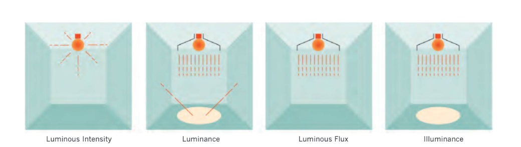
These include: luminous intensity, luminous flux, luminance, illuminance and brightness.
Luminous Intensity (I), refers to how much light energy is emitted from a source in any given direction and is measured in candela or CD.
Luminous flux is the perceived power of light in any direction measured in lumens (Im) and is included into the packaging of light bulbs to give an indication of the amount of light that the bulb will produce.
Luminance is an indicator of how bright the surface that the light is redirected from will be perceived and is measured in candela per square metre or cd/m^2.
Illuminance (E) is the amount of light energy that is hitting a surface and is measured in lux.
The illuminance level of a living room is about 100 lux while a typical office space is around 500 lux.
Brightness is a term that can be used to describe either the light appearance from a source or the redirection of light off a surface.
An example of brightness difference among surfaces would be the contrast between a flat dark tabletop and a similar surface in white.
The dark surface would absorb more light causing a low luminance surface whereas more light is redirected off the white surface making it appear brighter.
Brightness is not a colour attribute like hue, saturation or lightness (value) but rather a visual perception of light intensity.
Brightness should never be used for quantitative description, but only for non-quantitative references to physiological sensations and perceptions of light.
Aside
这段是不在要求内容的课本中的构图讲解.
Viewpoint
One of the first issues has to consider is the positioning or orientation that they want the viewer to have when engaging with their composition.
These issues are considerably different if their work is to beg installed on a ceiling, on a billboard or a side of a building, or in the controlled space of an art gallery.
Format
Format refers to the orientation of the surface area of the composition.
Most commonly used ones are: horizontal or landscape; vertical or portrait; square or round.
According to Rudolf Arnheim,
‘In representational painting, a land scape or crowd scene will normally call for a horizontal extension, whereas a full-length portrait or a waterfall calls for verticality.
The upright format strengthens the verticality within the picture.
It makes the portrayed figure taller and the waterfall narrower and longer.’
Common proportions range from the 8.5 x 11 (7.7:10 aspect ratio) paper size;
to a 1.5 to 1 (3:2) in standard photography;
to 1.33 to 1 (4:3) for computer monitors;
and to 1.618 to 1 of the golden ratio
and 1.78 to 1 (16:9) for standard HD video.
Numerous authors suggest that the content and the focal point of the composition should not be placed in the centre of the rectangle but off centre, either using the golden section, or the rule of thirds as guides to organize content.
Round, Square and Oval
Circle and oval formats have historically been used in architecture, painting, relief sculpture and the decorative arts.
In architecture, circles were often used in gable ends as a decorative motif, and in painting and relief sculpture they were used for religious subject matter and portraiture.
The circle is a universal symbol of unity, wholeness, female power and the Sun.
In numerous religions, the circle is a symbol of perfection and the square represents the physical world.
In logo design, for corporate identities, the square is used by financial institutions to convey the ideas of permanence, solidity and reliability.
Circle compositions will focus the viewer’s attention to the middle of the composition.
The oval, like the circle is good for portraits in the vertical orientation as well as for landscapes or reclining figures on the horizontal where the shape encloses the image more tightly and leaves less negative space around the subject matter.
Cropping of the Image
Cropping is the process of editing your composition by adjusting the outside edges of the frame in order to eliminate distractions and unwanted material and direct the viewer’s attention to the focal point(s).
At the rough sketching stage with the aid of cutout ‘L’ shape masks (or the use of your fingers) to help define the frame edges and focus attention on the important compositional elements.
This editing may lead to a format change from vertical to horizontal, and could include rotating the orientation on a diagonal in order to make more dramatic and unusual compositions.
Other factors to consider include: the distance of the content to the frame’s edges; orientation and movement.
Generally speaking, the more centrally located the content in the frame, the more static the composition.
In order to create more visual tension, items should be positioned off centre and closer to an edge.
Another technique to create more visual tension and visual energy is to place the content on a different orientation than the frame, at an oblique angle.
Movement through the frame can also be created when an object’s edges are cropped (cut off), thus appearing to be too large to be contained and moving towards the viewer.
Visual Energy and Tension

The use of various design elements either individually or collectively in a composition will provoke a response from viewers based on their associations with those forms.
Compositions can appear to be passive, dull, dynamic or chaotic, etc. depending on the use and arrangement of elements.
There is no standard universal language or response to these forms but there are adjectives that can be applied (which are somewhat subjective and can change according to the context).
For example, a series of horizontal lines that are parallel to the frame can appear passive or dull whereas the same series of lines that are scattered around the composition in different orientations can appear dynamic or chaotic.
Rule of Odds
This concept is based on the premise that an even number of elements produces more symmetry in an image and that odd numbers are more asymmetrical and dynamic.
This is perhaps because the eye is pleased by symmetry (see Gestalt Principles).
An even number represents symmetry and balance while an odd number of items in a composition seem less organized and therefore create more tension.
Repetition
Repetition of the elements such as dot, line, plane, shape, texture, value and colour is a technique that artists and designers can use to give unity to a composition, to emphasize elements or to move the viewer’s attention from one focal point to another.
Repetition can be an exact copy of an element or group of elements or forms, or it can be a variation of the original.
Elements can be replicated as many times as the artist and designer feels it necessary, depending on the compositional needs.
Along with being used to create focal points and to unify secondary and tertiary areas in the composition, repetition can be used to express movement, rhythm or the passage of time, establish elements for comparison or support an underlying structure of the work.
Golden Section
The Golden Section (known also as the Golden Mean, Golden Ratio, Divine Proportion etc.) is a law of proportionality that is often found in nature.
It is described by a mathematical equation: two geometrical quantities are considered to be in a golden ratio if the sum of the components of a longer section is equal to the ratio of the longer section to the smaller one.
In the Golden Rectangle, the ratio of the longer side to the shorter is the Golden Ratio, (expressed as an irrational algebraic number 1.61803… or the Greek letter Phi).
Fibonacci Sequence
The Fibonacci sequence (also know as Fibonacci numbers or Fibonacci series) is numbers in the following sequence:
0, 1, 1, 2, 3,
5, 8, 13, 21, 34, 55, 89, 144 ..
The Fibonacci sequence relates to the golden ratio, and appears quite frequently in nature with the branching of trees, spirals of sunflower heads and the pattern of pinecones being good examples.
Le Corbusier, a prominent 20th century architect, used the Fibonacci sequence along with the Golden Section to develop a system of measurement and proportion known as the ‘modulor’ to aid him in his designs of major projects.
Rule of Thirds
This rule is a simplification of the Golden Section and is a compositional technique used in photography that can also be used in other media.
In applying the rule of thirds, a picture plane is divided by both vertical and horizontal lines into thirds, thus creating nine equal areas.
The points where the lines intersect are the potentially visually interesting focal points of the composition.
Circular Observation
Circular observation takes the viewer’s eye around a composition in circles.
Moving from one corner around the outside edges of the frame, the eye circulates from one area of interest to another in a spiraling fashion.
Pyramids
Triangular forms such as pyramids can be used to construct a composition that moves the eye to various points of interest, with the apex being the logical focal point.
Cross
Cross, or cruciform compositions have a horizonal element intersecting with a vertical one to create one focal point.
This type of composition is very popular in religious Christian themes for obvious reasons.
‘S’ or ‘Z’ Curve
The ‘S’ curve (also known as contrapposto) is a traditional compositional device first used by ancient Greek and Roman sculptors that also has a contemporary application.
In sculpture, a figure’s weight and body is positioned to form sinuous curves like an ‘S’ or ‘Z’.
Studies done to help designers understand how viewers scan the printed page, show that most Western readers process a page from left to right and from top to bottom in a soft ‘Z’.
This is not surprising, given that students have been conditioned to read in that same pattern, but it is important to note that other cultures may process information differently, reading right to left and bottom to top.
Framing and Leading Lines
Two other powerful compositional techniques are framing and leading lines.
Framing your focal point with compositional elements forces the viewer’s eye to move in a particular direction.
Often other principles of design are used as well, such as colour or scale contrast, in order to heighten the visual weight of the focal point.
This technique can be used with both symmetric and asymmetric compositions.
Leading and converging lines can have the same effect and direct a viewer’s attention to a particular focal point in a composition.
The orientation of the leading line is depend ent on the type of mood that needs to be con-veyed, such as restful (horizontal), strong (vertical) or dynamic (diagonal), etc.
Again, depending on the mood of the composition, these lines can be symmetric, asymmetric, geometric (straight) or organic (curved).
More complex compositions may use a series of intersecting and converging lines to create very dynamic interactions.
Isolation
Another method to create a focal point is to isolate the main focal feature by strategically placing it away from other compositional elements.
The isolation can be created through placement in the composition and can be accentuated by colour, value, shape and texture.
These compositions may be asymmetric or symmetric, and may be a challenge to ensure that the visual weight appears balanced.
Grids and Geometric Forms
The use of repeating geometric forms in art and design has been seen throughout the ages from Islamic-styled mosaics and tiles right through to contemporary computer-generated work, tessellation, fractals and anamorphic art.
Grids
Grids can be used to give order and structure to a composition, to transfer an image from one surface to another, and to copy and/or enlarge an image.
In art, grids can create containers for information, while graphic design grids are instrumental in ensuring that information is consistently placed, so that it can be easily accessed.
Mathematical Forms
Mathematical forms can be found in the designs of Greek temples, Gothic cathedrals, and Renaissance perspective art.
The mathematical forms that have been used include Mobius bands, spirals, and polyhedrals (tetrahedron, cube, octahedron, dodecahedron, icosahedron).
One of the artists whose work is extremely popular is the 20th century Dutch graphic artist M.C. Escher, who was noted for using mathematical forms including tessellation, deformations, reflections, polyhedrals, spirals and hyperbolic geometry.
Tessellations
Tessellations are typically constructed using squares, triangles and hexagons which divide a two-dimensional plane into enclosed areas and do not overlap or leave gaps between sections.
There are three different types of tessellations: regular, semi-regular and demi-regular.
M.C. Escher often used tessellations as a starting point in his compositions. In order to create a variety of startling effects, he would distort his images by means of reflections, translations and rotations.
These distortions had to obey the three, four, or six-fold symmetry of the underlying pattern in order to preserve the tessellation.

Gestalt Theory

Principle besides gestalt:
The Common Fate principle explains our tendency when seeing moving objects to perceive them as being more similar than objects which are stationary or moving in different directions.
This common movement can create perceived paths for the objects.
Another grouping principle is termed the Past Experience principle.
This principle can be based on personal experience and behavior, and how the individual can order or structure content.
For example, if we were to read the following line, ‘Wh t are y u reaing?’, we would interpret it as ‘What are you reading?’.
The last principle that is important for art and design is the concept of Element Connectedness, which means items that are connected by means of line or any other basic design elements will be grouped together.
And just like the common region, this principle will override proximity.