
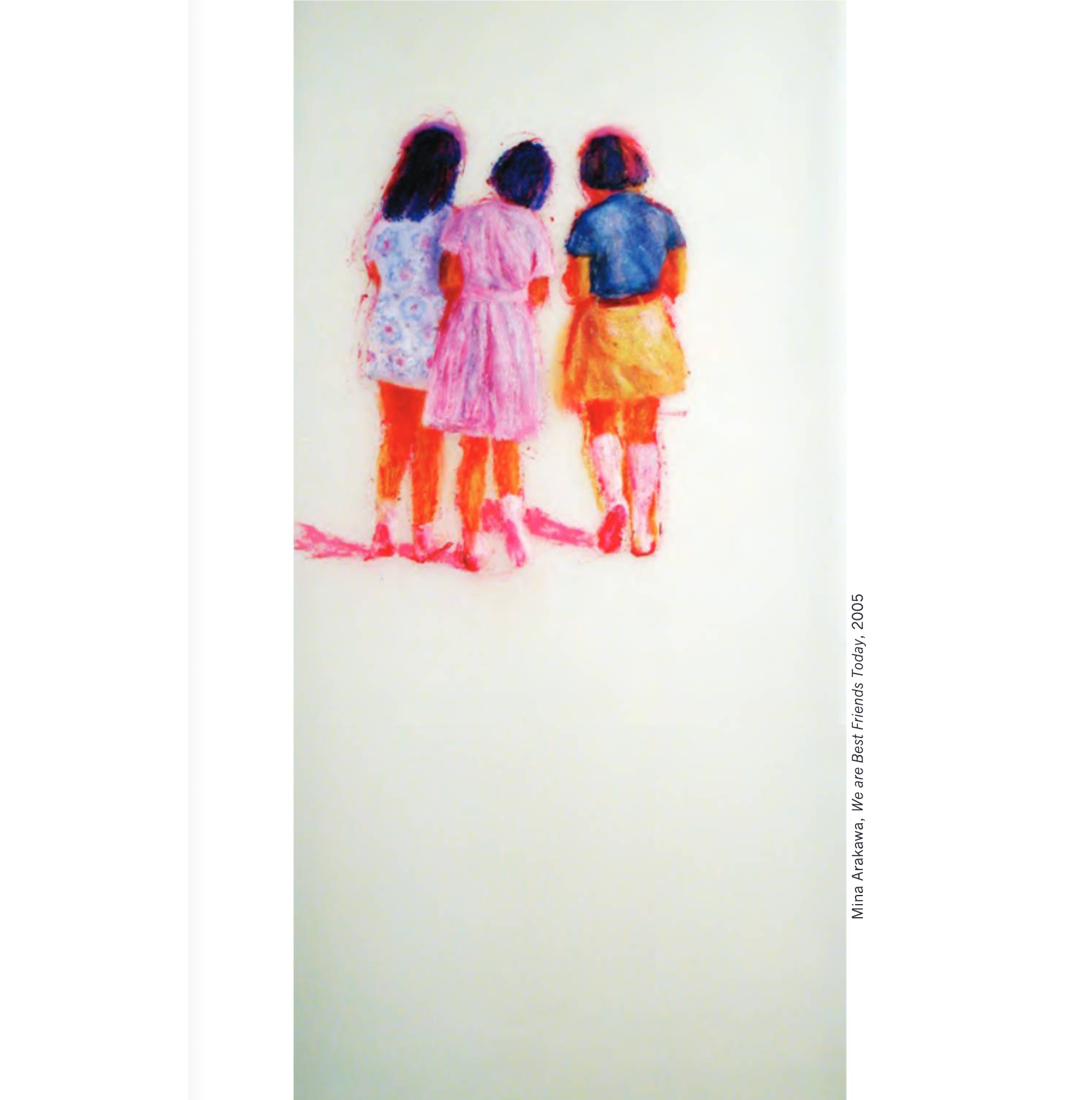
最近时间少,这次笔记甚至是录音转文字然后编辑一点(真的屑).
联动下篇.
Light line form, textbook.
Week 1
What is colour?
Topics:
Colour physics and perception
Colours of light vs. colours of objects
The physiology of colour vision
Colour blindness or alternative colour vision
There are three distinct ways to look at color.
- colors physical nature - the properties of the light spectrum
- objects do not actually have color, they only give off light that appears to have color.
- understand how the human eye senses color, which it turns out is somewhat different from how the human brain processes color.
The human capacity for color vision is due to the retina having two types of light sensitive receptor cells called rods and cones.
Rods are used primarily for low light conditions and by themselves would allow humans to only see in black and white.
It is the cones that are the most important for color vision.

There are three types of cones, short, medium and long wavelength.
Each is responsive to the regions of the visible spectrum, known generally as blue, green and red.
No matter how complex light therefore is reduced by the eye into three color components and sent to the brain through the optic nerve.
It is the brain’s processing of that information as well as a number of other clues that results in the perception of colour.
This highly complex process, the details of which are not fully understood and are still being researched results in the extraordinary capacity of humans to distinguish over 10.7 million different colors.
The way the eye and brain perceive the color of an object is dependent on the surface characteristics of the object.

The wavelengths of the illuminati and the surrounding environment objects can reflect, transmit or in some cases emit light, all of which will contribute to how their color is perceived.
There are two competing theories on the physiological process of color vision, Young-Helmholtz’s trichromatic theory, Hering’s system of colour opponency.
The trichromatic theory based on the premise that there are three types of photo receptors in the eye, red, green and blue that each detects certain wavelengths.
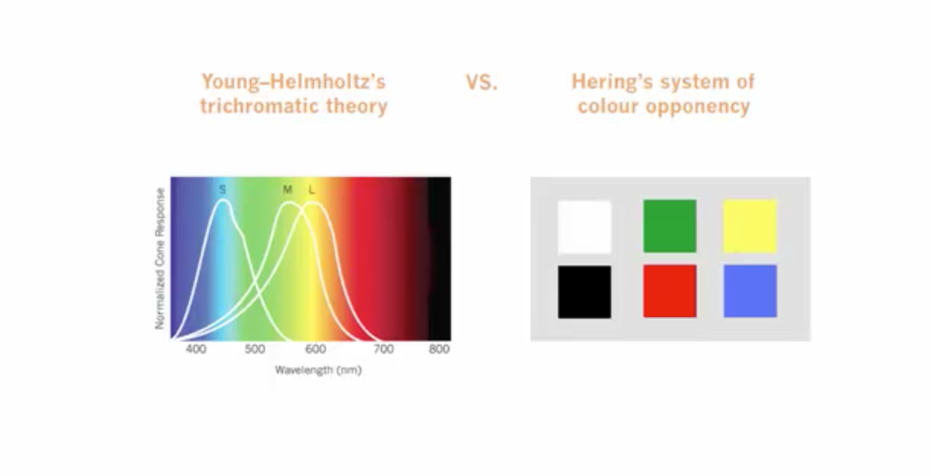
Hering’s theory attempted to explain why the after image for red is cyan and blue is yellow and vice versa.
This suggested to hearing that there were six primary colors that were detected by three pairs of opponents red + green, blue + yellow and white + black.
Any receptor that was turned off by one of these colors was excited by its coupled color.
The Elements of Colour
Topics:
Hue, Saturation and Value
Tints, tones and shades
Saturation
Colour Systems
There are three important terms used to describe physical properties saturation and value, otherwise known as HSV.
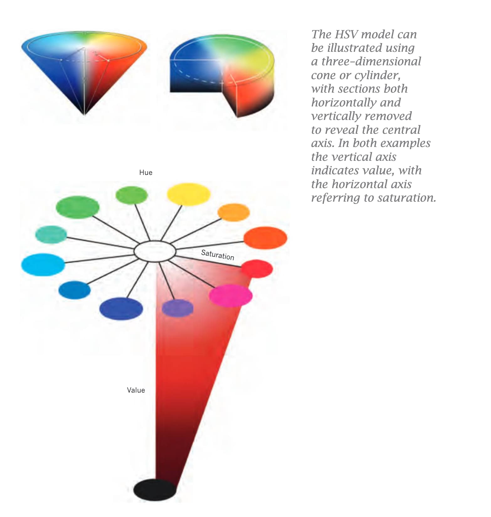
The HSV model can be illustrated using a three-dimensional cone or cylinder, with sections both horizontally and vertically removed to reveal the central axis.
In both examples the vertical axis indicates value with the horizontal axis referring to saturation.
Hue
Hue was the generic name of the distinct colour which is determined by its dominant wavelength, for example red green or blue.
Primary Hue definition:
primary hues as the colours that cannot be created by the combination of any other hues in the range of a given colour space, and they are the basis for creating the other colours in that system.
But do these hues really exist and do they meet these definitions?
The first question that needs to be addressed when dealing with primary colours is which colour mixing process is being dis-cussed: additive or subtractive?
在下文的例图里可以看到additive和subtractive分别的colour system.
Secondary hues:
Are formed by the mixing of primary hues.
The painter’s secondary hues are orange (red + yellow), violet (red + blue) and green (blue + yellow).
The secondary hues of the printing inks are red, (ma-genta + yellow), blue (magenta + cyan) and green (cyan + yellow).
The secondaries of light-emitting media are magenta (combining red + blue), yellow (combining red + green), and cyan (combining blue + green).
Tertiary Hues:
The painter’s tertiary hues of the subtractive mixing system are formed by the combination of a primary hue and an adjacent secondary hue.
Positioned between the primary and secondary hues on the 12-part circle they are, in clockwise order starting from yellow:
yellow-orange, red-orange, red-violet, blue-violet, blue-green, and yellow-green.
Just as secondary hues are mixed in an equal or 50/50 proportion of primaries, the tertiary hues of the colour wheel visually consist of 75% of one primary and 25% of another.
Cool vs. Warm Colour
The colour section of yellow through red is definitely warm, while that of green through violet is definitely cool. (The tertiary colours of yellow-green and red-violet are considered flexible in temperature.)
However, for those who work in photography or videography, colour temperature refers to a comparison of a light’s spectral signature with that of a set standard (that of a black-body radiator), measured in degrees Kelvin.
In this system, the colours with the lowest temperature are those in the yellow- red area of the spectrum, and the ones with the highest temperature are in the blue-green area of the spectrum.
Saturation
Saturation refers to the dominance of Hue within the colour in other words its purity or chroma(浓度), primary and secondary colours are fully saturated.
Saturation is also sometimes referred to as intensity.
In referring to colour saturation we may also use the terms pale or weak and pure and strong.
However when describing a color is light or dark we’re referring to its value or brightness based on how close it is to white.
Adding white increases of colors value while mixing black with it reduces it.
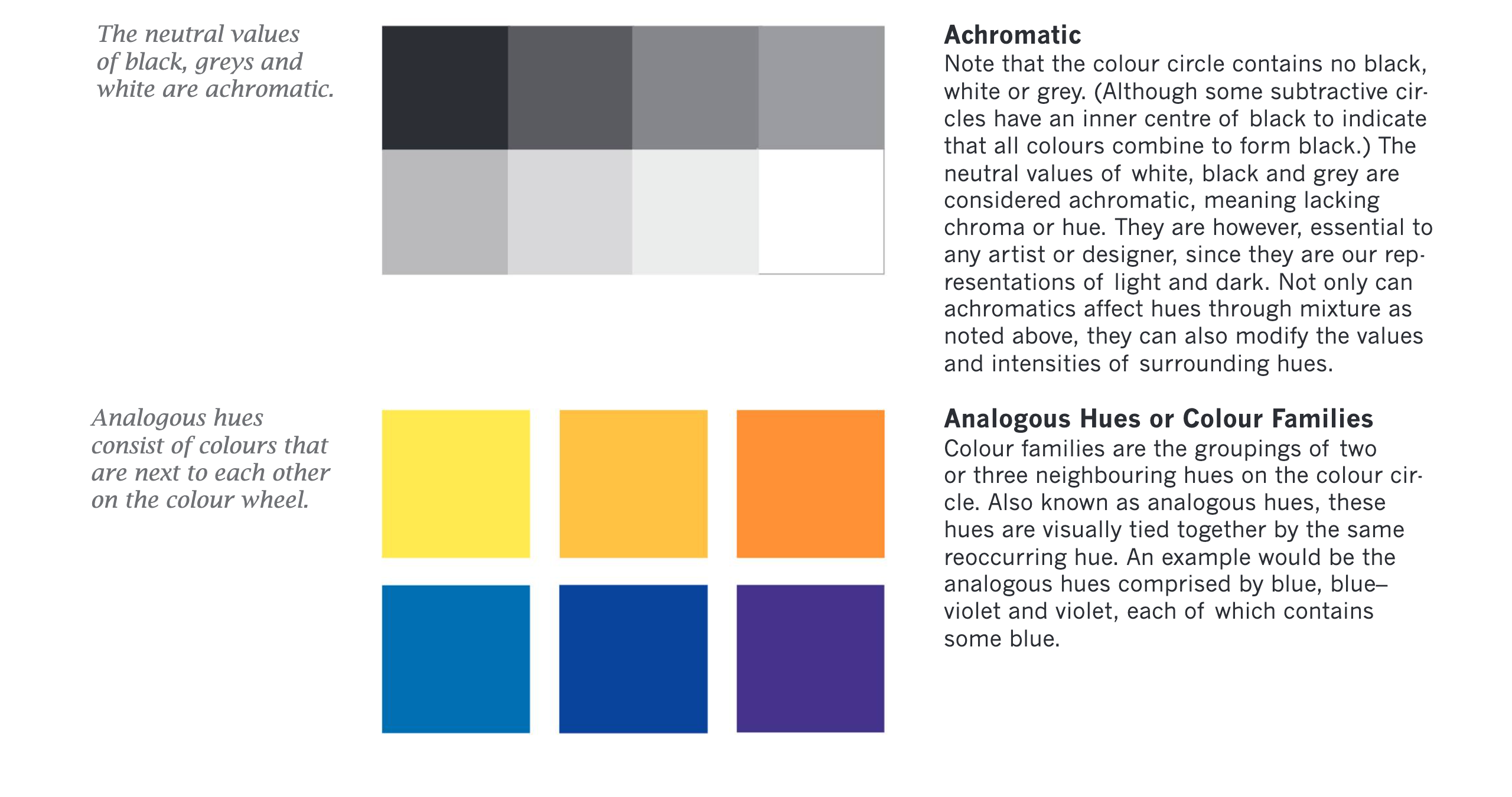
Tints, tones and shades
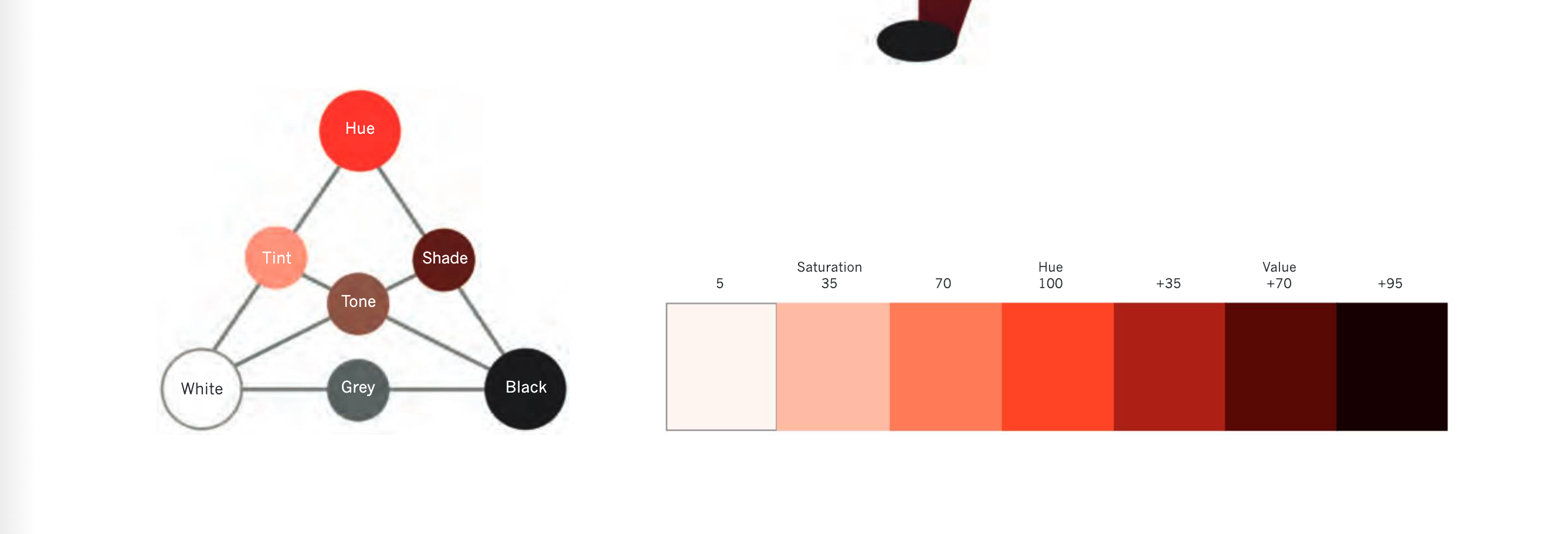
A tint is a hue or colour to white has been added.
A tone is a color that is being mixed with either compliment or with grey, and the shade is a color or hue to which black has been added.
Saturation(one more time)
Pure, intense, strong or bright are all terms that can be used to describe the attribute of color known as saturation, another word can use for it is chroma.
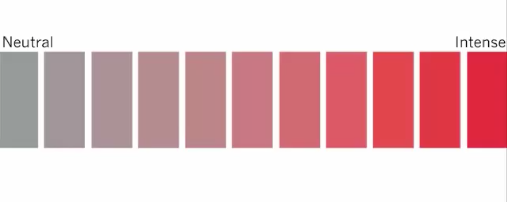
Saturation refers to the amount or degree of fullness of a hue within a color appears can be fully saturated or less saturated without any alteration of the Hue itself only its intensity.
The saturation of a hue can be changed in several ways including the addition of neutrals any intermixing of complementary Hues.
Mixing a hue this compliment will neutralize it muting its intensity, adding the neutrals white grey and black results and various tints tones and shades.
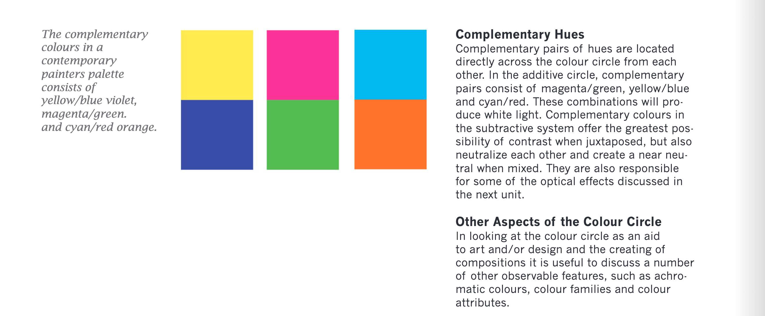
Color circle
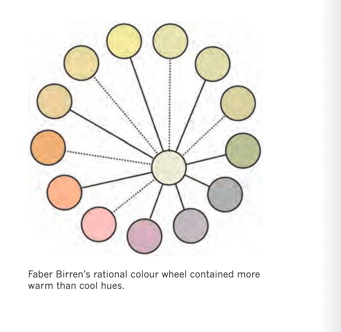
A color circle or color wheel is a good way to visualize color relationships.
Some critics claim that the color wheel oversimplify, 因为原本的关系应该是3D而colour wheel是还原成2D.
However the color circle still provides a good starting point for discussion and for students ongoing exploration of colors.
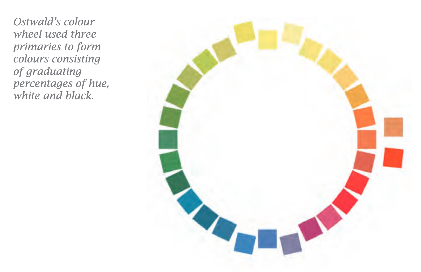
There are many types of color circles the additive color circle the subtractive or printers process Circle the traditional and contemporary artist Circle and so on.
There are a number of reasons why artists and designers are moving away from the use of the old traditional color circle, that is primaries can not mix all of the colours as the RGB or CMYK models.
Red and blue could not be mixed together using other hues, also there is a limited color gamete produced by red yellow blue.
And there is no scientific underpinning for the use of the RYB model other authors have noted the deficiencies of the traditional painters cricle.
It is impossible to create a subtractive colour wheel where every colour combined with the colour opposite it on the wheel will mix to grey [which is claimed by the traditional painters circle].
This type of colour wheel, which is found in many books for artists, (1) can only be approximate; (2) applies only to complex subtractive mixture, not to colour vision; and (3) precludes understanding many other things about colour.
Colour system
In mixing paints to achieve the illustrated colour wheel, a six colour palette should be considered in order to achieve the largest possible gamut range and purity of hues:
- primary yellow: benzimidazolone yellow (PY154) or hansa yellow medium (PY97)
- secondary red orange: pyrrole orange (P073)
- or cadmium scarlet (PR108)
- primary magenta: quinacridone magenta (PR122) or quinacridone rose (‘permanent rose’, PV19)
- secondary blue violet: ultramarine blue (PB29) or cobalt blue deep (PB73)
- primary cyan: phthalocyanine blue GS (PB15) or phthalocyanine cyan (PB17)
- secondary blue green: phthalocyanine green
BS (PG7) or phthalocyanine green YS (PG36); the best colour match to magenta falls between these two greens (MacEvoy).
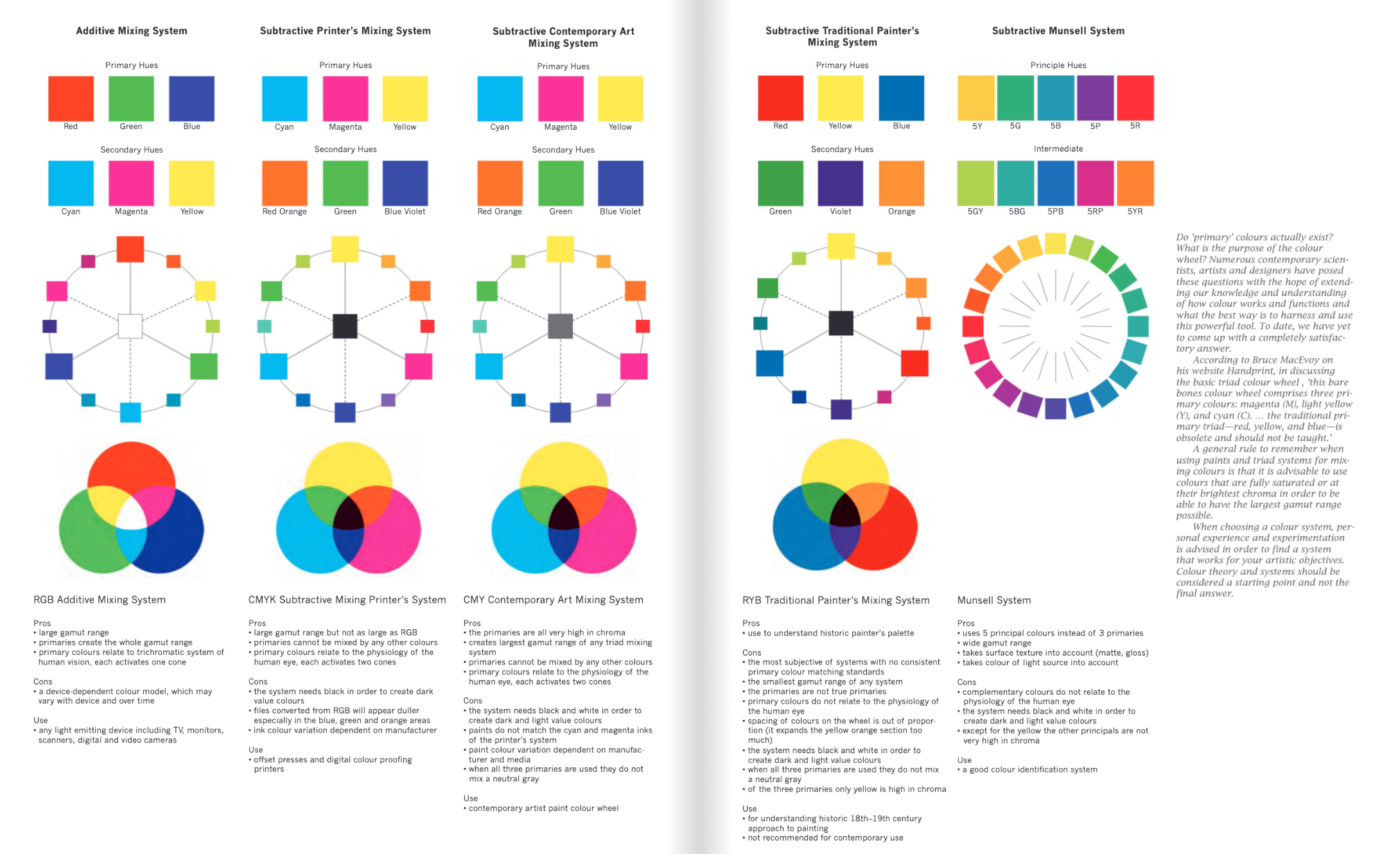
This type of color wheel which is found in many books for artists can only be approximate applies to complex subtractive mixture not to color vision.
A general rule to remember when using paints and triad systems for mixing colors is that it is advisable to use colors that are fully saturated or at their brightest chroma in order to have the largest gathering possible.
When shooting a color system personal experience and experimentation is advised in order to find a system that works for your artistic objectives color theory and systems of color should be considered only a starting point and not the final answer.
Week 2
Chevreul’s colour interaction
Chevreul’s definition of simultaneous contrast stated that:
Two adjacent colours when seen by the eye will appear as dissimilar as possible.
Successive contrasts or afterimages occur when the spectator looks away from an area of colour to discover its complementary hue forming for a brief period of time.
There are three different types of simultaneous contrast and they can function either individually or at the same time:
- value contrast
- complementary effect
- subtraction
Value contrast
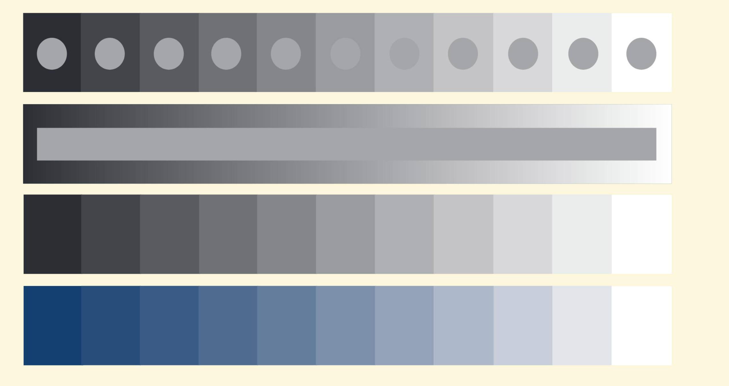
The same value of grey is used in the inner circles or rectangles (top two examples)
But the values appear to be lighter on a dark ground and darker on a lighter ground due to the principle of light/dark contrast.
The Chevreul Effect, (bottom two examples) stepped values placed next to each other will appear to be scalloped on the edges rather than flat areas.
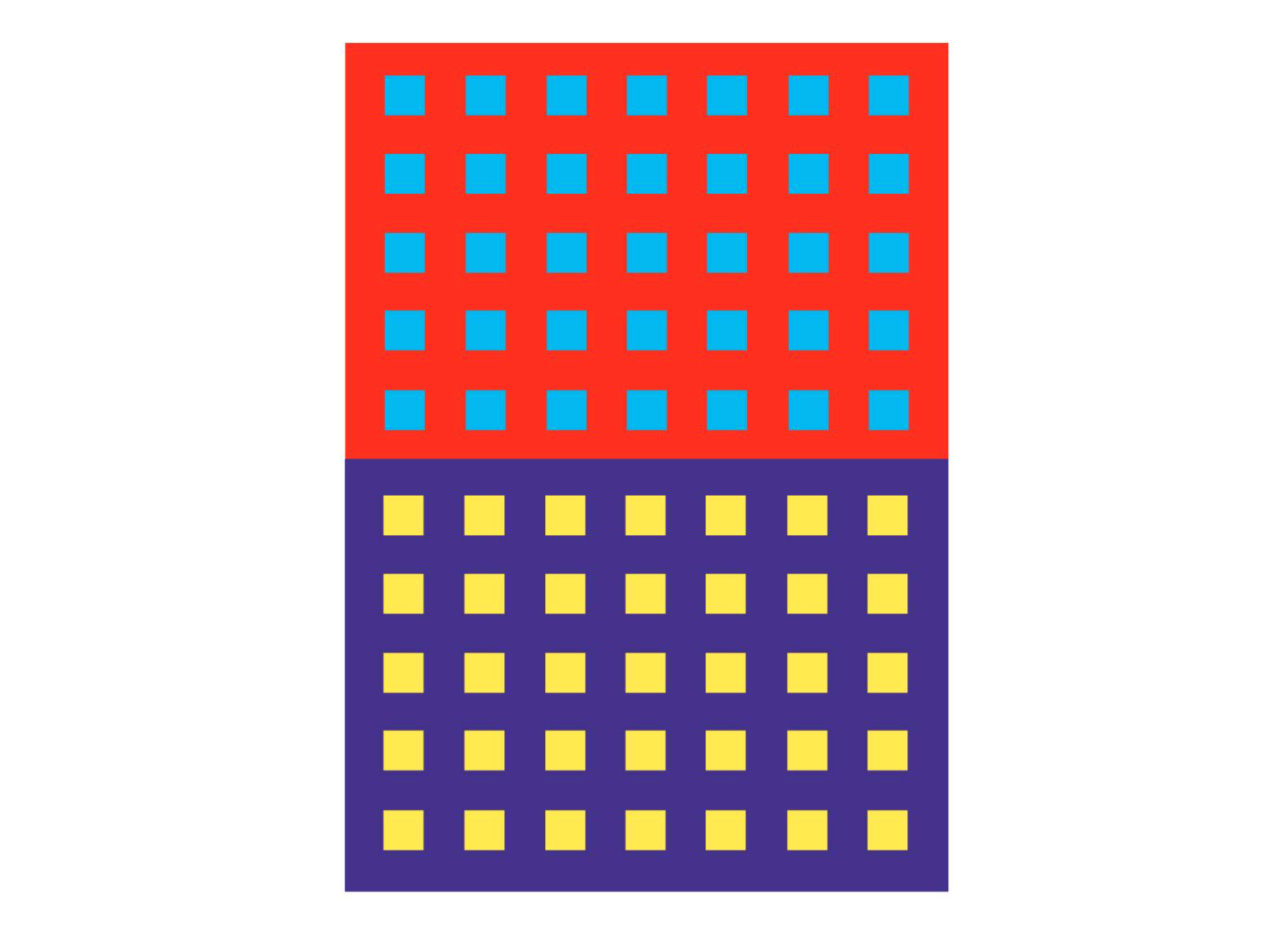
Complementary effect
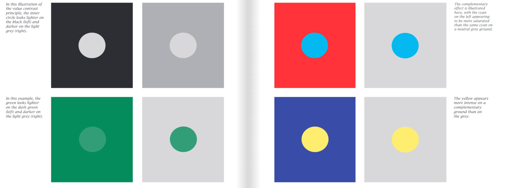
In this illustration of the value contrast principle the Inner Circle looks lighter on the black and darker on the light grey.
Value contrast works with colors as well in this example the green circle looks lighter on the dark green and darker on the light gray.
Complementary effect, when all the primary hues are present, the eye tends to be at rest.
However when one is missing it will seek, and if necessary, generate the missing complement.
Cyan on a red ground will appear more vibrant than the same cyan on a neutral grey ground.
Because of the highly saturated red ground, our eye intensifies the saturation of the complementary cyan.
Complementary contrast can be seen whenever two colours containing even the suggestion of a complementary relationship are placed next to each other. For example, a blue-green sample placed next to red will appear more green, while placed next to orange it will appear more blue.
Subtraction
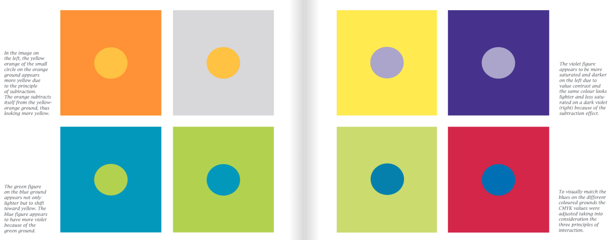
Subtraction is another principle of colour interaction.
It explains how similar hues when viewed together in a figure-ground relationship will react, with the dominant one appearing to pull or subtract its own colour from the lesser one.
In the first illustration on this page the yellow-orange on an orange ground will appear less orange and more yellow than the comparison square on a neutral grey.
This subtraction effect will appear to change both the hue and the saturation of a colour.
This gets more interesting when the complementary effect is also involved in the relationship, as is the case with green on a dominant blue ground.
The blue will subtract its own component from the green, which makes it appear more yellow.
When the roles are reversed, the green seeks its complement and shifts toward red, making it appear like a blue violet.
All colour shifts are not the same.
As a contemporary of Chevreul’s noted, the best example of colour shift occurs when hues are of mid value and fully or nearly fully saturated.
Also, the further two hues are from each other on the colour wheel, the more noticeable the colour shift.
Less noticeable shifts will occur when viewing lighter or darker valued hues.
Successive Contrast and Afterimage
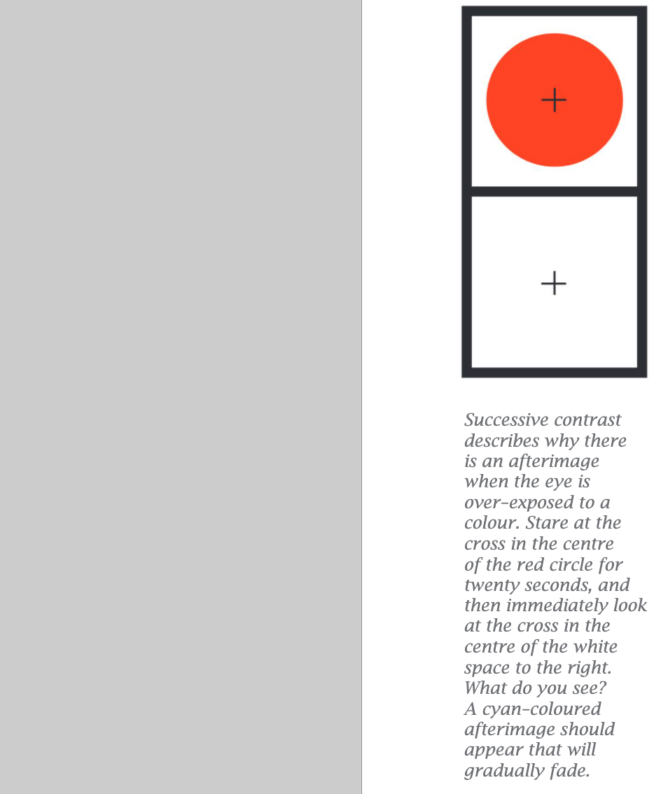
Successive contrast describe what occurs when the eye is overexposed to a colour.
It is manifested as an afterimage.
Seeking respite from overexposure to a hue, the eye will in direct succession, generate an afterimage of its complementary colour.
As explained by Hering’s opponent theory, the three primary opponent channels in the eye are: red/cyan, blue yel low, and black/white.
When looking at a blue image this will tire out the blue photoreceptors, and they produce a weaker signal, resulting in less blue and more of its paired primary colour, which is yellow.
Optical or Partitive Mixing
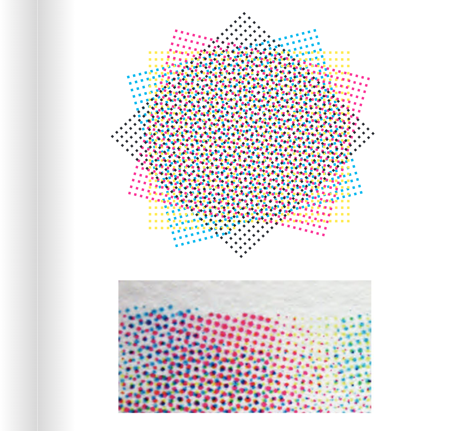
Optical or partitive mixing takes advantage of the eyes’ tendency to blend adjoining hues so that they appear to create a different combined (or third) colour.
This was another additive mixing process first noted by Chevreul, while working with fabrics, that many more colours could be created by the combination of the warp and weft of woven material than those actually present in the yarns.
The effect of juxtaposing colours was further explored by the French artist Eugène Delacroix (who termed it broken colour), the Impressionists and Post-Impressionists, develop a new painting technique known as pointillism..
They found that the viewer’s eye would then optically mix the two colours into brown-and a brown that was actually more lively, or rather lighter and more saturated in sensation, than the one they could have created through physical mixing.
Optical mixing underlies the way we see colour TV and computer monitors and is widely used in the four-colour offset printing process.
Fluttering Heart and Complementary or Simultaneous Vibration
When two highly saturated colours are juxtaposed, the eye seems to sense a slight impression of movement.
When for example, a red patch is placed on a blue ground, with both colours being highly saturated, the red seems to ‘float’ above the blue.
This was a phenomenon that was sometimes described in the nineteenth century as ‘fluttering hearts,’ presumably because some examples of it featured heart-shaped figures.
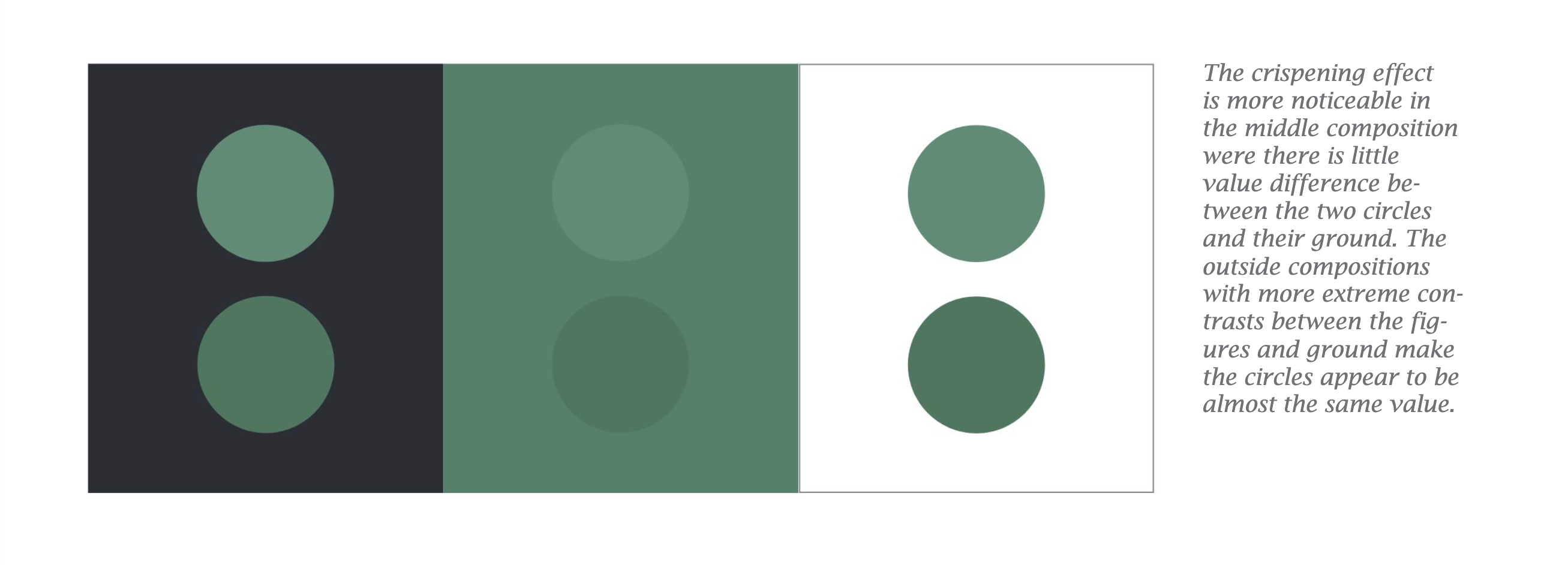
Bezold Effect or Assimilation
Another example of colour interaction is the Bezold effect.
Bezold discovered that he could affect the appearance of all the colours in a complex design or pattern by changing just a single colour in it.
Such changes not only seemed to affect the colour relationships, but also the design’s visual weight and balance.
Important for artists and designers to be aware of, this aspect of the Bezold effect seems to be reduced by separating the colougareas with white or black outlines.
Depending on line width, white rules will isolate and expand the colour, while black constrains it.
Another effect associated with Bezold (some times called assimilation), is his discovery that contrary to the laws of simultaneous contrast where colours seem to switch to their complementary, some colours will actually take on the same colour as their surroundings.
In these situations a colour positioned next to a light colour appears lighter, but next to a dark colour it will appear darker.
Although simultaneous contrast has a known physiological explanation, the science behind the assimilation effect is still unknown.
Transparency
When two objects overlap each other but do not completely obscure one another, areas of transparency may be created that, depending on the object’s level of opacity, will have the combined characteristics of the two.
Transparency has the effect of moving the eye in and out of different layers of space.
There are two different types of transparency: actual (glass, filters plastic, etc.), and simulated or illusory.
Layers of transparency can be created through such traditional media as watercolours, oil and acrylics, with the patient build-up of thin washes.
This technique works best on a whole composition or on large areas of a composition.
It is also possible to recreate transparent interactions by mixing in a third colour that reflects the properties of the overlapping areas, using any combination or pairing of colours.
Week 3
Colour Harmonies
In discussing colour harmonies, the following colour schemes are meant to act as a basic guideline or framework that will assist you in the planning and development the two-dimensional composition.
These schemes are not meant to be a rigid set of rules but merely a jumping-off point for the exploration and development of a more personalized approach to colour.
They’re based on hues from the colour circle which is used to determine the various types of colour relationships and harmonies.
All of these relationships have their own personalities and characteristics that can be learned and used in order to achieve colour Harmony.
Achromatic Harmony
Achromatic schemes are created using colours that have no hue.
Achromatic compositions (such as those seen in some Cubist paintings) are characteristically re strained, subtle and sophisticated.
A traumatic schemes the use of neutrals is easily implemented however there was a lack of emphasis in order to create and versus make use of value contrast.
Pros: Neutrals are easy.
Cons: Lack of emphasis.
Tips: Use value to create emphasis and movement.
Monochromatic Harmony
Monochromatic harmony in compositions is created using a single hue with variations of lightness and saturation.
These schemes can easily establish an overall mood that the artist/designer is trying to achieve (as in Pi. casso’s blue period works) and convey the personality and characteristics of that colour (see Unit 8 for colour symbolism).
The lack of hue contrast to help create focal points or emphasis in a composition can be compensated for by the use of value.
Pros: Monochromatic compositions are easy to create and will appear organized, balanced and cohesive.
Cons: These compositions can lack a spark and are less vibrant than other colour schemes.
Tips: By using value through the use of tints and shades of the chosen colour, emphasis and focal points can be created.
If the desired effect is not being achieved through the use of a monochromatic scheme, consider trying analogous colours, which offer the same qualities of harmony but more variety and nuances of hue.
Analogous Harmony

Analogous schemes are created as hues that are adjacent to each other, on the color circle such as yellow orange and red.
Analogous keens easily create visual unity but with greater variety and with more easily created focal points than a monochromatic schemes.
Their downside is that they lack you contrast and eye-popping focal points when using an analogous team arrange the composition around a dominant Hue with smaller amounts of the adjacent hues.
Polychromatic Harmony

Polychromatic Harmony uses a wide range of views from any location on the colour circle that have a similar value range.
This is what gives the composition harmony while balance can be achieved through the consistency of non-hue features.
In order for the composition to be successful the hues should have a limited range of value and saturation, which will allow the artist/designer to combine a wide range of hues together without them clashing or appearing discordant.
Colour schemes that are targeted for children frequently use highly saturated combinations of hues.
Another common usage are pastels of the same light value and intensity.
The positive aspects of a polychromatic scheme are that they are highly visible and eye-catching when using this technique.
Could be aware that it can be difficult to achieve a balanced harmonious result by using a continuous neutral background colour jarring contrasts can be reduced.
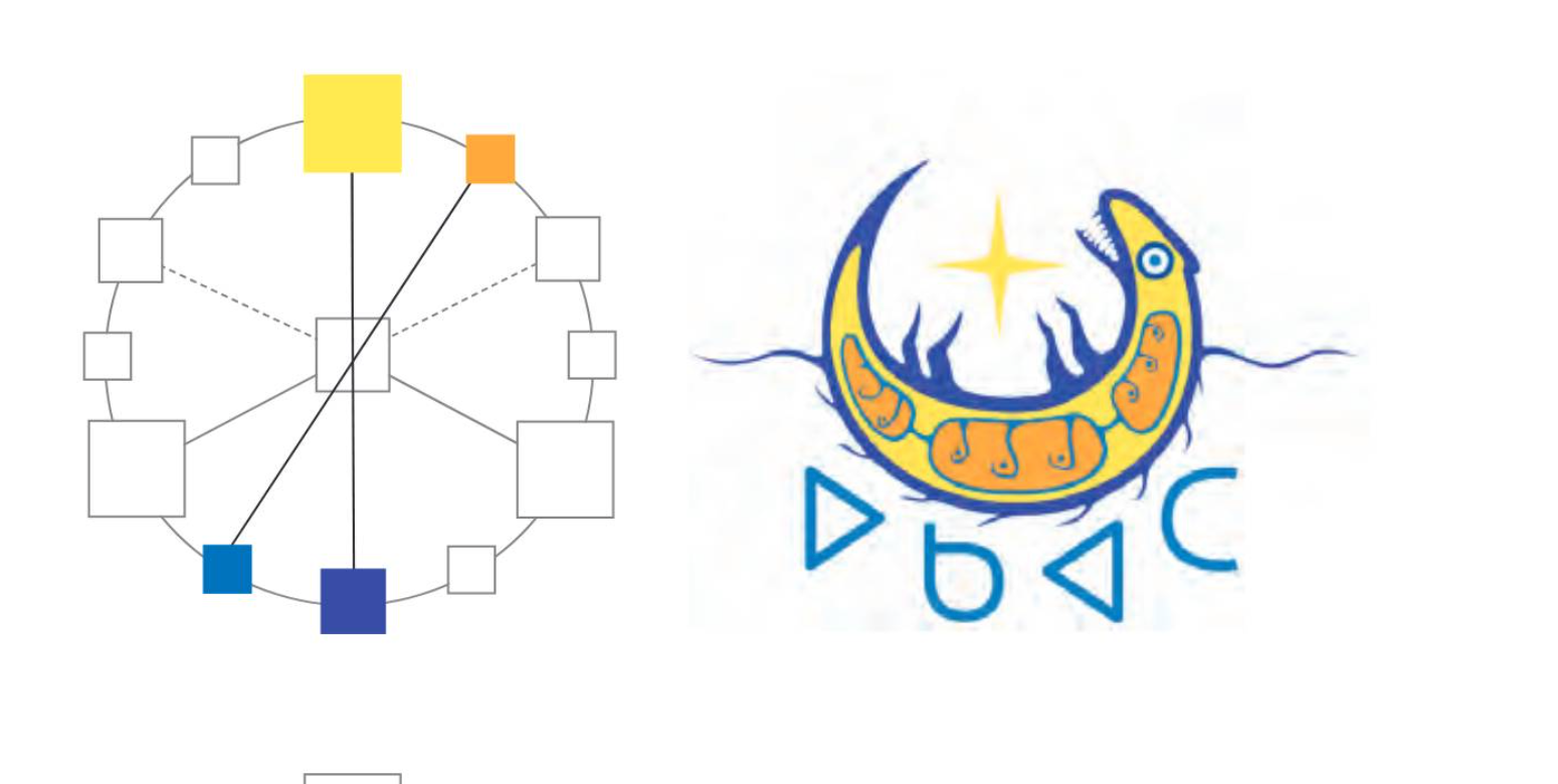
Complementary or Dad Harmony
A complementary or dyadic scheme uses use that are directly opposite each other on the colour circle.
They are high-contrast in nature and when placed next to each other they cause an effect known as complementary vibration.
Because of this effect, compositions that use the complementary hues at full value and saturation should be avoided unless the intention is to create a jarring relationship.
The sharp contrast between these hues make it easy for the artist or designer to draw the audience’s attention to focal points when using this colour scheme.
It may be more difficult to achieve a balanced composition compared to other colour.
Tips: More successful compositions are achieved when the colours have unequal weight. If more variety is needed, a split complementary colour scheme should be considered.
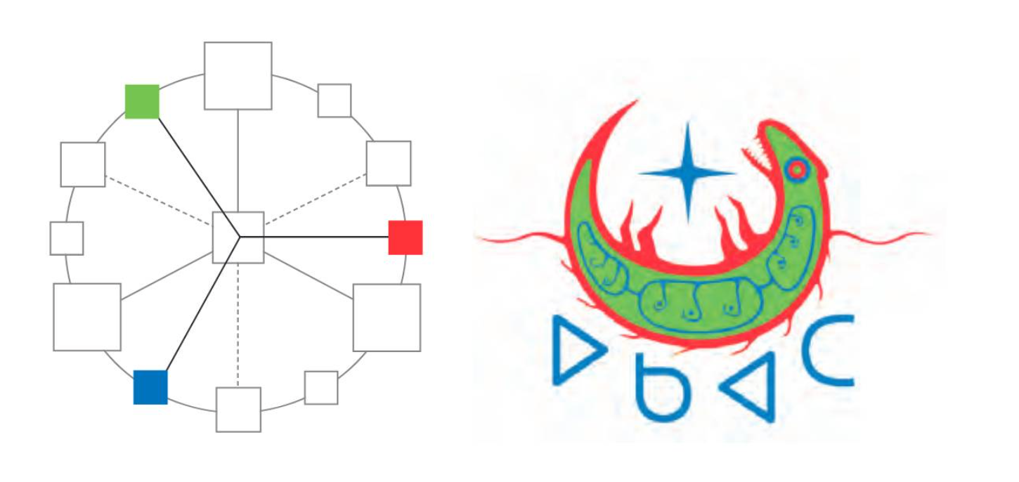
Split complementary
A split complementary scheme has the advantages of combining the harmonious effect of two analogous hues along with the strong contrast created by a complementary colour.
It statues use and an opposite diet that should form a V shape formation on the colour circle.
These compositions are generally balanced and have variety.
The adjoining hues offer nuance, while the complementary hue adds strong contrast.
Difficult aspect of split complementary schemes is that they do not have the same amount of contrast as complementary schemes to create a composition with a strong focal point, use a warm hue for the accent and a range of cooler colours for the background.
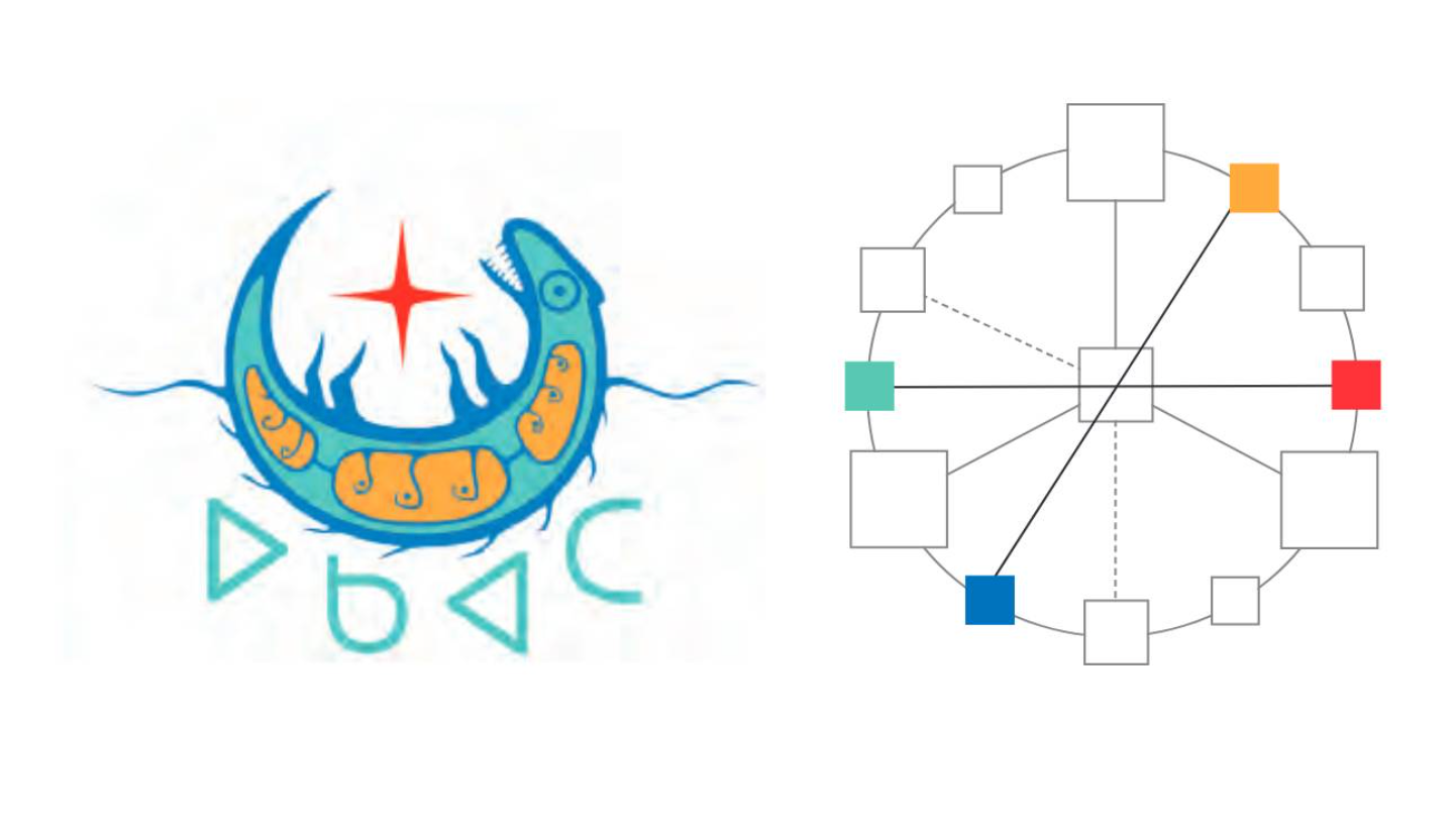
Double Complementary Harmonys
Double complimentary is a rich complex colour scheme that uses for use of two adjacent complementary pairs.
the double complementary scheme is softer and with less contrast than a complementary scheme but is more difficult to harmonize if all hues are of equal value.
Pros: This scheme is rich in variety and contrast.
Cons: Because of the variety of hues it is more difficult to balance your composition.
Tips: If all four colours are used at equal value they will appear unbalanced, so use a variety of shades and tones.
Triadic
Triadic schemes use hues that are equally spaced on the colour circle.
Triadic schemes are considered balanced with high contrast but not as strong as contrast complementary schemes.
They will create compositions that are not as contrasting as complementary schemes but rich, varied in hue and balanced.
Tips: Have large areas of a composition dominated by one colour with the other colours used more sparingly.
Tetradic
Like the double complementary scheme the tetradic is a rich, complex combination that uses four hues.
This scheme offers more variety and high contrast value than other combinations.
Tetradic seems allow for great variety and contrast, however this game to be difficult to balance attention to the balance of cool and warm hues.
In the composition also let one colour dominate and avoid using fuor hues of equal value colors.
Discordance
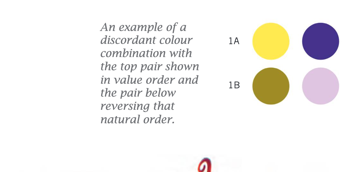
Discordance is created when colours that do not correspond with the natural order of tonal value are juxtaposed.
For example when orange is used in combination with a light blue, it does not follow the natural order of tonal value (orange is positioned lighter on the colour circle than blue).
If handled carefully however this type of colour scheme can be quite successful.
Pros: Creates attention-grabbing compositions.
Cons: Difficult to balance and if excessive can turn your audience off.
Tips: Discordant colours work best when there is extreme value and hue contrast between them.
Restrict the number of colours used and keep the most jarring colour relationship to the focal point of the composition.