

心之所向(?)报了门graphic design history.
挺有意思的,或者说画了那么多年没有了解过历史…还是会可惜的.
盘算着这份笔记说不定可以用来做更加有趣的.
下篇.
Elements of design
- Point (Dot)
- Line
- Plane
- Volume
- Shape
- Colour
- Dimension
- Form
- Texture
- Space
- Material
以上组成了.
Principles of design
(有很多很多priciples,以下只为一小部分.)
- Scale
- Balance (Symmetry/Asymmetry)
- Repetition
- Rhythm
- Direction
- Movement
- Harmony/Flow/Unity
- Proportion
- Economy
- Contrast/Emphasis
- Point of view
- etc.
Break it down
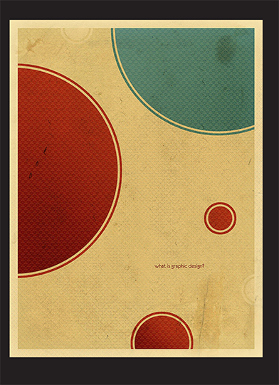
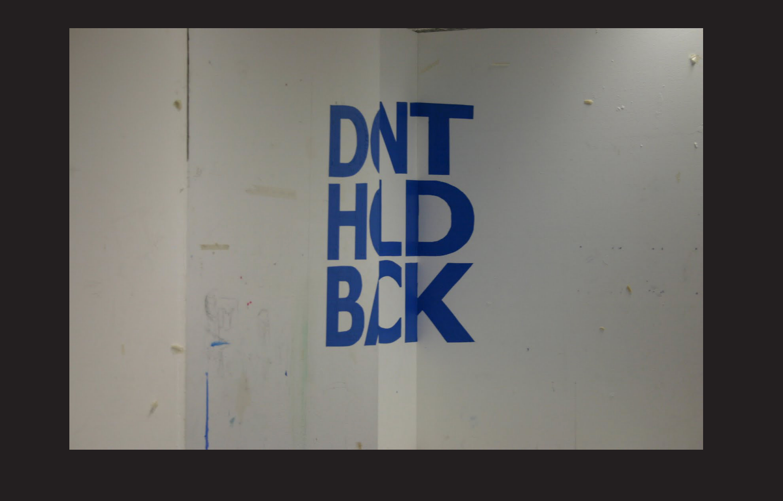
Balance

惊讶老师用这张举例子…
Balance is the concept of visual equilibrium, and related to our physical sense of balance.
Asymmetrical balance, or informal balance, occurs when the weight of a composition is not evenly distributed around a central axis.
It involves the arranging of objects of differing size in a composition such that they balance one another with their respective visual weights.
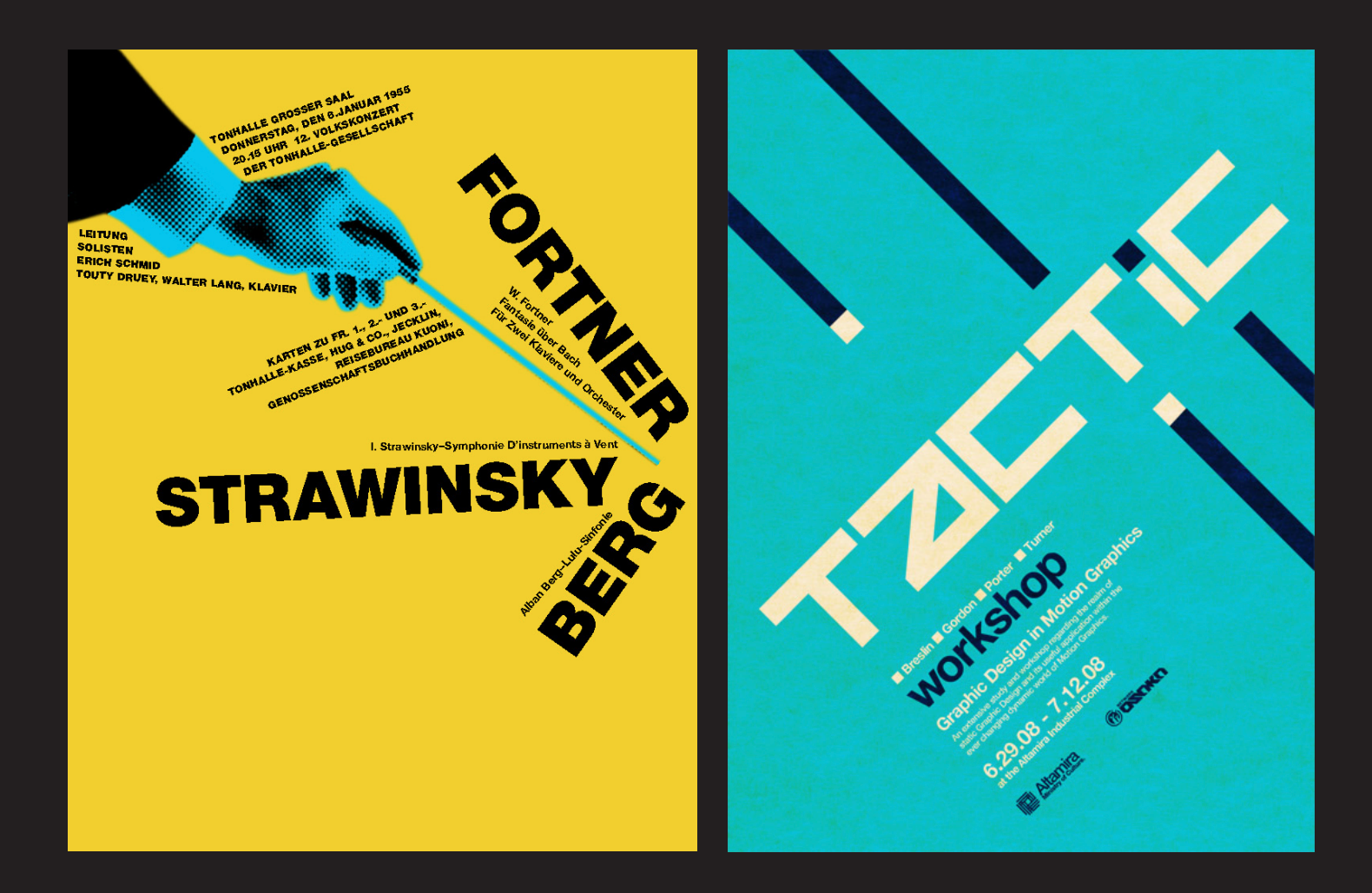
Rhythm or Repetition

这张图我很喜欢,老师说第一张regular rhythm is not really rhythm
Rhythm应该有变化.
The alternation of elements, often with defined intervals between them. Rhythm can create a sense of movement, and can establish pattern and texture. There are many different kinds of rhythm, often defined by the feeling it evokes when looking at it.
Rhythm should not be static, usually something that changes along the way. Change but repeat (like music, heart monitor).
eg. A. M. Cassandre 1920s (art deco), Andy Warhol Marilyn Diptych

这张我也很喜欢…
Unity
Unity is the underlying principle that summarizes all of the principles and elements of design.
It refers to the coherence of the whole, the sense that all of the parts are working together to achieve a common result; a harmony of all the parts.
One of the best ways to achieve some sort of unity, especially if it’s a complicated piece of design that you’re working with, is limiting the number of colours or your colour palette.
It’s neither too little, not too much, exactly right.
Proportion

Proportion is the comparison of dimensions or distribution of forms.
It is the relationship in scale between one element and another, or between a whole object and one of its parts.
Differing proportions within a composition can relate to different kinds of balance or symmetry, and can help establish visual weight and depth.

Economy

Economy emphasizes the simplification of elements to express a message; Only the elements required to express the idea are used.
The use of too many elements or contrasts in a design may distract viewers from the message, or cause them to disengage completely from the viewing experience.
eg. after art nouveau German Poster Style (Plakatstil).
Emphasis
Aka: point of focus, dominance or interruption.
It marks the locations in a composition which most strongly draw the viewers attention. Hierarchy is established through emphasis.
Emphasis is most commonly controlled by contrast.
Contrast
Constrast addresses the notion of dynamic tension or the degree of conflict that exists within a given design between the visual elements in the composition.

Gestalt theory
In visual communication, there are two kinds of control.
- control over the PHYSICAL FORM of the designed artefact
Perception:
How stimuli from the world interacts with our sensory systems.
Affects involuntary/inherent processes which we can control this through understand and use of:
Elements/Principles of Design, Gestalt psychology.
- control over HOW INFORMATION IS MENTALLY REPRESENTED
Cognition:
How people mentally represent their experience and then use these representations to operated effectively. We can control this through:
Semiotics Rhetoric: Ethos/Pathos/Logos
Rhetoric is the art of discourse that attempts to inform, persuade, or motivate particular audiences in specific situations.
Gestalt principles
(大脑会做的一些,自动补全,形状类比trick.)
- Similarity
- Proximity
- Closure
- Figure/Ground
- Prägnanz
- Common Fate
- Continuation
Proximity
Elements that are close together are perceived to be more related than elements that are further apart.
这张我觉得还有大脑自动补全的Gestalt principles.
Similarity
Elements that are similar are seen as being more closely related than elements that are dissimilar.

大脑会把对话框,鸟,形状类似的自动归类.
Prägnanz
A tendency to interpret ambiguous symbols as simple and complete, versus complex and incomplete.
例子::-)
Figure-ground
Elements are either perceived as figures (object of focus) or ground (the rest of the perceptual field). Sometimes, the differentiation can be blurred.

eg. MC Escher; Noma Bar
Closure
A tendency to perceive a set of individual elements as a single, recognizable pattern, rather than multiple, individual elements.

Continuity
When there is an intersection between two or more objects, people tend to perceive each object as a single uninterrupted object. This allows differentiation even when there is visual overlap.
We have a tendency to group and organize lines or curves that follow an established direction over those defined by sharp and abrupt changes in direction.

Origins of typography and Graphic design
Renaissance
1455
The printing press arrives, Gutenberg第一位使用活字印刷publish book.
Gutenberg bible, initiated the incunabula - or cradle, the term for the first fifty years of movable-type printing.
这时候的书装点的很有意思…
Printing was the core technological achievement that made possible the advent of an era of increased scholarship during Renaissance.
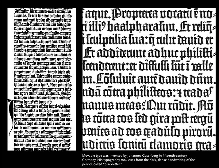
(这时候的字是所谓的black letter,很重艺术感的字体.)
1458

Nicolas Jenson, the first to start using Roman type.
Venetian roman typeface, the first one based on local manuscript writing for his book.
看上去已经跟现在用的字体很相似了…五百年诶兄弟.
The word humanist is referencing the way the human hand moves.
1500
Aldus Manutius (hired Francisco Griffo to), invented first italic type font.
And also inexpensive smaller books(文库本的诞生).
当初italic font的诞生只是for more economical use of space.
1531
Claude Garamond (one of the first punch cutters)’s roman fonts.
Punch cutters, the people that actually create the metal type and actually take the lead metal. Melt it down and pour it into the forms that would then become the individual pieces of metal type that could then be placed into presses in order to create prints and books.

Garamond’s promotion resulted the gradual disappearance of blackletter, and an adaptation of Manutius’s Bembo.
A style change from the heavy French Gothics to broad forms and light proportions.
interesting fact that Hilter is the one stopped the use of the black letter, cuz most ppl didn’t really able to read black letter, and Hilter as the man wanna take over the Europe, he changed it.

Meanwhile Germany still using Blackletter, modify and proliferate the use of the form, Martin Luther published New Testament in 1522.
Enlightenment and abstraction
Next shift in type design in Europe we called it Transitional(or Realist).
- embodying the rational spirit of the Enlightenment
- contrast between increases between thick and thin strokes
- axis tends to be vertical
- serifs tend to be thin but still wedge shaped
1692

Louis XIV commissioned for the use by the Royal Print Office.
Developed by Philippe Grandjean de Fouchy, called Romain du Roi (King’s Roman).
The letterforms constructed not through intuition but through the rational approach of the empirical scientist.
1725
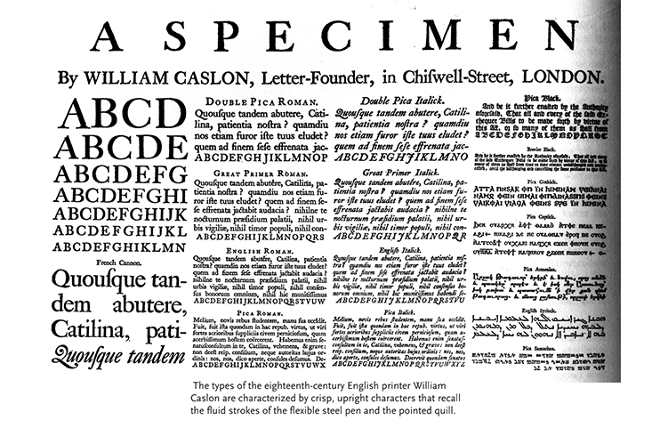
William Caslon, Caslon. Become popular because of the functionality, legible, sensitive proportions.
Famous example, United States Declaration of Independence.
Geofroy Tory, believed that proportions of the alphabet should reflect the human ideal.
Designs of Baskerville, Dedo and Badoni.
Style becomes more Cursive or script.
1754

Baskerville by John Baskerville, high contrast, generous proportions, between thin parts and thick parts.
1784

Modern Roman typeface, Firmin Didot. Neoclassical typefaces that exquisitely captured the Modern style.
Another modern, closely modeled after Didot was Bodoni, acquired of very unmistakeable scent of fashion in mid 20th century.
Second industrial revolution
1800s
Monster fonts(large-scaled and bolded).
Using lithography (wood instead of metal), developed in Germany in 1796 by Alois Senefelder.
Using curves, also some add colours.


Fat face, Extra Condensed typefaces, Egyptian, use as much spaces as possible.
The font at these time, represent the advent of graphic design, using weight to produce strongly contrasted, (build for) can make product to stand out.
Reform and revolution
Edward Johnston 1919 for London Underground, removing all unnecessary elements.
He reacting against he called the monstrosities of 19th century commercial advertising, wants to understand to go through an exploration of what constitutes a B.

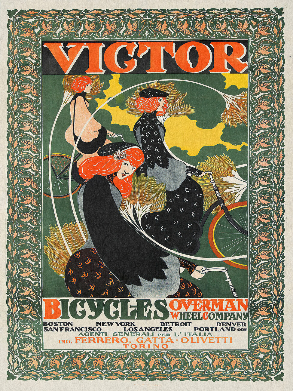
Art Nouveau
The advent of graphic design
In 1900, the advertising rise, demand for large-scale letters and graphic design. (Including large area of hoarding. 巨大的招牌版) The use of colour was new due to at that time, before using colours need to be done by hands.

Initially, the proliferation of the mass media during the industrial revolution came about without a complementary expansion in the design profession.
The term graphic design itself did not appear until 1920s.
Arts and crafts movement
Started in Britain.
William Morris the leader, recognize the flood of goods produces because of the advances of the period all too often lacked artistic merit.
Expanded his business to include book design founding the Kelmscott Press(出版社), return 15th century book forms.
He dedicated his life to bettering the quality of the impoverished objects that had flooded Europe.
(So it’s like replicating the aesthetics of the past, particularly classic things like Greek and Roman.)
1893 the arts and crafts movement was criticized as the work of the few for the few because it failed to address the problems of mass production.
Starting of Art nouveau
Art Nouveau and its associated movements also turned away from the mechanical aspect of industrialism, using non-mechanical, organic lettering in the case of Art Nouveau, influenced by ukiyo-e woodblock prints(浮世絵) and the lithographic medium(平版印刷媒介).

Most people would agree this is the born of modern art.
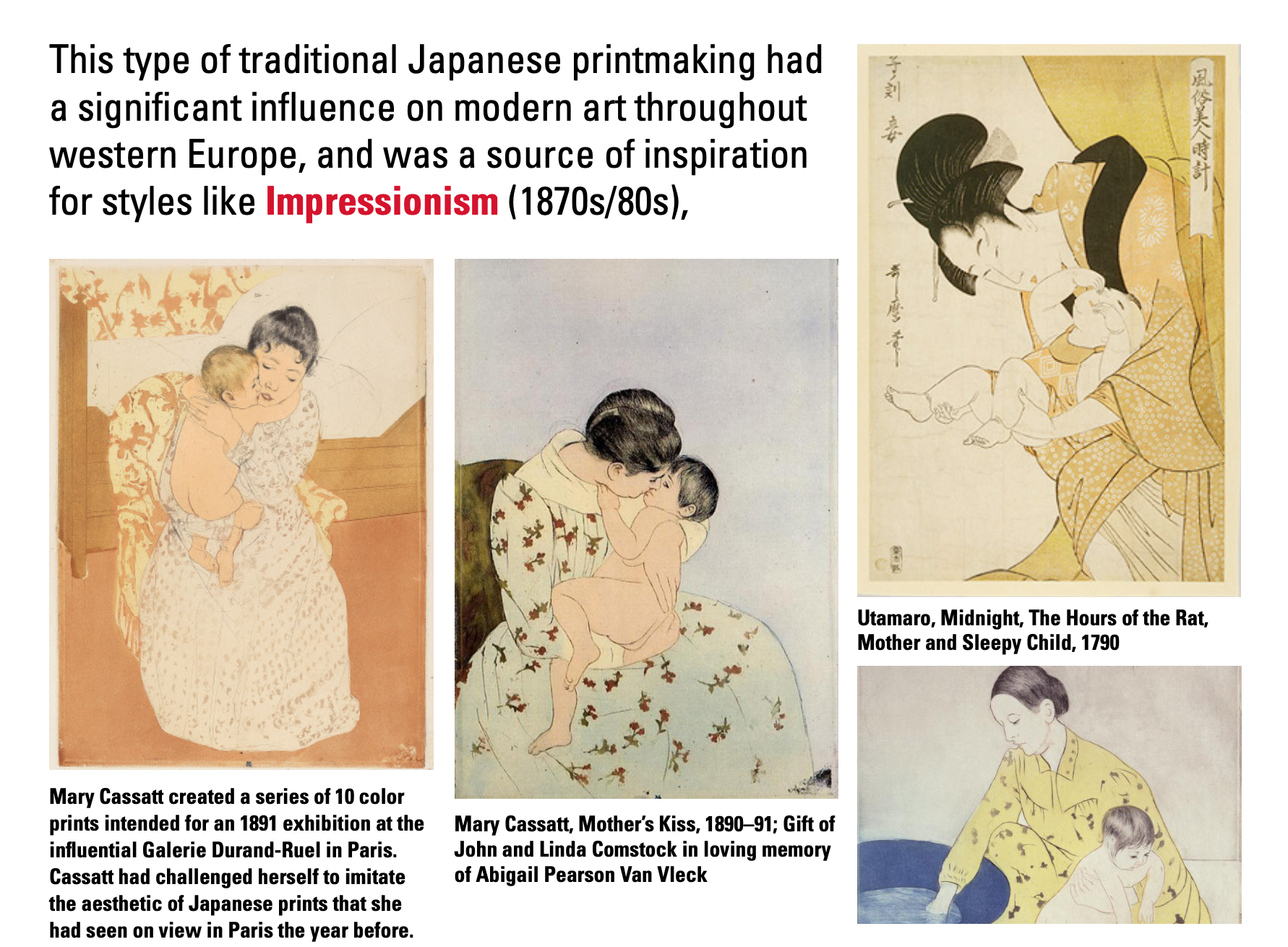
Interesting fact that… 因为女人那时候无法自由出门,所以这位画家(Mary Cassatt)很多主题是家内的题材.

虽然还是保留了西方在我心中像神经质优等生一样的行准和人体,但的确能看出很多influence…

Another interesting fact that 梵高(earlier work)受到的影响.
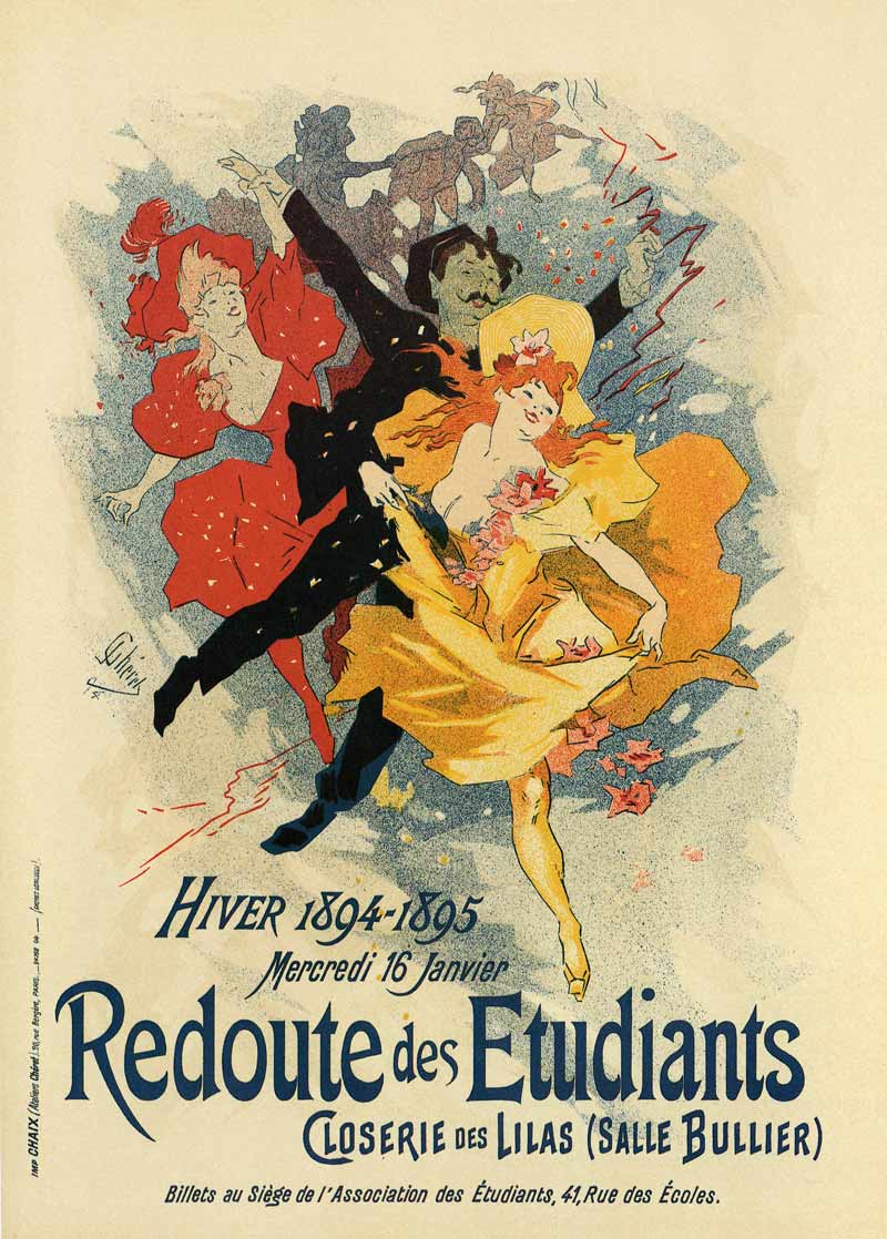
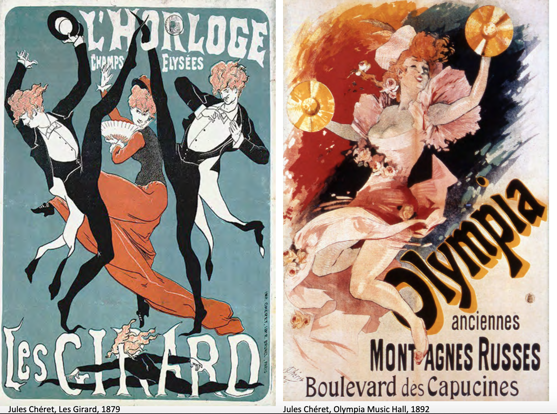
Jules Cheret
French Art Nouveau.
The most influential poster designer of the late 19th century, Jules Cheret.
因为真的好看收了不少张.
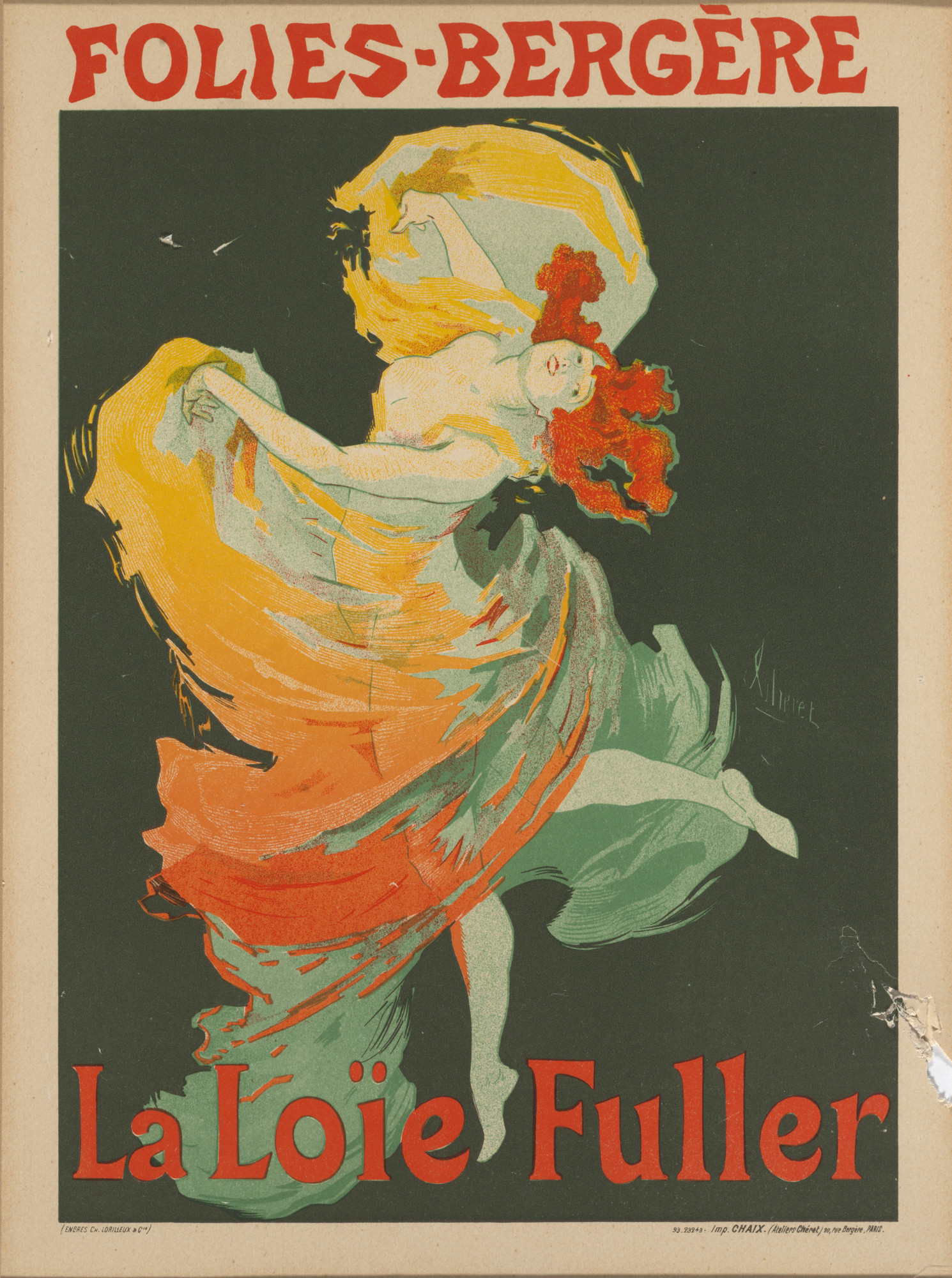
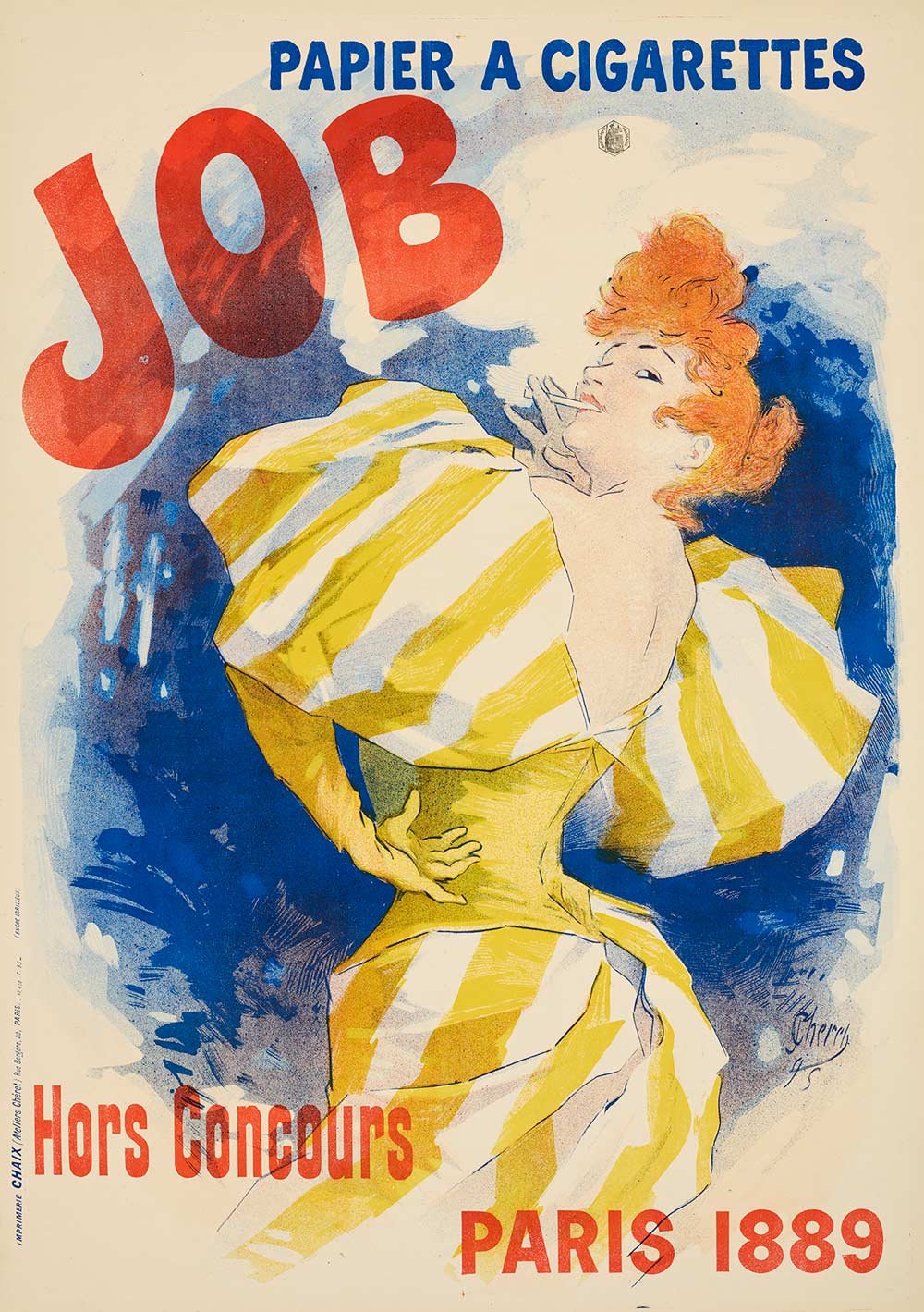
Charet has expertly intertwined the legs and bodies of the figures with the lettering on the poster, but there was no need to use pre-designed type in chromolithography. Cheret was free to design his own lettering. Therefore, the exuberant forms of his letters mimic the frenetic movements of the dancing figures.
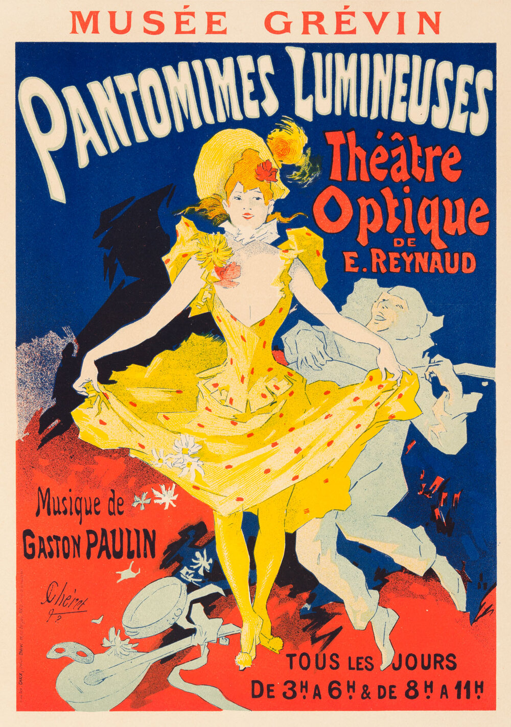
The influence of art nouveau did not only comes from ukiyo art but also camera.
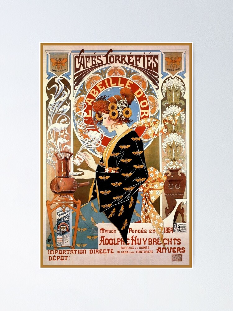
Alphonse Mucha
Mucha的名字作为一种style就很有名了…都不知道归为art nouveau(?).

Mucha’s style: The elongated figure amid a mesmerizing field of decorative flat patterns, characterized by the presence of natural motifs and the leading roles of feminine figures are generally dressed in flowing, Neoclassical - looking robes with long hair.
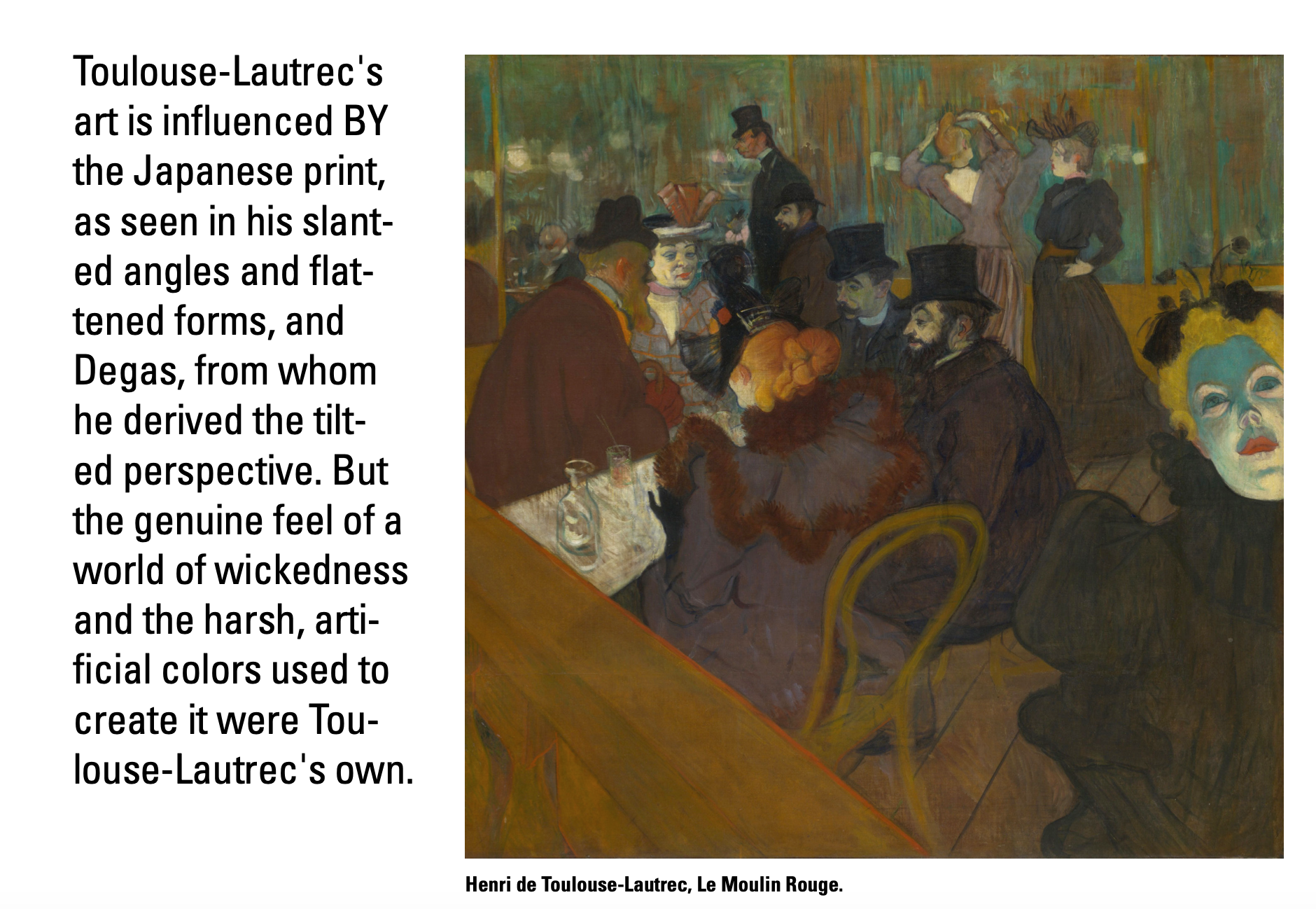
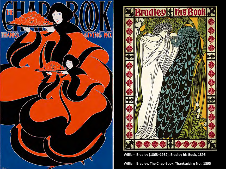
Henri de Toulouse-Lautrec
Highly linear, thin brushstrokes, and gives great emphasis to contour.
Often leave much of the board on which they are painted showing through.
这位大哥的风格差好大!
Eugene Grasset
American Art Nouveau.
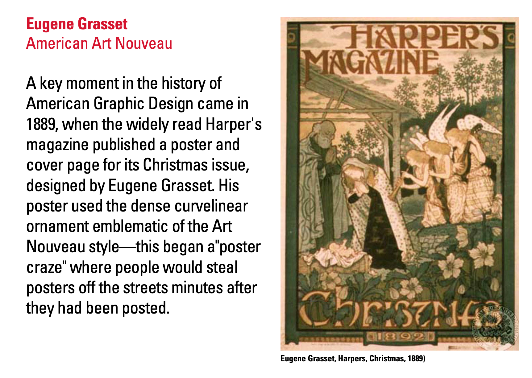
老师评价美国人的art nouveau更加uptight,不像法国人的比较快乐(?).

附一些写博客搜集图片单纯觉得很好看的!


The century guild
- Arthur Mackmurdo
- Aubrey Beardsley
Art nouveau not only in publication, but also architecture.

Symbolism become a feature of 19th century art work.
They did not accept John Ruskins utilitarian conception of art as being something moral or useful. Instead, they believe that art did not have a didactic purpose that it only need the beautiful.

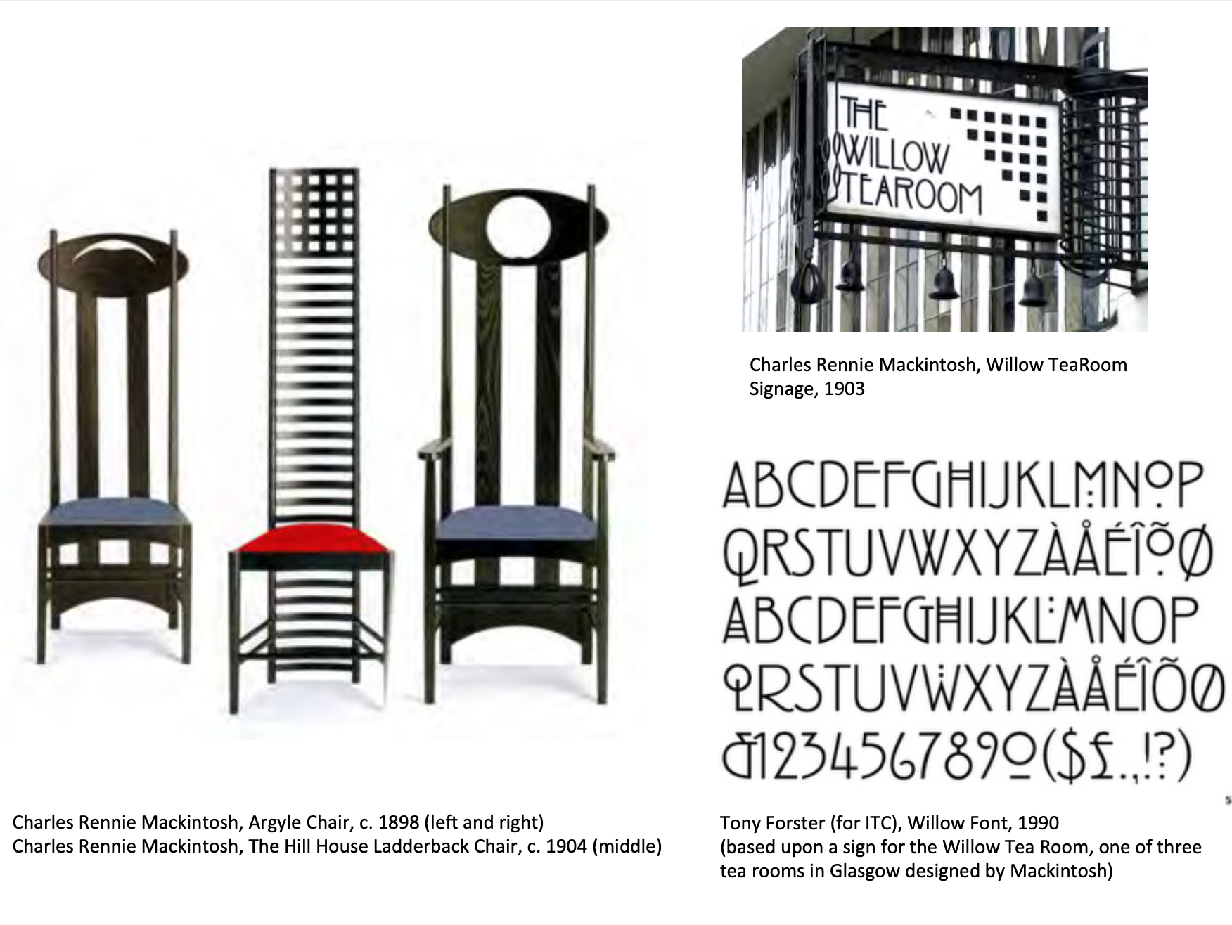
The four
Art nouveau movement in Scotland.
- Francis McDonald
- Margaret McDonald
- Herbert MacNair
- Charles Rennie Mackintosh

Art nouveau in US
- William Bradley
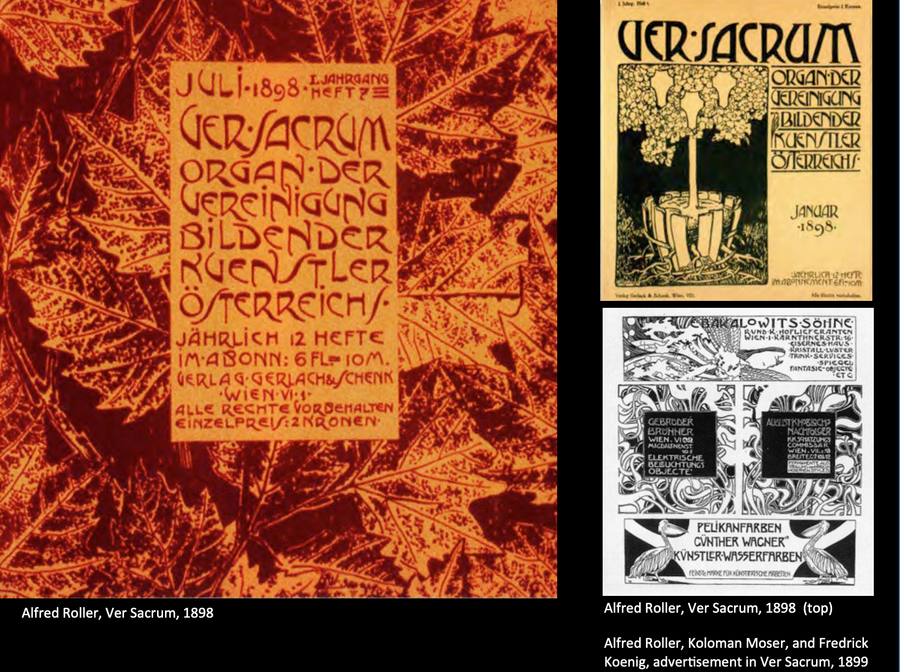
Vienna succession
The Wiener Werkstätte (engl.: Vienna Workshop), established in 1903 by the graphic designer and painter Koloman Moser, the architect Josef Hoffmann and the patron Fritz Waerndorfer, was a productive association in Vienna, Austria that brought together architects, artists, designers and artisans working in ceramics, fashion, silver, furniture and the graphic arts.
- Gustav Klimt

Quote: If you can not please all men by actions, and by art then please the few it is bad to please the many.
虽然老师放的例图很graphic design,但是这位是以金灿灿的图而闻名(?)的.
- Josef Olbrich
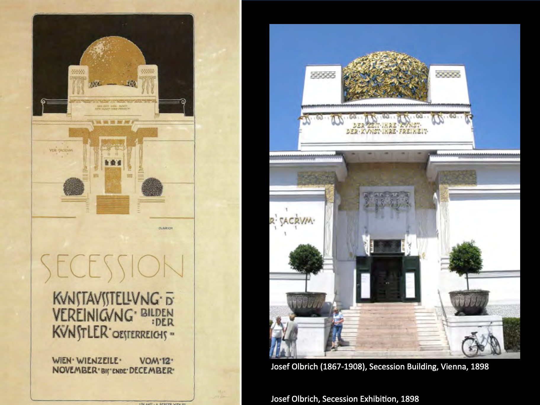
Quote: To every age its art and to art its freedom.
- Alfred Roller
- Koloman Moser
Tho they still influenced by the past but they are stepping out and doing their own things.
这种extraordinary and repetition pattern making风格渐渐move to Art Deco.
- Josef Hoffmann


Germany
- Henry van de Velde
- Joseph Saaler
- Oao Eckmann

- Fritz Erler
- Thomas Heine
- Peter Behrens

有趣的事情是这几位画家的时候,基本都是不单单是graphic designer,画家,家具设计,建筑设计等等,都是multi-medium人才.
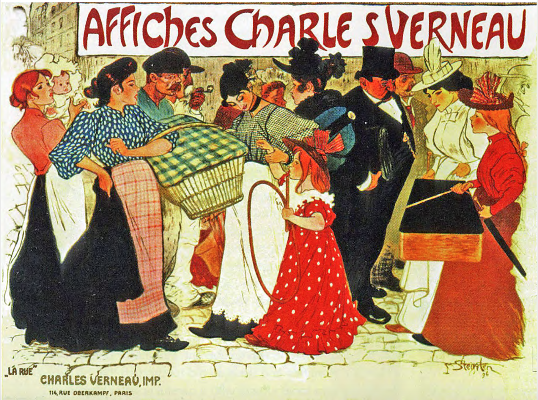
History of the Poster
Belle Epoque: The Art Poster 1880-1890s

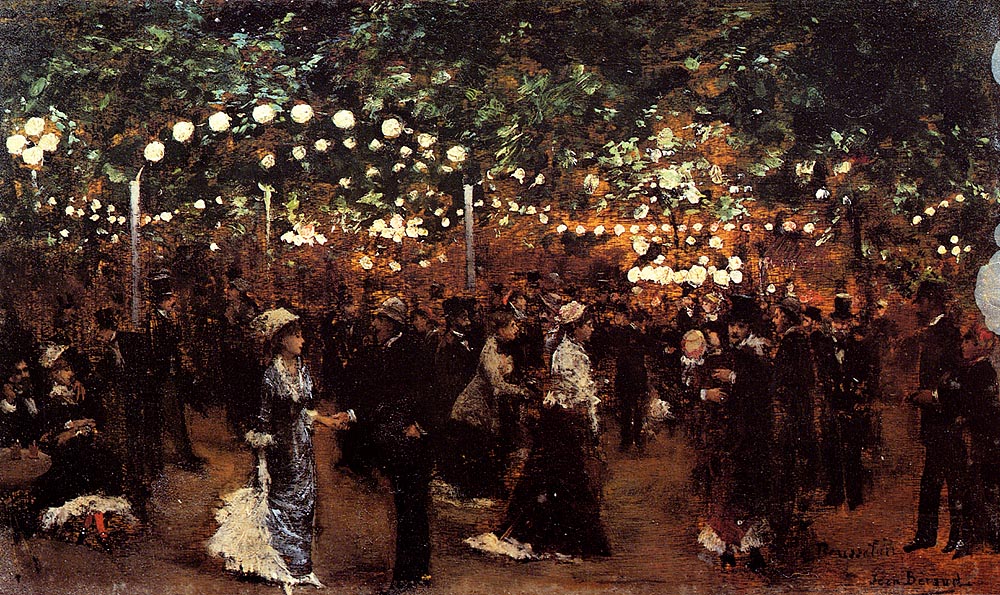
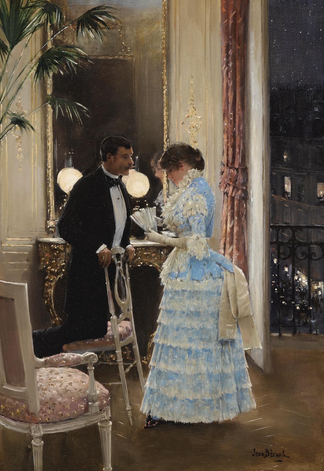
虽然这位画家画的真是好看但是这门课想讲的是…请看图中的海报!海报是很朴素的!
但是Jean Béraud的画真是好看我没忍住搜了几张.

Japanese Ukiyo-e Prints

Lack of respective, shadow, asymmetrical compositions with usually low diagonal access to the background, decorative pattern, flat contrast in colours.
然后我们又说回Jules Chéret, was called the father of the modern poster.
(甚至这些为广告而做的poster成为了popular collection!一己之力推动一个产业好牛逼!)
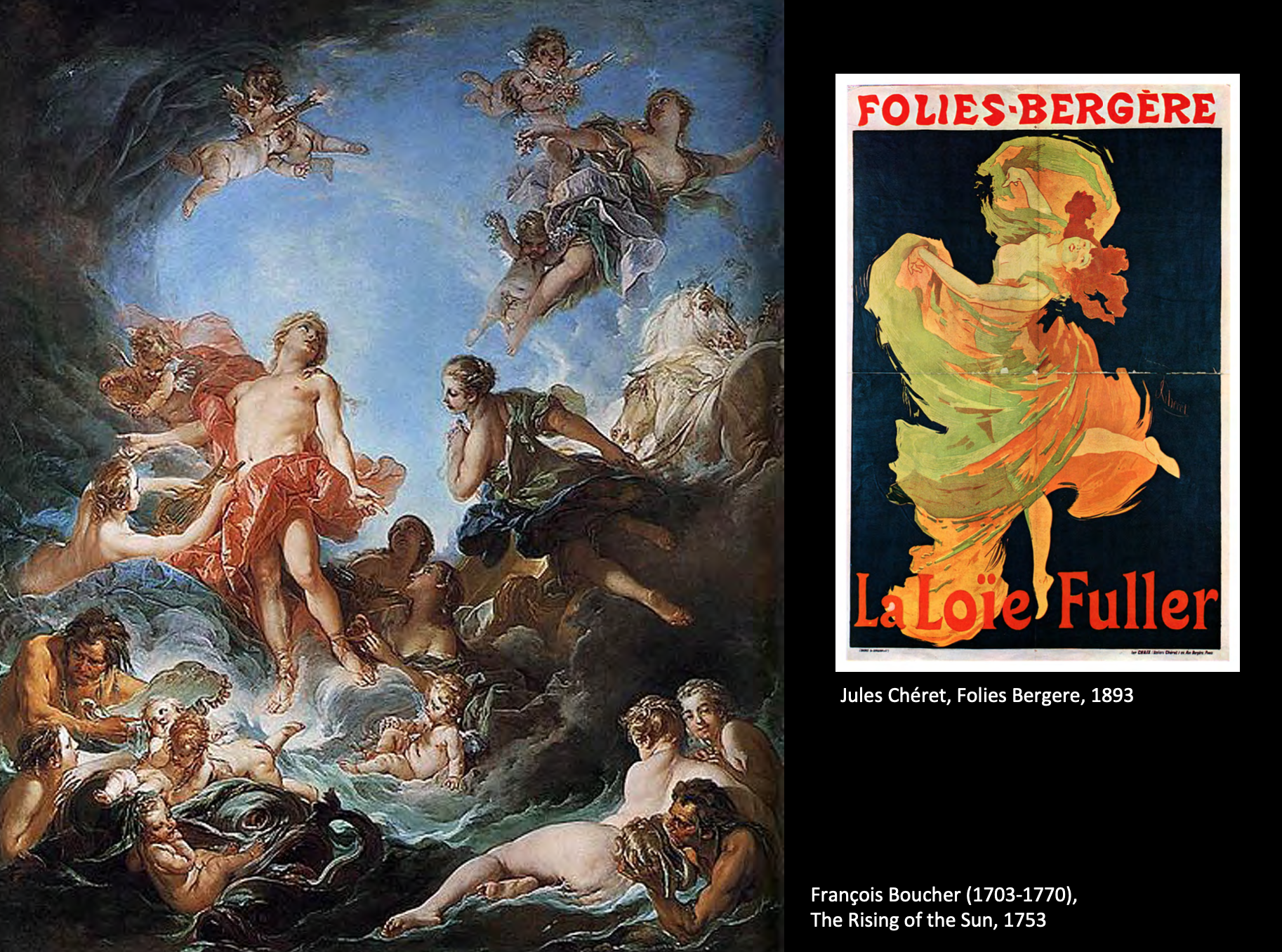
影响来源的左边是18th century French art rococo, frivolous, extremely detailed but also thematically pretty, flagrantly showing bodies.
很有意思的是这位画家给他的读者subscription,每个月(做了60个月)读者会邮件收到97位parisian artist的最棒的作品.(一种合志贩卖)
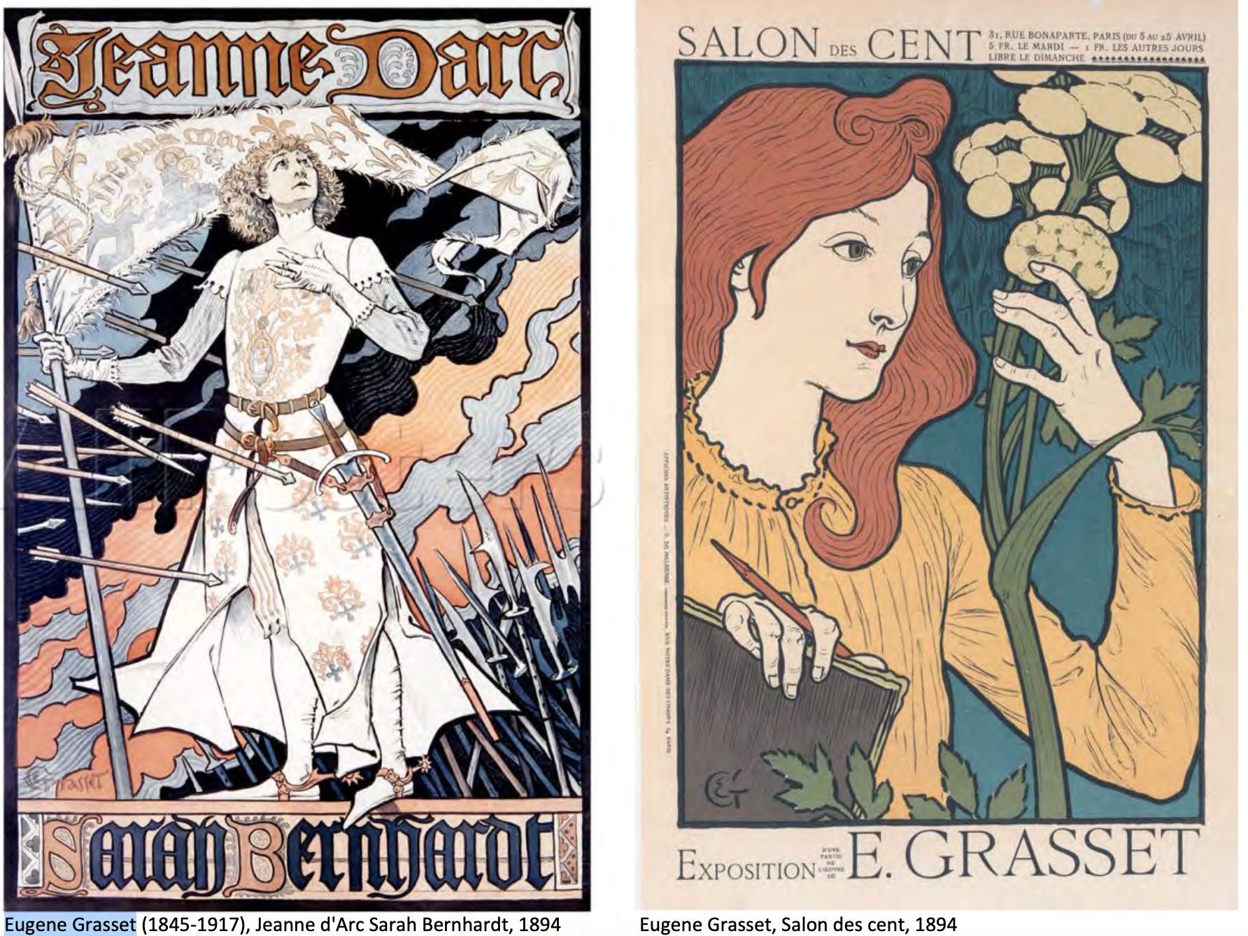
Eugene Grasset, his creation are considered to be the cornerstone of the Art nouveau motifs and patterns.

又回到Mucha.
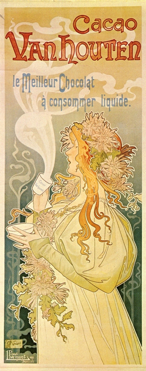
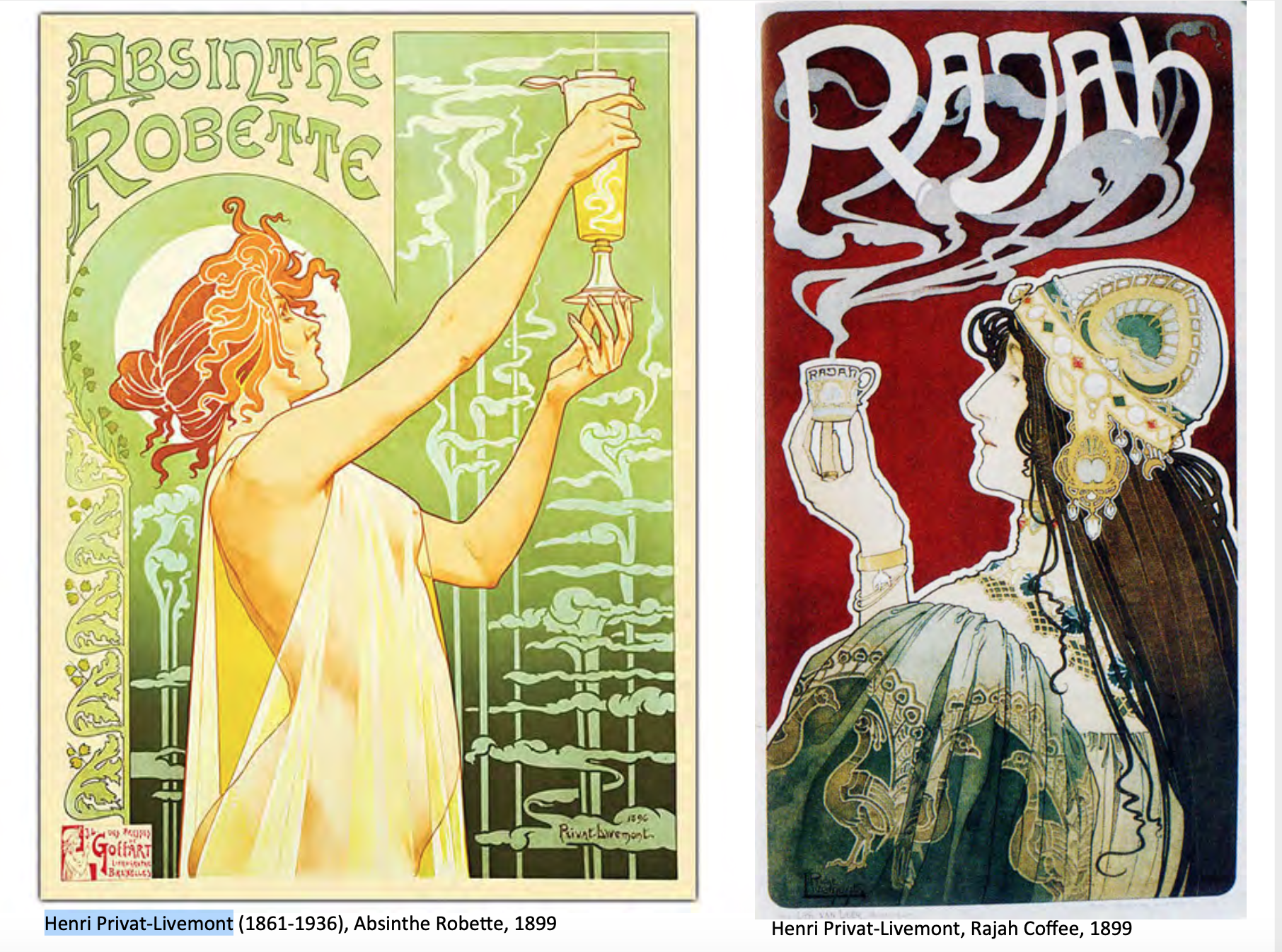
和一样victorian romanticism的Henri Privat-Livemont.
Théophile Steinlen, believes that design and art could have a bigger impact on society than simple beautification.
这位很有名的poster是只黑猫…但我个人不是很喜欢那张,为什么这么有名??(..)
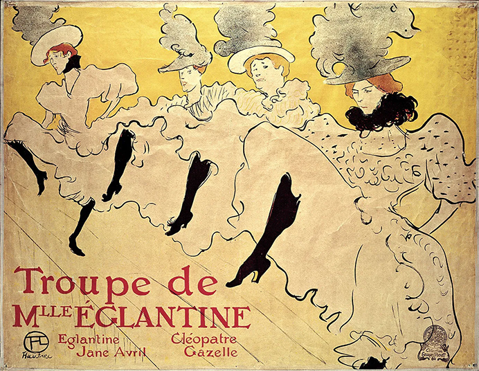
又回到Henri de Toulouse-Lautrec.这位大哥真是很有想法的大哥…
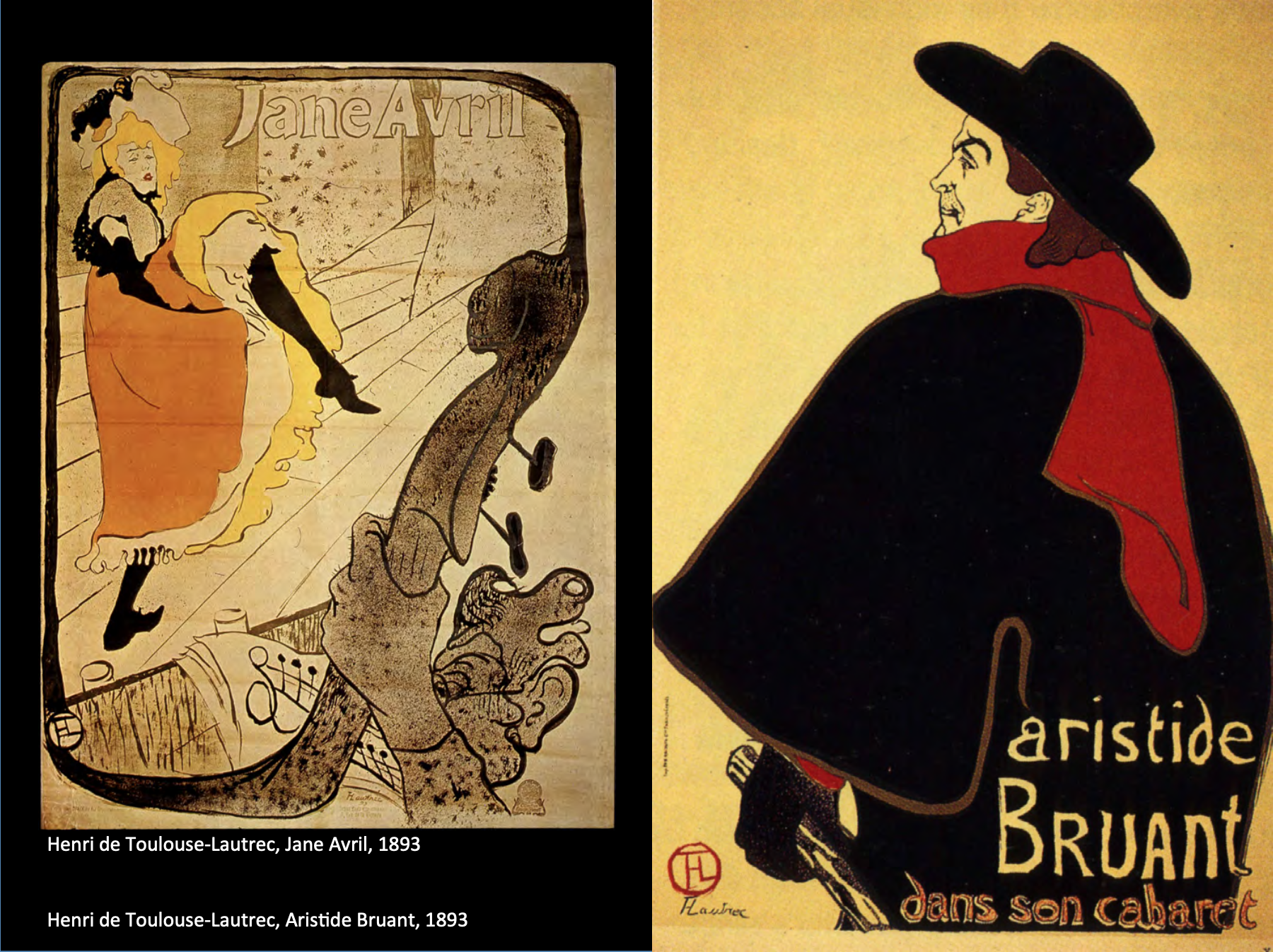
(左)Lautrec painted the poster that elevated her(French cancan dancer) stature in the entire entertainment world and this is really quite special to see how an artist depicting something as simple as a poster could actually influence that figures prominence in the world.
这张在最初的负形里就很喜欢.
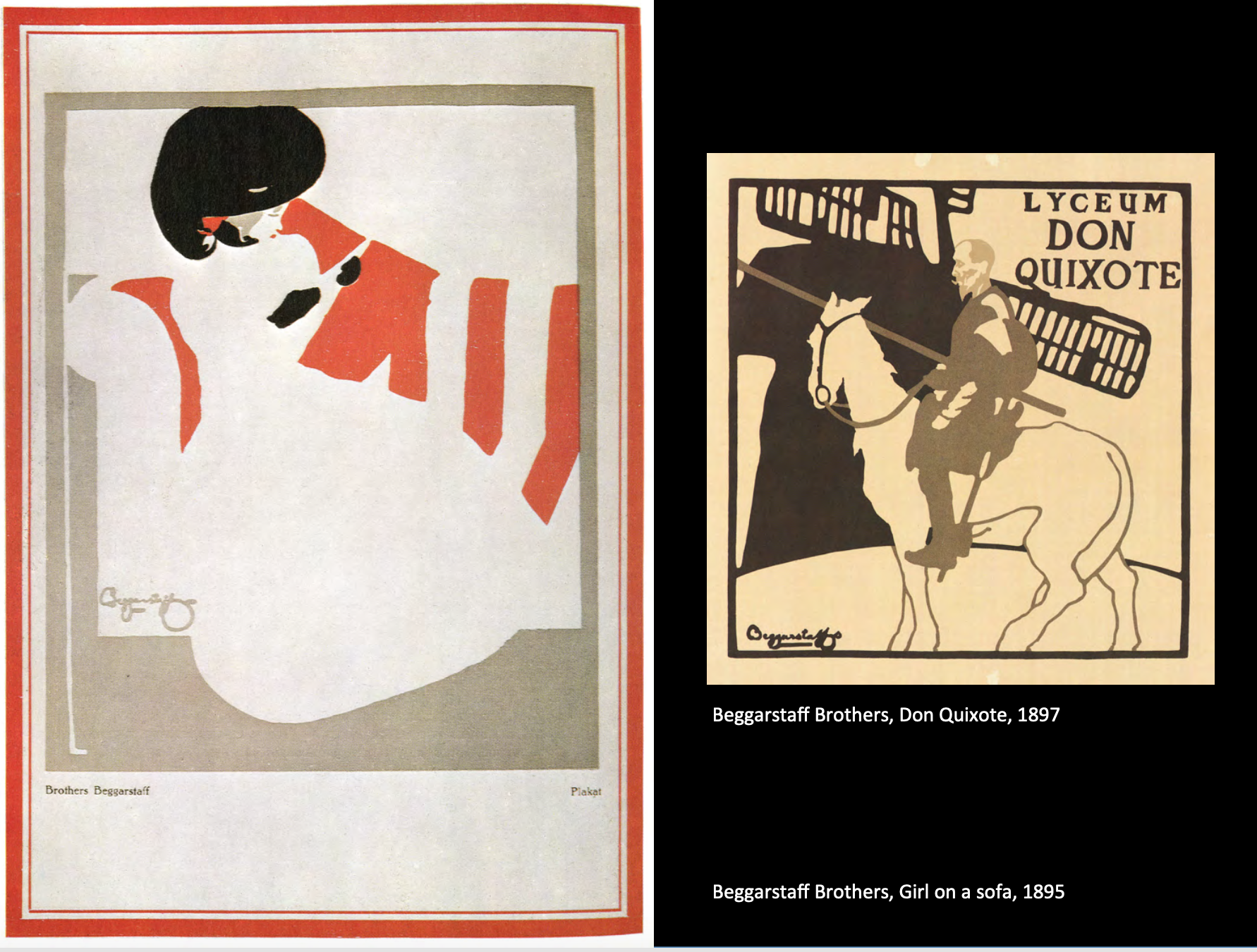
Beggarstaff Brothers是一对brother in law British artists William Nicholson and James Pryde.
They ignore a lot of art nouveau influence but were artistic success however financial disaster(…).
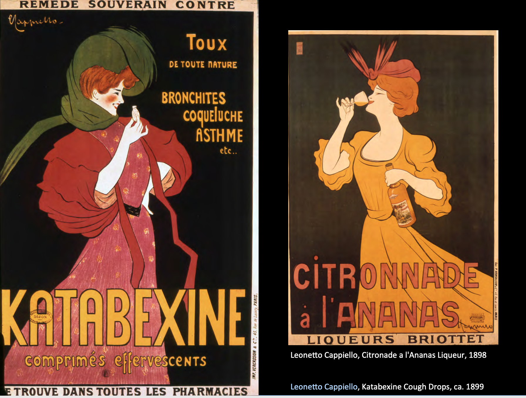
Leonetto Cappiello.
Was the first poster artist used those big bold figures and popping out of the black background, a huge startling contrast to the earlier posters that we seen.
Plakatstil
Poster style in Germany.
非常的精简且使用负形.

Avoiding any sort of flair, any allegorical figures, what you see is what you get.
- Lucian Bernhard
- Rudi Hans Erdt
- Ludwig Hohlwein
Disconnect facility.
WW1 Propaganda Posters

Interpolation is the process by which advertisement actually beckons your summon. Just use the word hue, and in this case kind of pointing directly to the audiences.
This can be very effective when it comes to propaganda. Basically conventional realistic styles dominate most forms of communication during the war at this point.
(甚至会不被当作art,因为不够有趣…功能性比较强吧!)
甚至还有心理战的Psychological posters.
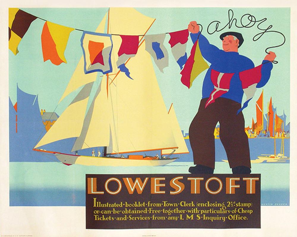
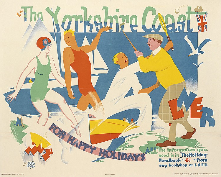
Posters in the 1920s
英国.Abstract, more expressing feelings.
(Right) Using colour and symbolism to communicate the idea of temperature.
- Maxwell Armfield
- Austin Cooper
这两个人的颜色都很有意思…收了点图片.顺便一提armfield也是个画家,cooper做的poster更多.
伦敦地铁的海报为什么这么好看…


这张简洁高效的圣诞树真的很喜欢!紫粉的配色也太好看!

我们讲到另一位也给伦敦地铁画海报的画家.
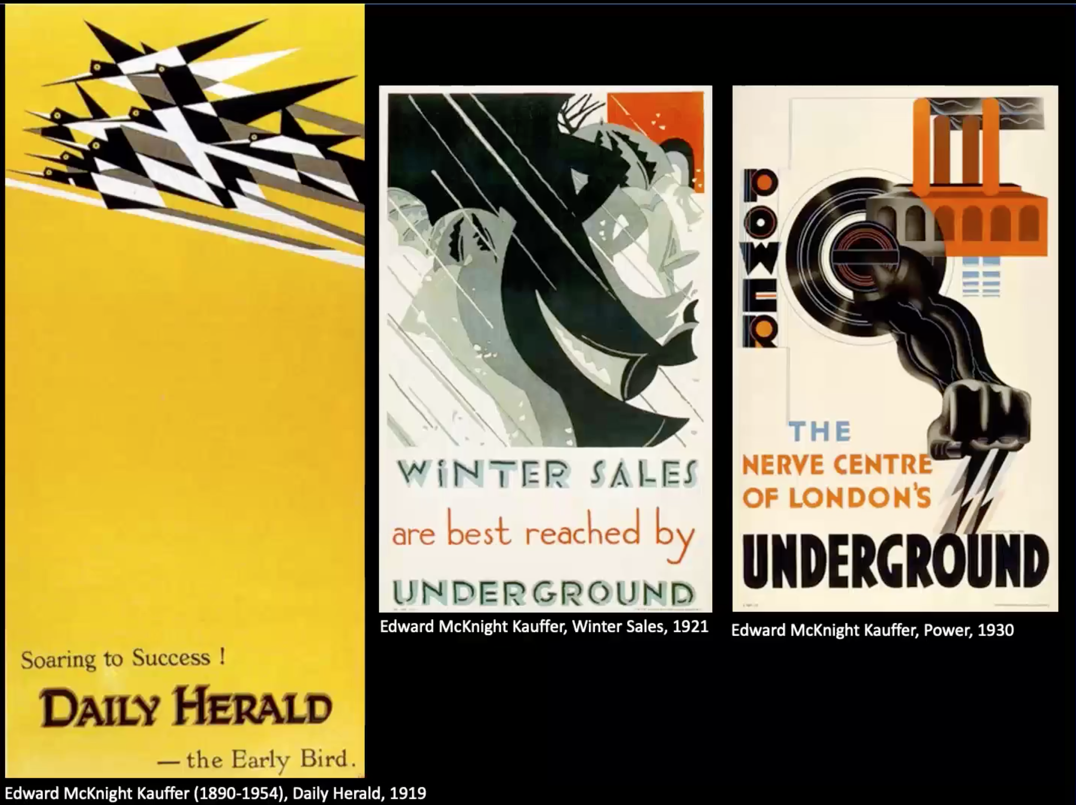
- Edward McKnight Kauffer
法国.

- A.M. Cassandre
老师说使用cubism和futurism,倾向于art deco.俺感觉cassandre特别会构图.
Cassandre quote:
I’m designing poster means solving a technical and commercial problem which has nothing to do with the artists own unique sensitivity.
It means communicating with masses in the language that can be instant understood by a common man.
A language comparable to that of medieval illustrators.
The Greek Potters the fresco artists of Egypt. It means the telling the crowd a story.
老师评价说虽然我们觉得cassandre有art deco的style,但他自己不觉得自己有style,很有意思.

德国.Strong use of angles (45 degree) can create visual interest but more tension.
Influenced by bauhaus.


- Stenberg Brothers
到Ukraine. Vertical, rule of the third.
兄弟这有点旧未来风的恐怖.
Posters in the 1930s
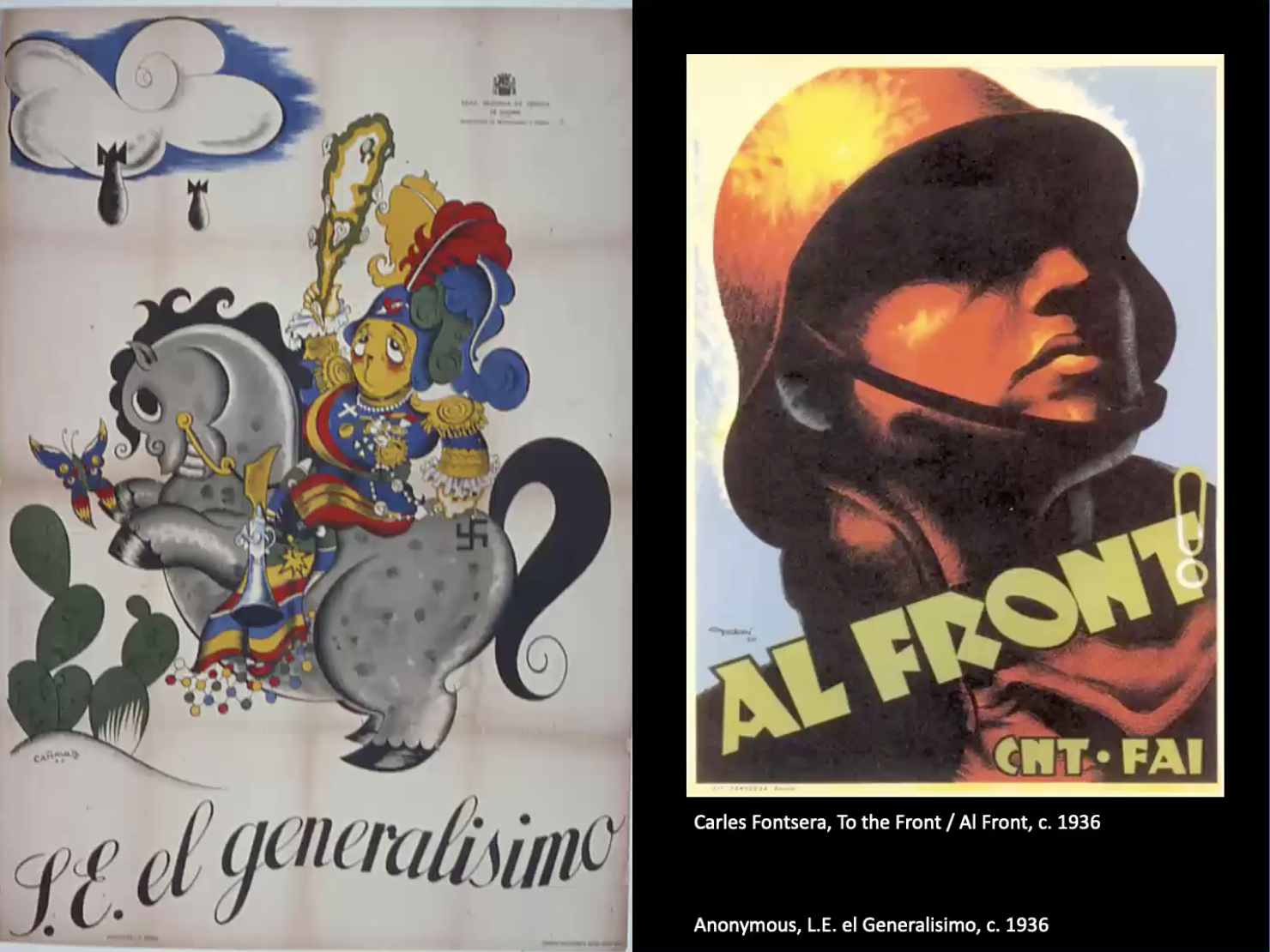
Spain.这时候的美术跟spain civil war(1936-1939)很大关系.
关于war poster, poster plays a role in communicating essential messages, including from recruitment, moral support, dehumanizing the opposition…
carles fontsere的poster我可以一秒幻视苏联(不是.
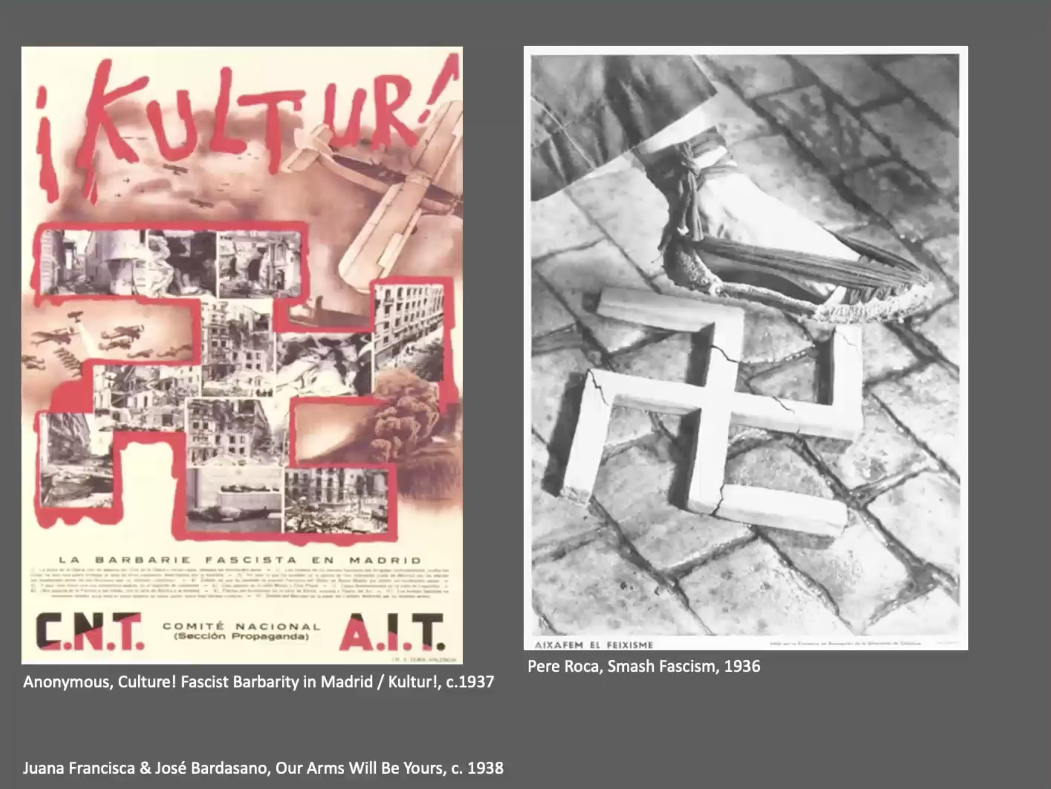
German.主题是男人去打仗,女人留在工厂.
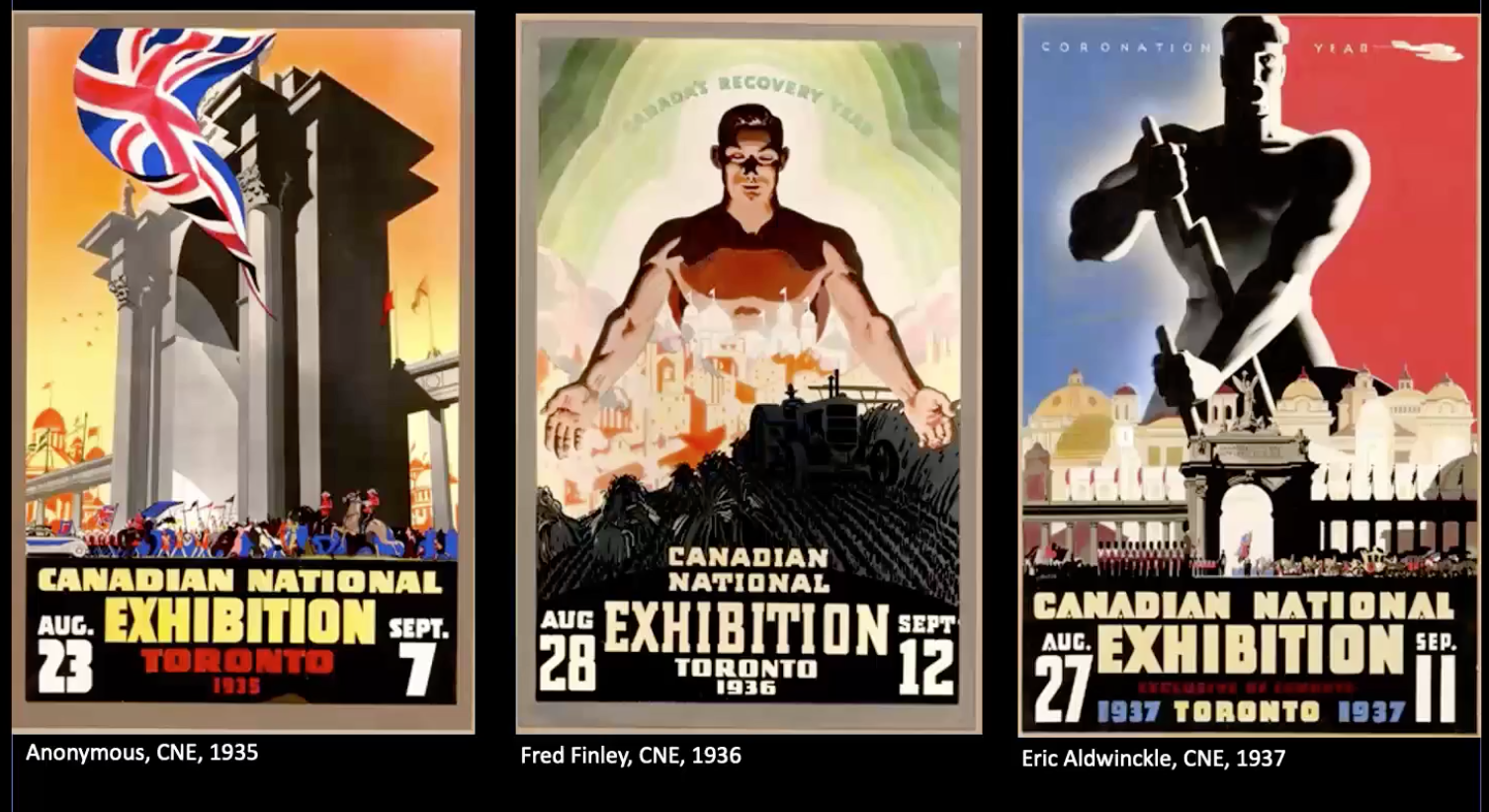
Canadian, exhibition theme.
Huge figure is dominating and the point of view is interesting that always looking up to them.

- Herbert Matter
Matter pioneered photomontage techniques. 不就是一种photoshop大师.
Use diagonals to communicate dynamic activity, the use of texture of unify all of the elements together, use the graphic elements to tie and link elements together. Use of the airbrush to soften and bring focus to specific elements.
The use of transparency was something new.
(不过这是用胶片在不同的化学物质中做出的颜色效果,牛逼.)

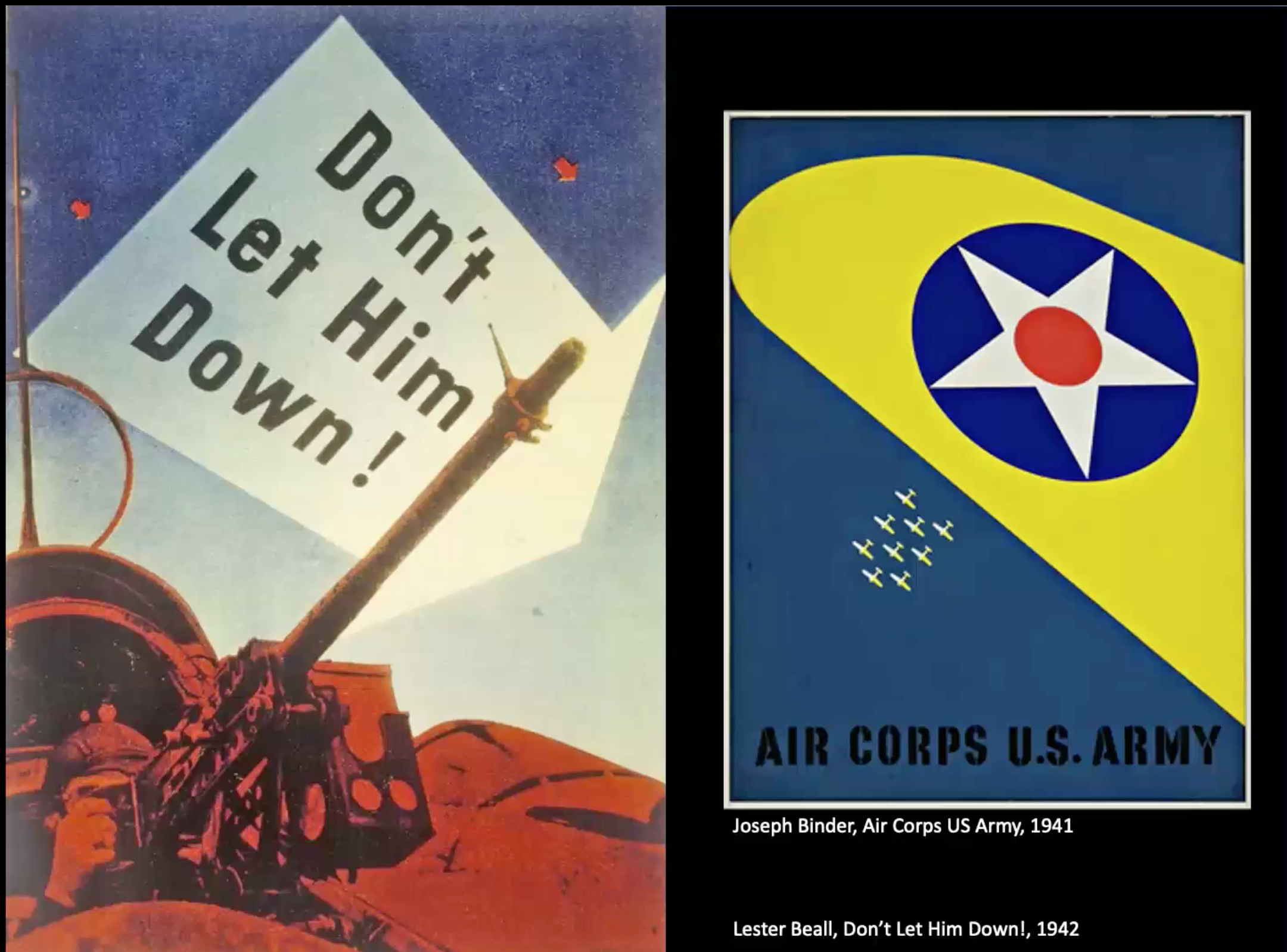
- Lester Beall
Notable as a leading proponent of modernist graphic design in US.
我感觉他的海报十分的精简…节能型设计(?).
老师:因为1930年代(美国)很多人并没有接受教育,并不是所有人都有阅读的能力.
World War Two Propaganda Posters
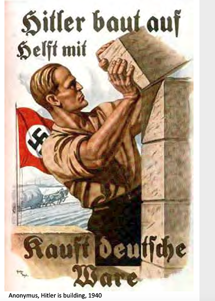
前情提要之之后希特勒把blackletter在德国取缔了.
很有那个味…
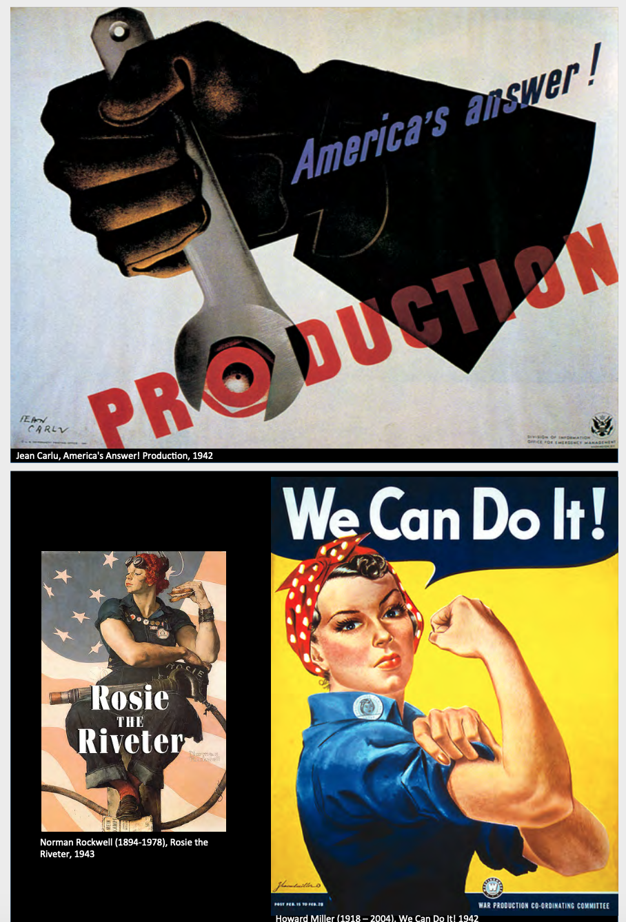
有趣的是战争主题的poster中女性是共同的主题之一,包括中国最有名的毛时代“妇女能顶半边天”言论.
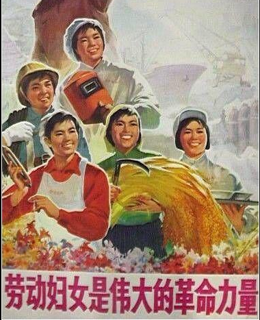
但就说中国在毛时代后女性权益并没有好起来.
所以像这是战争限定的,需要人力而说服的言论,并不是真正的女权.
但说来很是矛盾的.
如果要培养大学学生的思想与能力,那么会自然而然的学习思辨.
思辨是一种能力,跟思考的内容无关,所以思考政治是必然的事情,而极权政府想避讳,那必然会导致思辨的抑制亦或是矛盾.
而女性能力与自主意识的发展也是一种能力,与时代需求无关.
如果要持续父系社会,那女性的能力也是一种矛盾.
不过我觉得思想自由也好,女性权利也好…是一种时代的必然…只是达成会经历很多很多的痛苦,也是一种时代的必然(?).
扯远了.

这时候政府印了很多poster因为是便宜的宣传手段.
Posters in the 1950s
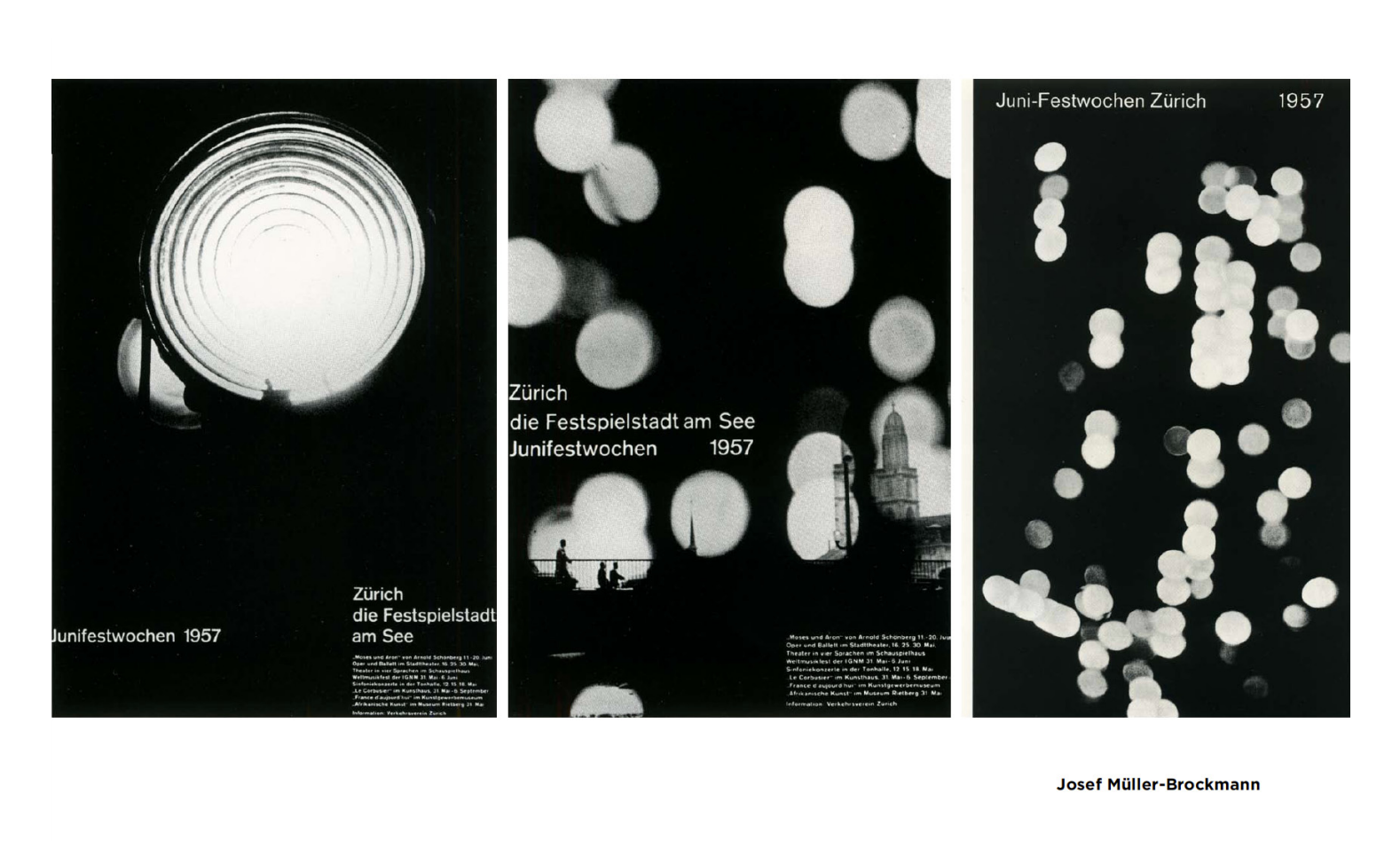
回到我们的构图大师Josef Muller-Brockmann.
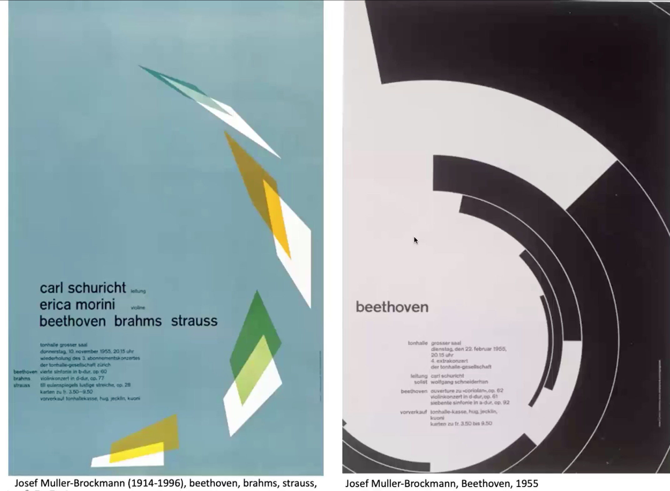
Famous for use of grid (grid for page structure).
然后老师讲到了毛时代的美术(就很草!连讲三页中国特色海报!).
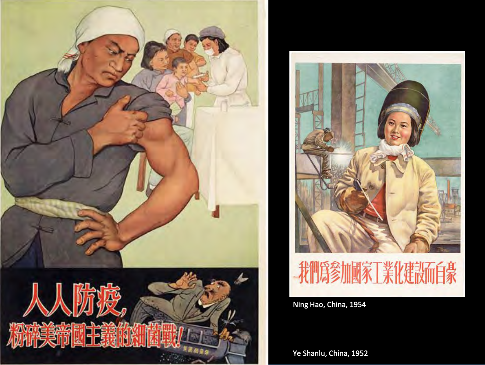
Unity of politics and art, highest possible perfection.
Correct in political viewpoint but lacking in artistic power.
Quote: On questions of literature and art, we must carry on a struggle on two fronts.
老师的评价是人们用同一种art style protesting的确有点意思.
但那个时代有些海报我觉得还有点好看的…一种水粉感的赛璐璐上色.但的确叙事的作用更大一些.
Posters in the 1960s

- Wes Wilson
的字体感觉很现代了.
- Victor Moscoso
的颜色好蒸汽波…
老师:这时候在进行counterculter movement (sex drug alcohol jk).
我个人还觉得这样的海报挺有意思的.
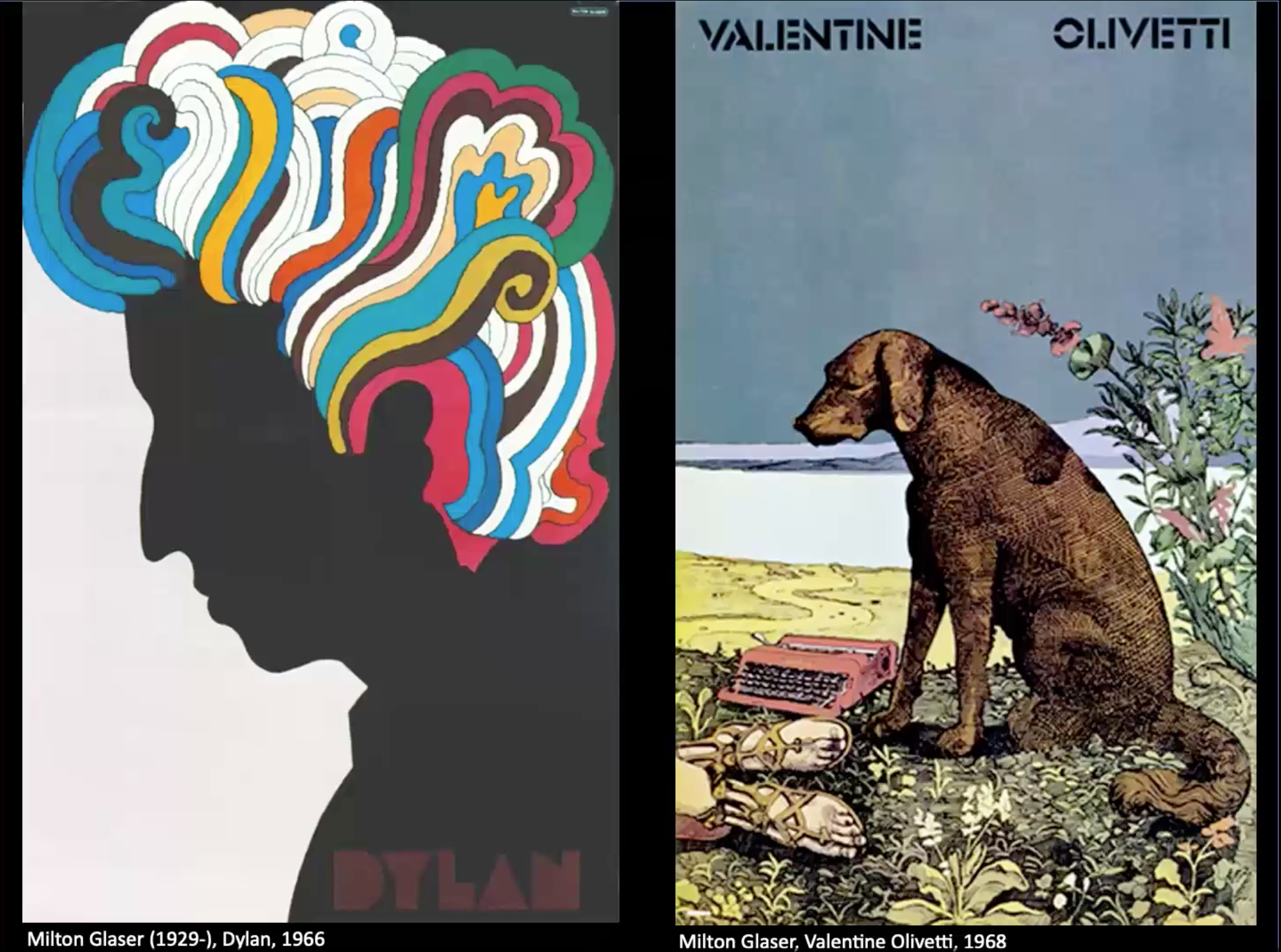
- Milton Glaser
Classical persian miniature painting + collage self portrait.
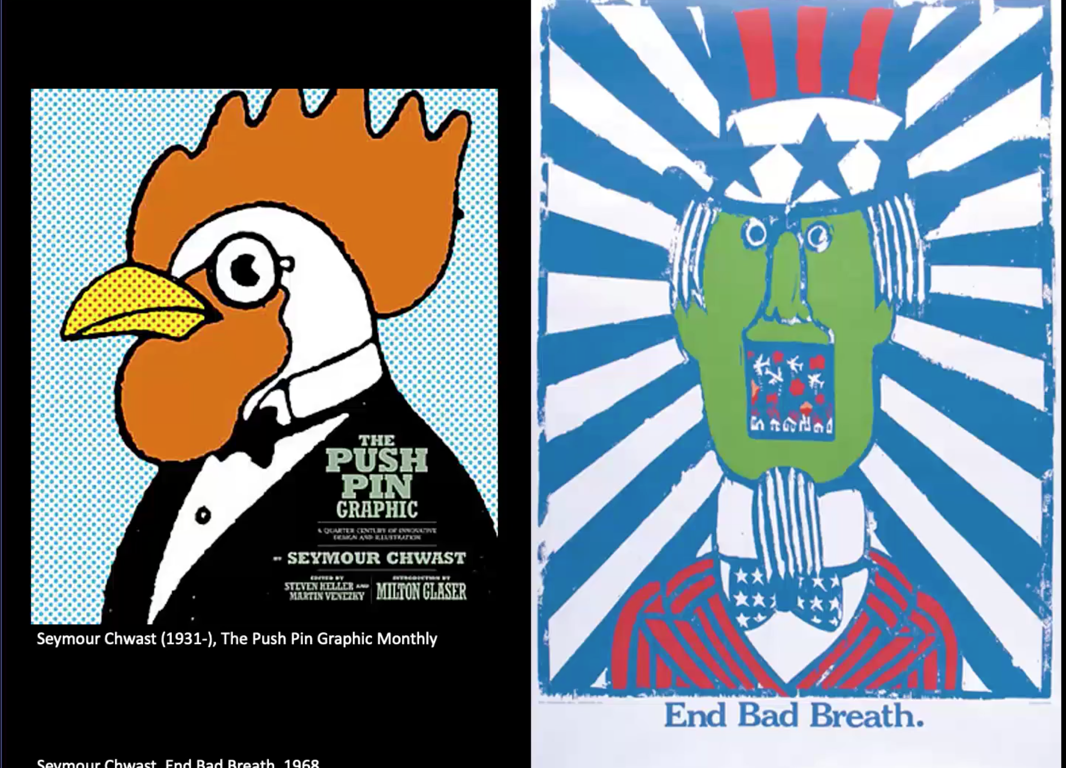
- Seymour Chwast
又是另一个风格了…这种很早期的波点漫画很有意思.
Strategies that Chwast and did to embrace style such as collective Victorian, to cause ppl to look at them in new light.
Posters in the 1960-90
Polish Politcal Posters.
因为太怪了没有带图,有一点抽象恐怖片的现代艺术感.
Posters in the 21st Century
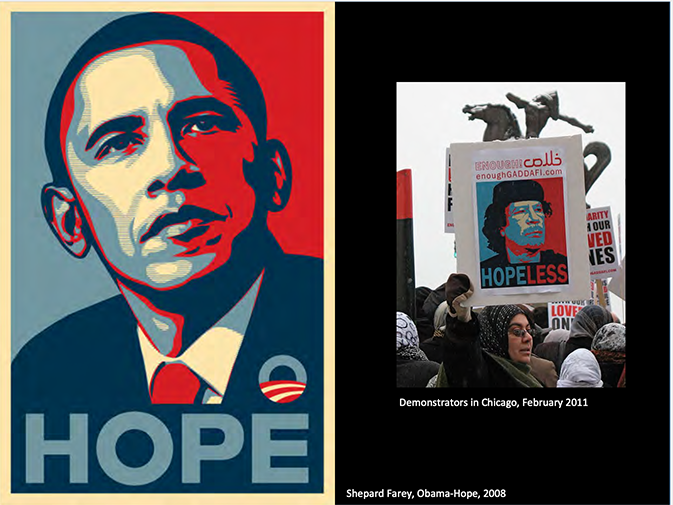
Mixed media stenciled protrait.
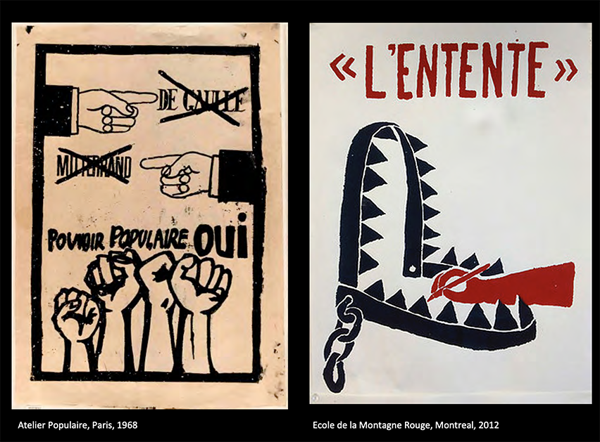
最后老师选了这张学生制作的海报(右),influenced by 左.
有意思的是老师将这些海报称之为weapon.
Consider them as objects aesthetic interest, is to impair both their function and their effect.
That is why these work should not be taken as the final outcome of an experience, but as an inducement for finding through contact with the masses, new levels of action.
Ref notes
最后是一些附加阅读.
Ellen Lupton Graphic Design The New Basics.
The 7 TED Talks every designer should watch.
There are some experimental tools that deal with Accessible colour – meaning the preservation of colour contrasts that accommodate specific forms of colour vision – as they are on screen, a transmissive media, I wonder about the accuracy of these, HOWEVER, they are worth bringing forward as issues you may, in fact, have to deal with in, say, a second year interaction studio, or maybe even sooner in Typography.
The Five Hat Racks - (A Motion Graphics from The Universial Principles of Design).
插入一位画家的主页.