Exploratory analysis is done when you are searching for insights. These visualizations don’t need to be perfect. You are using plots to find insights, but they don’t need to be aesthetically appealing. You are the consumer of these plots, and you need to be able to find the answer to your questions from these plots.
Explanatory analysis is done when you are providing your results for others. These visualizations need to provide you the emphasis necessary to convey your message. They should be accurate, insightful, and visually appealing.
process分为五部.
Extract - Obtain the data from a spreadsheet, SQL, the web, etc.
Clean - Here we could use exploratory visuals.
Explore - Here we use exploratory visuals.
Analyze - Here we might use either exploratory or explanatory visuals.
Share - Here is where explanatory visuals live.
viualization
design: colour(less colour) & area & shape & size.
chart jurk: whether to display or not on the chart.注重每个ink使用比例都要高效.
accurate: lie factor(misleading or not).
lie factor=ΔdatadatastartΔvisual/visualstart
Aside: To be sensitive to those with colorblindness, you should use color palettes that do not move from red to green without using another element to distinguish this change like shape, position, or lightness. Both of these colors appear in a yellow tint to individuals with the most common types of colorblindness. Instead, use colors on a blue to orange palette.
Aside:Extra: Code Some of the plots in this presentation were created using the programming language R, and a very popular library known as ggplot2. Though this is beyond the scope of this course, the code used to create these visualizations is provided below:
df = read.csv(file.choose())#select your dataset df2 = head(df,30)
qplot(df2$Math.SAT, df2$Verbal.SAT, xlab ='Math SAT Score', ylab ='Verbal SAT Score', main ='Average SAT Scores By College')
qplot(df2$Math.SAT, df2$Verbal.SAT, xlab ='Math SAT Score', ylab ='Verbal SAT Score', main ='Average SAT Scores By College', color = as.factor(df2$Public..1...Private..2.))
qplot(df2$Math.SAT, df2$Verbal.SAT, xlab ='Math SAT Score', ylab ='Verbal SAT Score', main ='Average SAT Scores By College', shape = as.factor(df2$Public..1...Private..2.), color = df2$stud..fac..ratio)
# Necessary imports import numpy as np import pandas as pd import matplotlib.pyplot as plt import seaborn as sb %matplotlib inline
# Read the csv file, and check its top 10 rows pokemon = pd.read_csv('pokemon.csv')
# A semicolon (;) at the end of the statement will supress printing the plotting information sb.countplot(data=pokemon, x='generation_id');
更改颜色.
1 2 3 4 5 6 7
# The `color_palette()` returns the the current / default palette as a list of RGB tuples. # Each tuple consists of three digits specifying the red, green, and blue channel values to specify a color. # Choose the first tuple of RGB colors base_color = sb.color_palette()[0] # color_palette里有很多的颜色
# Use the `color` argument sb.countplot(data=pokemon, x='generation_id', color=base_color);
1 2 3 4 5 6 7 8 9 10 11 12 13 14
# Return the Series having unique values x = pokemon['generation_id'].unique()
# Return the Series having frequency count of each unique value y = pokemon['generation_id'].value_counts(sort=False)
plt.bar(x, y)
# Labeling the axes plt.xlabel('generation_id') plt.ylabel('count')
matplotlib.pyplot.bar(x, y, width=0.8, bottom=None, * , align='center', data=None)
1 2 3 4 5 6 7 8 9 10 11 12 13 14
# Return the Series having unique values x = pokemon['generation_id'].unique()
# Return the Series having frequency count of each unique value y = pokemon['generation_id'].value_counts(sort=False)
plt.bar(x, y)
# Labeling the axes plt.xlabel('generation_id') plt.ylabel('count')
# Dsiplay the plot plt.show()
更改顺序.
1
2
3
4
5
6
7
8
9
10
11
12
13
14
# Static-ordering the bars sb.countplot(data=pokemon, x='generation_id', color=base_color, order=[5,1,3,4,2,7,6]); # 可以手动输入index_order
# Dynamic-ordering the bars # The order of the display of the bars can be computed with the following logic. # Count the frequency of each unique value in the 'generation_id' column, and sort it in descending order # Returns a Series freq = pokemon['generation_id'].value_counts() # 也可以用value_counts找到顺序后带入
# Get the indexes of the Series gen_order = freq.index
# Plot the bar chart in the decreasing order of the frequency of the `generation_id` sb.countplot(data=pokemon, x='generation_id', color=base_color, order=gen_order);
Rotate the category labels (not axes)
1 2 3 4 5
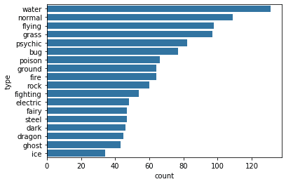
# Plot the Pokemon type on a Vertical bar chart sb.countplot(data=pokemon, x='type_1', color=base_color);
# Use xticks to rotate the category labels (not axes) counter-clockwise plt.xticks(rotation=90)
Rotate the axes clockwise
1 2 3
# Plot the Pokemon type on a Horizontal bar chart type_order = pokemon['type_1'].value_counts().index sb.countplot(data=pokemon, y='type_1', color=base_color, order=type_order);
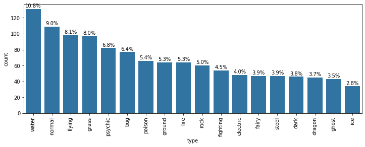
absolute(数值多少本身) vs relative(proportion也就是按category只显示占比) frequency. seaborn countplot默认absolute.
Data Wrangling Step We will use the pandas.DataFrame.melt() method to unpivot a DataFrame from wide to long format, optionally leaving identifiers set. The syntax is:
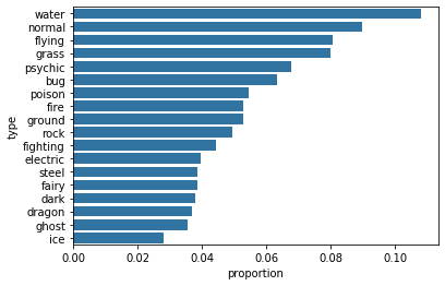
Find the frequency of unique values in the type column,也就是我们之后用于做relative frequency的数据.
1 2 3 4 5 6
# Count the frequency of unique values in the `type` column of pkmn_types dataframe. # By default, returns the decreasing order of the frequency. type_counts = pkmn_types['type'].value_counts()
# Get the unique values of the `type` column, in the decreasing order of the frequency. type_order = type_counts.index
Plot a bar chart having the proportions, instead of the actual count, on one of the axes. Find the maximum proportion of bar
1 2 3 4 5 6 7 8 9 10
# Returns the sum of all not-null values in `type` column n_pokemon = pkmn_types['type'].value_counts().sum()
# Return the highest frequency in the `type` column max_type_count = type_counts[0]
# Return the maximum proportion, or in other words, # compute the length of the longest bar in terms of the proportion max_prop = max_type_count / n_pokemon print(max_prop)
Create an array of evenly spaced proportioned values
1 2 3
# Use numpy.arange() function to produce a set of evenly spaced proportioned values # between 0 and max_prop, with a step size 2\% tick_props = np.arange(0, max_prop, 0.02)
We need x-tick labels that must be evenly spaced on the x-axis. For this purpose, we must have a list of labels ready with us, before using it with plt.xticks() function.
Create a list of String values that can be used as tick labels.
1 2 3 4 5 6
# Use a list comprehension to create tick_names that we will apply to the tick labels. # Pick each element `v` from the `tick_props`, and convert it into a formatted string. # `{:0.2f}` denotes that before formatting, we 2 digits of precision and `f` is used to represent floating point number. # Refer [here](https://docs.python.org/2/library/string.html#format-string-syntax) for more details tick_names = ['{:0.2f}'.format(v) for v in tick_props] tick_names
The xticks and yticks functions aren’t only about rotating the tick labels. You can also get and set their locations and labels as well. The first argument takes the tick locations: in this case, the tick proportions multiplied back to be on the scale of counts. The second argument takes the tick names: in this case, the tick proportions formatted as strings to two decimal places.
I’ve also added a ylabel call to make it clear that we’re no longer working with straight counts.
Plot the bar chart, with new x-tick labels (计算每个数值按proportion所需要的长度,并plot)
1 2 3 4
sb.countplot(data=pkmn_types, y='type', color=base_color, order=type_order); # Change the tick locations and labels plt.xticks(tick_props * n_pokemon, tick_names) plt.xlabel('proportion');
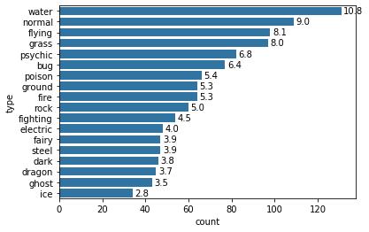
Print the text (proportion) on the bars of a horizontal plot.加上text标注.
1
2
3
4
5
6
7
8
9
10
11
12
13
14
# Considering the same chart from the Example 1 above, print the text (proportion) on the bars base_color = sb.color_palette()[0] sb.countplot(data=pkmn_types, y='type', color=base_color, order=type_order);
# Logic to print the proportion text on the bars for i inrange (type_counts.shape[0]): # Remember, type_counts contains the frequency of unique values in the `type` column in decreasing order. count = type_counts[i] # Convert count into a percentage, and then into string pct_string = '{:0.1f}'.format(100*count/n_pokemon) # Print the string value on the bar. # Read more about the arguments of text() function [here](https://matplotlib.org/3.1.1/api/_as_gen/matplotlib.pyplot.text.html) plt.text(count+1, i, pct_string, va='center')
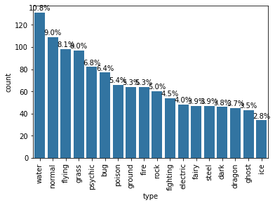
Print the text (proportion) below the bars of a Vertical plot.
# .get_text() method to obtain the category name. # text function to print each percentage, with the x-position, y-position, and string as the three main parameters to the function.
# Considering the same chart from the Example 1 above, print the text (proportion) BELOW the bars base_color = sb.color_palette()[0] sb.countplot(data=pkmn_types, x='type', color=base_color, order=type_order);
# Recalculating the type_counts just to have clarity. type_counts = pkmn_types['type'].value_counts()
# get the current tick locations and labels locs, labels = plt.xticks(rotation=90)
# loop through each pair of locations and labels for loc, label inzip(locs, labels):
# get the text property for the label to get the correct count count = type_counts[label.get_text()] pct_string = '{:0.1f}%'.format(100*count/n_pokemon)
# print the annotation just below the top of the bar plt.text(loc, count+2, pct_string, ha = 'center', color = 'black')
用matplotlib的场合.
1 2 3
from matplotlib import rcParams # Specify the figure size in inches, for both X, and Y axes rcParams['figure.figsize'] = 12,4
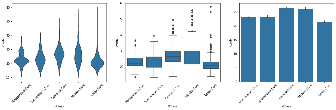
Adapted Bar Charts using barplot function, plot a numeric variable against a categorical variable by adapting a bar chart so that its bar heights indicate the mean of the numeric variable.
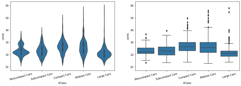
# left plot: violin plot plt.subplot(1, 3, 1) sb.violinplot(data=fuel_econ, x='VClass', y='comb', inner = None, color = base_color) plt.xticks(rotation = 45); # include label rotation due to small subplot size
# center plot: box plot plt.subplot(1, 3, 2) sb.boxplot(data=fuel_econ, x='VClass', y='comb', color = base_color) plt.xticks(rotation = 45);
# right plot: adapted bar chart plt.subplot(1, 3, 3) sb.barplot(data=fuel_econ, x='VClass', y='comb', color = base_color) plt.xticks(rotation = 45);
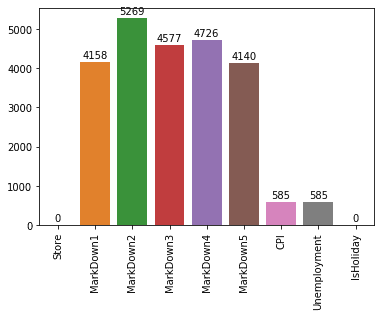
# Let's drop the column that do not have any NaN/None values na_counts = sales_data.drop(['Date', 'Temperature', 'Fuel_Price'], axis=1).isna().sum()
Plot the bar chart from the NaN tabular data, and also print values on each bar
1 2 3 4 5 6 7 8 9 10 11 12 13
# The first argument to the function below contains the x-values (column names), the second argument the y-values (our counts). # Refer to the syntax and more example here - https://seaborn.pydata.org/generated/seaborn.barplot.html sb.barplot(na_counts.index.values, na_counts)
# get the current tick locations and labels plt.xticks(rotation=90)
# Logic to print value on each bar for i inrange (na_counts.shape[0]): count = na_counts[i]
# Refer here for details of the text() - https://matplotlib.org/3.1.1/api/_as_gen/matplotlib.pyplot.text.html plt.text(i, count+300, count, ha = 'center', va='top')
pie charts
A pie chart is a common univariate plot type that is used to depict relative frequencies for levels of a categorical variable. A pie chart is preferably used when the number of categories is less, and you’d like to see the proportion of each category.
# We have the used option `Square`. # Though, you can use either one specified here - https://matplotlib.org/api/_as_gen/matplotlib.pyplot.axis.html?highlight=pyplot%20axis#matplotlib-pyplot-axis plt.axis('square')
# The argument of add_axes represents the dimensions [left, bottom, width, height] of the new axes. # All quantities are in fractions of figure width and height. ax = fig.add_axes([.125, .125, .775, .755]) ax.hist(data=pokemon, x='speed');
# Resize the chart, and have two plots side-by-side # set a larger figure size for subplots plt.figure(figsize = [20, 5])
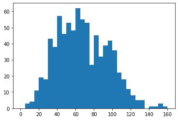
# histogram on left, example of too-large bin size # 1 row, 2 cols, subplot 1 plt.subplot(1, 2, 1) bins = np.arange(0, pokemon['speed'].max()+4, 4) plt.hist(data = pokemon, x = 'speed', bins = bins);
# histogram on right, example of too-small bin size plt.subplot(1, 2, 2) # 1 row, 2 cols, subplot 2 bins = np.arange(0, pokemon['speed'].max()+1/4, 1/4) plt.hist(data = pokemon, x = 'speed', bins = bins);
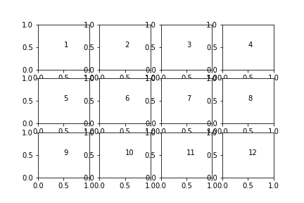
Demonstrate pyplot.sca() and pyplot.text() to generate a grid of subplots
1 2 3 4 5
fig, axes = plt.subplots(3, 4) # grid of 3x4 subplots axes = axes.flatten() # reshape from 3x4 array into 12-element vector for i inrange(12): plt.sca(axes[i]) # set the current Axes plt.text(0.5, 0.5, i+1) # print conventional subplot index number to middle of Axes
limit
zoom in某部分图表(去除outlier的影响).用axis limit.
1
2
3
4
5
6
7
8
9
10
11
12
13
14
# Get the ticks for bins between [0-15], at an interval of 0.5 bins = np.arange(0, pokemon['height'].max()+0.5, 0.5)
# Plot the histogram for the height column plt.hist(data=pokemon, x='height', bins=bins);
# Get the ticks for bins between [0-15], at an interval of 0.5 bins = np.arange(0, pokemon['height'].max()+0.2, 0.2) plt.hist(data=pokemon, x='height', bins=bins);
# Set the upper and lower bounds of the bins that are displayed in the plot # Refer here for more information - https://matplotlib.org/3.1.1/api/_as_gen/matplotlib.pyplot.xlim.html # The argument represent a tuple of the new x-axis limits. plt.xlim((0,6));
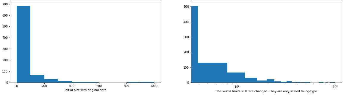
# HISTOGRAM ON LEFT: full data without scaling plt.subplot(1, 2, 1) plt.hist(data=pokemon, x='weight'); # Display a label on the x-axis plt.xlabel('Initial plot with original data')
# HISTOGRAM ON RIGHT plt.subplot(1, 2, 2)
# Get the ticks for bins between [0 - maximum weight] bins = np.arange(0, pokemon['weight'].max()+40, 40) plt.hist(data=pokemon, x='weight', bins=bins);
# The argument in the xscale() represents the axis scale type to apply. # The possible values are: {"linear", "log", "symlog", "logit", ...} # Refer - https://matplotlib.org/3.1.1/api/_as_gen/matplotlib.pyplot.xscale.html plt.xscale('log') plt.xlabel('The x-axis limits NOT are changed. They are only scaled to log-type')
Even though the data is on a log scale, the bins are still linearly spaced. This means that they change size from wide on the left to thin on the right, as the values increase multiplicative. Matplotlib’s xscale function includes a few built-in transformations: we have used the ‘log’ scale here. Secondly, the default label (x-axis ticks) settings are still somewhat tricky to interpret and are sparse as well.
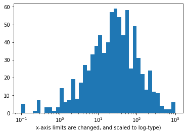
Scale the x-axis to log-type, and change the axis limit.
1 2 3 4 5 6 7 8 9 10 11 12 13 14 15 16
# Transform the describe() to a scale of log10 # Documentation: [numpy `log10`](https://docs.scipy.org/doc/numpy/reference/generated/numpy.log10.html) np.log10(pokemon['weight'].describe())
# The argument in the xscale() represents the axis scale type to apply. # The possible values are: {"linear", "log", "symlog", "logit", ...} plt.xscale('log')
# Apply x-axis label # Documentatin: [matplotlib `xlabel`](https://matplotlib.org/api/_as_gen/matplotlib.pyplot.xlabel.html)) plt.xlabel('x-axis limits are changed, and scaled to log-type')
Scale the x-axis to log-type, change the axis limits, and increase the x-ticks
1 2 3 4 5 6 7 8 9 10 11 12 13 14 15 16 17 18
# Get the ticks for bins between [0 - maximum weight] bins = 10 ** np.arange(-1, 3+0.1, 0.1)
# Generate the x-ticks you want to apply ticks = [0.1, 0.3, 1, 3, 10, 30, 100, 300, 1000] # Convert ticks into string values, to be displaye dlong the x-axis labels = ['{}'.format(v) for v in ticks]
# Plot the histogram plt.hist(data=pokemon, x='weight', bins=bins);
# The argument in the xscale() represents the axis scale type to apply. # The possible values are: {"linear", "log", "symlog", "logit", ...} plt.xscale('log')
# Apply x-ticks plt.xticks(ticks, labels);
Custom scaling the given data Series, instead of using the built-in log scale
1 2 3 4 5 6 7 8 9 10 11 12 13 14 15 16 17 18
defsqrt_trans(x, inverse = False): """ transformation helper function """ ifnot inverse: return np.sqrt(x) else: return x ** 2
# Bin resizing, to transform the x-axis bin_edges = np.arange(0, sqrt_trans(pokemon['weight'].max())+1, 1)
# Plot the scaled data plt.hist(pokemon['weight'].apply(sqrt_trans), bins = bin_edges)
# Identify the tick-locations tick_locs = np.arange(0, sqrt_trans(pokemon['weight'].max())+10, 10)
当数字时discrete时,用jitter错开. Jitter - Randomly add/subtract a small value to each data point
1 2 3 4 5 6 7 8 9 10 11 12 13 14 15 16 17 18
########################################## # Resize figure to accommodate two plots plt.figure(figsize = [20, 5])
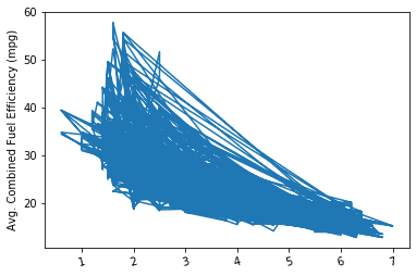
# PLOT ON LEFT - SIMPLE SCATTER plt.subplot(1, 2, 1) sb.regplot(data = fuel_econ, x = 'year', y = 'comb', truncate=False);
########################################## # PLOT ON RIGHT - SCATTER PLOT WITH JITTER plt.subplot(1, 2, 2)
# In the sb.regplot() function below, the `truncate` argument accepts a boolean. # If truncate=True, the regression line is bounded by the data limits. # Else if truncate=False, it extends to the x axis limits. # The x_jitter will make each x value will be adjusted randomly by +/-0.3 sb.regplot(data = fuel_econ, x = 'year', y = 'comb', truncate=False, x_jitter=0.3);
当很多的数字叠在一起时,用Transparency看浓度了解distribution. Plot with both Jitter and Transparency
1 2 3 4 5 6 7
# The scatter_kws helps specifying the opaqueness of the data points. # The alpha take a value between [0-1], where 0 represents transparent, and 1 is opaque. sb.regplot(data = fuel_econ, x = 'year', y = 'comb', truncate=False, x_jitter=0.3, scatter_kws={'alpha':1/20});
# Alternative way to plot with the transparency. # The scatter() function below does NOT have any argument to specify the Jitter plt.scatter(data = fuel_econ, x = 'year', y = 'comb', alpha=1/20);
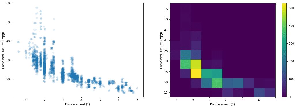
# PLOT ON LEFT plt.subplot(1, 2, 1) sb.regplot(data = fuel_econ, x = 'displ', y = 'comb', x_jitter=0.04, scatter_kws={'alpha':1/10}, fit_reg=False) plt.xlabel('Displacement (1)') plt.ylabel('Combined Fuel Eff. (mpg)');
# PLOT ON RIGHT plt.subplot(1, 2, 2) plt.hist2d(data = fuel_econ, x = 'displ', y = 'comb') plt.colorbar() plt.xlabel('Displacement (1)') plt.ylabel('Combined Fuel Eff. (mpg)');
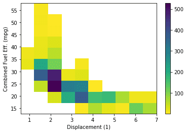
Set a minimum bound on counts and a reverse color map
1 2 3 4 5 6
# Use cmin to set a minimum bound of counts # Use cmap to reverse the color map. plt.hist2d(data = fuel_econ, x = 'displ', y = 'comb', cmin=0.5, cmap='viridis_r') plt.colorbar() plt.xlabel('Displacement (1)') plt.ylabel('Combined Fuel Eff. (mpg)');
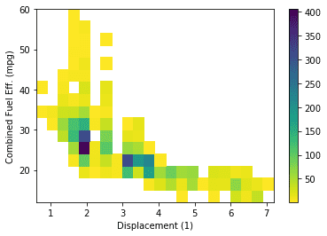
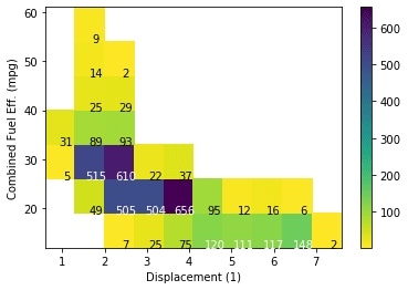
# Specify bin edges bins_x = np.arange(0.6, 7+0.7, 0.7) bins_y = np.arange(12, 58+7, 7) # Use cmin to set a minimum bound of counts # Use cmap to reverse the color map. h2d = plt.hist2d(data = fuel_econ, x = 'displ', y = 'comb', cmin=0.5, cmap='viridis_r', bins = [bins_x, bins_y])
# Select the bi-dimensional histogram, a 2D array of samples x and y. # Values in x are histogrammed along the first dimension and # values in y are histogrammed along the second dimension. counts = h2d[0]
# Add text annotation on each cell # Loop through the cell counts and add text annotations for each for i inrange(counts.shape[0]): for j inrange(counts.shape[1]): c = counts[i,j] if c >= 100: # increase visibility on darker cells plt.text(bins_x[i]+0.5, bins_y[j]+0.5, int(c), ha = 'center', va = 'center', color = 'white') elif c > 0: plt.text(bins_x[i]+0.5, bins_y[j]+0.5, int(c), ha = 'center', va = 'center', color = 'black')
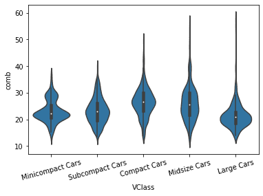
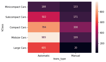
# Types of sedan cars sedan_classes = ['Minicompact Cars', 'Subcompact Cars', 'Compact Cars', 'Midsize Cars', 'Large Cars']
# Returns the types for sedan_classes with the categories and orderedness # Refer - https://pandas.pydata.org/pandas-docs/version/0.23.4/generated/pandas.api.types.CategoricalDtype.html vclasses = pd.api.types.CategoricalDtype(ordered=True, categories=sedan_classes)
# Use pandas.astype() to convert the "VClass" column from a plain object type into an ordered categorical type fuel_econ['VClass'] = fuel_econ['VClass'].astype(vclasses);
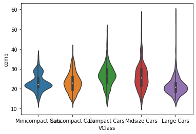
Violin plot without datapoints in the violin interior
1 2 3 4 5 6 7
base_color = sb.color_palette()[0]
# The "inner" argument represents the datapoints in the violin interior. # It can take any value from {“box”, “quartile”, “point”, “stick”, None} # If "box", it draws a miniature boxplot. sb.violinplot(data=fuel_econ, x='VClass', y='comb', color=base_color, innner=None) plt.xticks(rotation=15);
# Step 3. Convert the "VClass" column from a plain object type into an ordered categorical type # Types of sedan cars sedan_classes = ['Minicompact Cars', 'Subcompact Cars', 'Compact Cars', 'Midsize Cars', 'Large Cars']
# Returns the types for sedan_classes with the categories and orderedness # Refer - https://pandas.pydata.org/pandas-docs/version/0.23.4/generated/pandas.api.types.CategoricalDtype.html vclasses = pd.api.types.CategoricalDtype(ordered=True, categories=sedan_classes)
# Use pandas.astype() to convert the "VClass" column from a plain object type into an ordered categorical type fuel_econ['VClass'] = fuel_econ['VClass'].astype(vclasses);
# Step 4. TWO PLOTS IN ONE FIGURE plt.figure(figsize = [16, 5]) base_color = sb.color_palette()[0]
# RIGHT plot: box plot plt.subplot(1, 2, 2) sb.boxplot(data=fuel_econ, x='VClass', y='comb', color=base_color) plt.xticks(rotation=15); plt.ylim(ax1.get_ylim()) # set y-axis limits to be same as left plot
# Convert the "VClass" column from a plain object type into an ordered categorical type
# Types of sedan cars sedan_classes = ['Minicompact Cars', 'Subcompact Cars', 'Compact Cars', 'Midsize Cars', 'Large Cars']
# Returns the types for sedan_classes with the categories and orderedness # Refer - https://pandas.pydata.org/pandas-docs/version/0.23.4/generated/pandas.api.types.CategoricalDtype.html vclasses = pd.api.types.CategoricalDtype(ordered=True, categories=sedan_classes)
# Use pandas.astype() to convert the "VClass" column from a plain object type into an ordered categorical type fuel_econ['VClass'] = fuel_econ['VClass'].astype(vclasses);
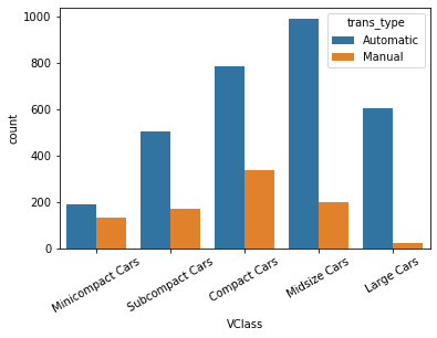
# Add a new column for transmission type - Automatic or Manual
# The existing `trans` column has multiple sub-types of Automatic and Manual. # But, we need plain two types, either Automatic or Manual. Therefore, add a new column.
# The Series.apply() method invokes the `lambda` function on each value of `trans` column. # In python, a `lambda` function is an anonymous function that can have only one expression. fuel_econ['trans_type'] = fuel_econ['trans'].apply(lambda x:x.split()[0])
sb.countplot(data = fuel_econ, x = 'VClass', hue = 'trans_type')
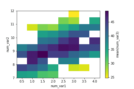
或者用heatmap.
1 2 3 4 5 6 7 8 9 10 11 12 13
# Use group_by() and size() to get the number of cars and each combination of the two variable levels as a pandas Series ct_counts = fuel_econ.groupby(['VClass', 'trans_type']).size()
# Use Series.reset_index() to convert a series into a dataframe object ct_counts = ct_counts.reset_index(name='count')
# Use DataFrame.pivot() to rearrange the data, to have vehicle class on rows ct_counts = ct_counts.pivot(index = 'VClass', columns = 'trans_type', values = 'count')
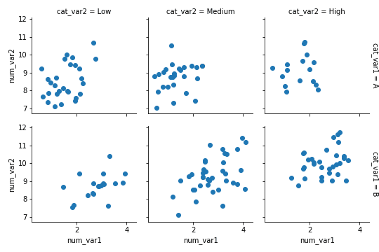
clusterbar类似bar chart的faceting. faceting, the data is divided into disjoint subsets, most often by different levels of a categorical variable. 用map function.
# Convert the "VClass" column from a plain object type into an ordered categorical type sedan_classes = ['Minicompact Cars', 'Subcompact Cars', 'Compact Cars', 'Midsize Cars', 'Large Cars'] vclasses = pd.api.types.CategoricalDtype(ordered=True, categories=sedan_classes) fuel_econ['VClass'] = fuel_econ['VClass'].astype(vclasses);
# Plot the Seaborn's FacetGrid g = sb.FacetGrid(data = fuel_econ, col = 'VClass') g.map(plt.hist, "comb")
bin_edges = np.arange(12, 58+2, 2)
# Try experimenting with dynamic bin edges # bin_edges = np.arange(-3, fuel_econ['comb'].max()+1/3, 1/3)
g = sb.FacetGrid(data = fuel_econ, col = 'VClass', col_wrap=3, sharey=False) g.map(plt.hist, 'comb', bins = bin_edges);
# Find the order in which you want to display the Facets # For each transmission type, find the combined fuel efficiency group_means = fuel_econ[['trans', 'comb']].groupby(['trans']).mean()
# Select only the list of transmission type in the decreasing order of combined fuel efficiency group_order = group_means.sort_values(['comb'], ascending = False).index
# Use the argument col_order to display the FacetGrid in the desirable group_order g = sb.FacetGrid(data = fuel_econ, col = 'trans', col_wrap = 7, col_order = group_order) g.map(plt.hist, 'comb')
line
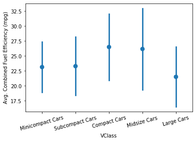
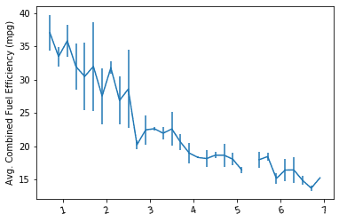
比对两个variable的关系(one numeric variable against values of a second variable).注重关系与x-value.
# Set a number of bins into which the data will be grouped. # Set bin edges, and compute center of each bin bin_edges = np.arange(0.6, 7+0.2, 0.2) bin_centers = xbin_edges[:-1] + 0.1
# Cut the bin values into discrete intervals. Returns a Series object. displ_binned = pd.cut(fuel_econ['displ'], bin_edges, include_lowest = True)
# For the points in each bin, we compute the mean and standard error of the mean. comb_mean = fuel_econ['comb'].groupby(displ_binned).mean() comb_std = fuel_econ['comb'].groupby(displ_binned).std()
# Plot the summarized data plt.errorbar(x=bin_centers, y=comb_mean, yerr=comb_std) plt.xticks(rotation=15); plt.ylabel('Avg. Combined Fuel Efficiency (mpg)');
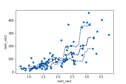
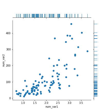
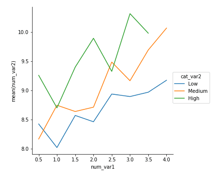
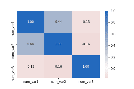
We sort_values to put the x-values in ascending order first. Then use rolling.
1 2 3 4 5 6 7 8 9 10 11 12 13 14 15 16 17
# compute statistics in a rolling window df_window = df.sort_values('num_var1').rolling(15) x_winmean = df_window.mean()['num_var1'] y_median = df_window.median()['num_var2'] y_q1 = df_window.quantile(.25)['num_var2'] y_q3 = df_window.quantile(.75)['num_var2']
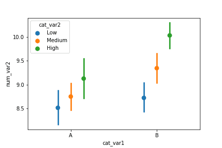
# plot the summarized data base_color = sb.color_palette()[0] line_color = sb.color_palette('dark')[0] plt.scatter(data = df, x = 'num_var1', y = 'num_var2') plt.errorbar(x = x_winmean, y = y_median, c = line_color) plt.errorbar(x = x_winmean, y = y_q1, c = line_color, linestyle = '--') plt.errorbar(x = x_winmean, y = y_q3, c = line_color, linestyle = '--')
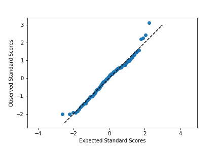
plt.scatter(expected_scores, data_scores) plt.plot([-2.5,3],[-2.5,3],'--', color = 'black') plt.axis('equal') plt.xlabel('Expected Standard Scores') plt.ylabel('Observed Standard Scores')
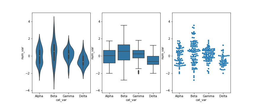
# left plot: violin plot plt.subplot(1, 3, 1) ax1 = sb.violinplot(data = df, x = 'cat_var', y = 'num_var', color = base_color)
# center plot: box plot plt.subplot(1, 3, 2) sb.boxplot(data = df, x = 'cat_var', y = 'num_var', color = base_color) plt.ylim(ax1.get_ylim()) # set y-axis limits to be same as left plot
# right plot: swarm plot plt.subplot(1, 3, 3) sb.swarmplot(data = df, x = 'cat_var', y = 'num_var', color = base_color) plt.ylim(ax1.get_ylim()) # set y-axis limits to be same as left plot
rug and strip plots
1 2 3
g = sb.JointGrid(data = df, x = 'num_var1', y = 'num_var2') g.plot_joint(plt.scatter) g.plot_marginals(sb.rugplot, height = 0.25)
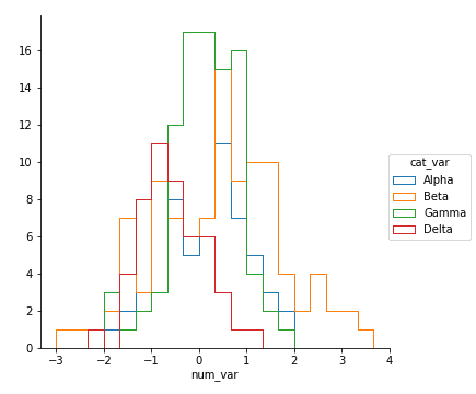
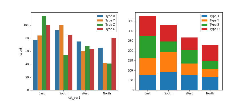
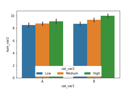
# left plot: clustered bar chart, absolute counts plt.subplot(1, 2, 1) sb.countplot(data = df, x = 'cat_var1', hue = 'cat_var2', order = cat1_order, hue_order = cat2_order) plt.legend()
# right plot: stacked bar chart, absolute counts plt.subplot(1, 2, 2)
baselines = np.zeros(len(cat1_order)) # for each second-variable category: for i inrange(len(cat2_order)): # isolate the counts of the first category, cat2 = cat2_order[i] inner_counts = df[df['cat_var2'] == cat2]['cat_var1'].value_counts() # then plot those counts on top of the accumulated baseline plt.bar(x = np.arange(len(cat1_order)), height = inner_counts[cat1_order], bottom = baselines) baselines += inner_counts[cat1_order]
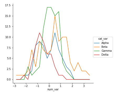
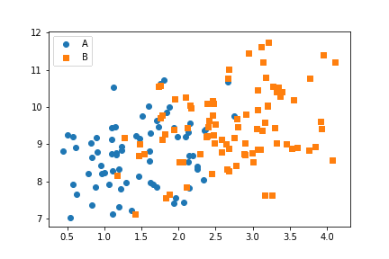
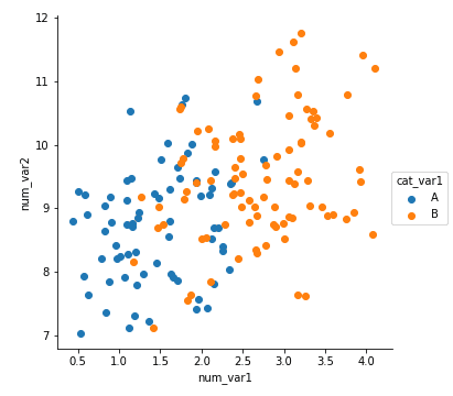
for cat, marker in cat_markers: df_cat = df[df['cat_var1'] == cat] plt.scatter(data = df_cat, x = 'num_var1', y = 'num_var2', marker = marker) plt.legend(['A','B'])
size
1 2 3 4 5 6 7 8 9
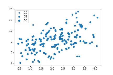
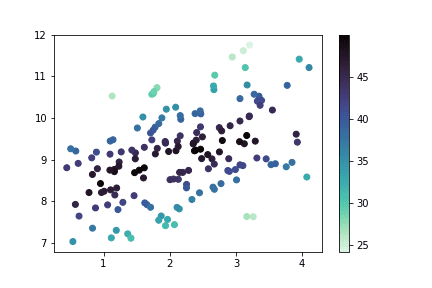
plt.scatter(data = df, x = 'num_var1', y = 'num_var2', s = 'num_var3')
# dummy series for adding legend sizes = [20, 35, 50] base_color = sb.color_palette()[0] legend_obj = [] for s in sizes: legend_obj.append(plt.scatter([], [], s = s, color = base_color)) plt.legend(legend_obj, sizes)
# count number of points in each bin xbin_idxs = pd.cut(df['num_var1'], xbin_edges, right = False, include_lowest = True, labels = False).astype(int) ybin_idxs = pd.cut(df['num_var2'], ybin_edges, right = False, include_lowest = True, labels = False).astype(int)
legend: create and customize a legend. One key parameter to use is “title”, which allows you to label what feature is being depicted in the legend. You might also need to make use of the “loc” and “ncol” parameters to move and shape the legend if it gets placed in an awkward location by default.
colorbar: add a colorbar. Use the “label” parameter to set the label on a colorbar.
suptitle: setting figure titles. The main difference between suptitle and title is that the former sets a title for the Figure as a whole, and the latter for only a single Axes. This is an important distinction: if you’re using faceting or subplotting, you’ll want to use suptitle to set a title for the figure as a whole.
1 2 3 4 5 6 7 8 9 10 11 12 13 14 15
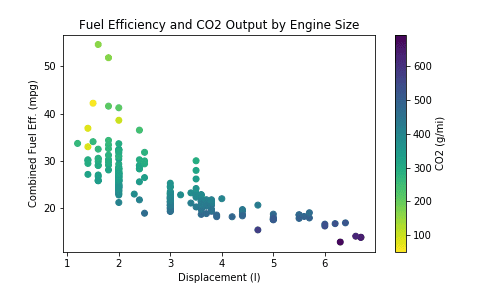
# loading in the data, sampling to reduce points plotted fuel_econ = pd.read_csv('./data/fuel_econ.csv')
# plotting the data plt.figure(figsize = [7,4]) plt.scatter(data = fuel_econ_subset, x = 'displ', y = 'comb', c = 'co2', cmap = 'viridis_r') plt.title('Fuel Efficiency and CO2 Output by Engine Size') plt.xlabel('Displacement (l)') plt.ylabel('Combined Fuel Eff. (mpg)') plt.colorbar(label = 'CO2 (g/mi)');