

联动上篇.
Graphic design in 20s and 30s
The Influence of Modern Art
Cubism
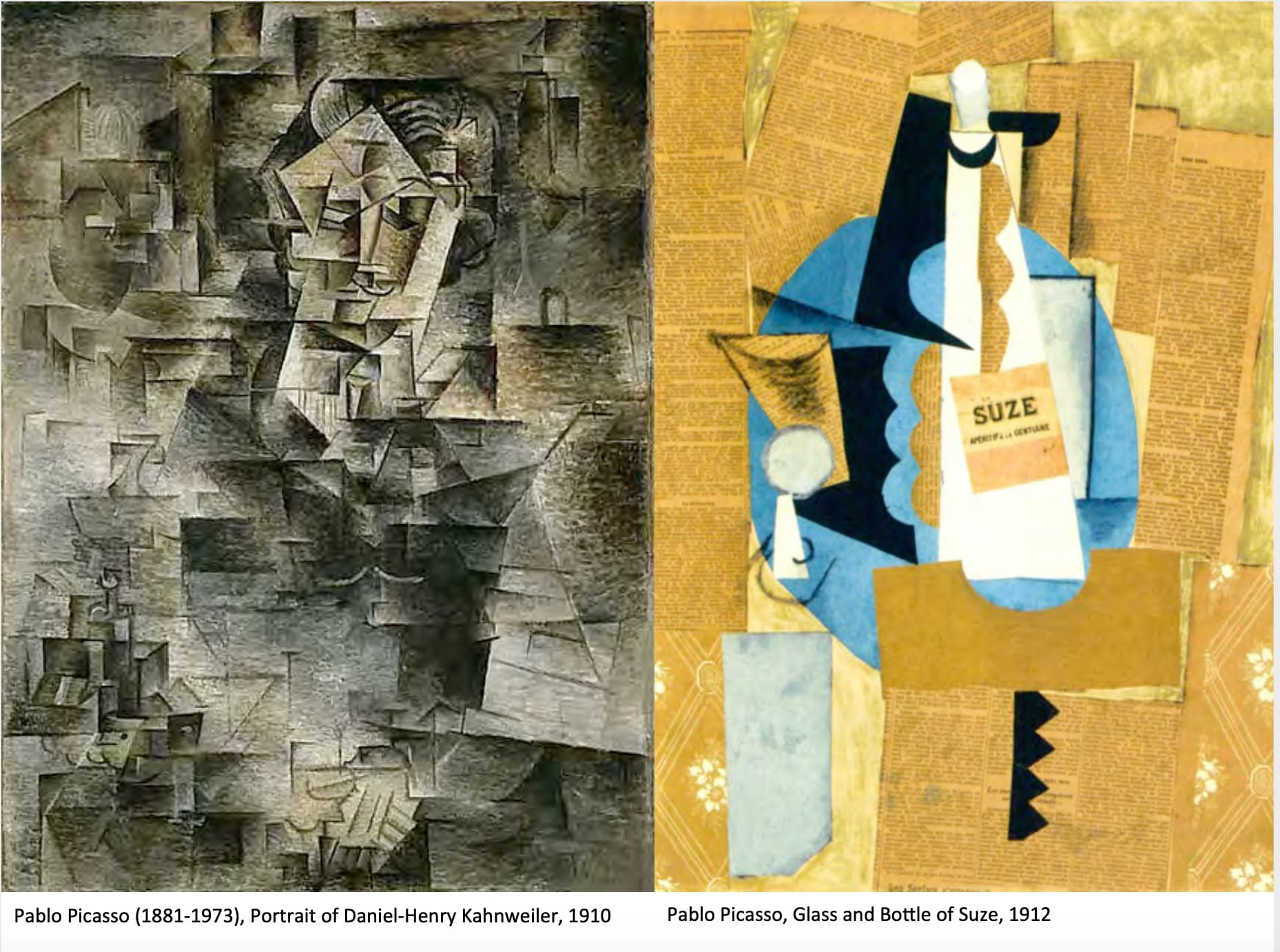
Is 20th century avant garde art movement, pioneered by Pablo Picasso and Georges Braque.
Start with analytical cubism 1907, kind of finishing up in 1911 in France.
Second is synthetic cubism, start with 1912-ish and end around 1914.
Cubist artwork are broken up and analyzed, reassembled in abstracted form.
Instead of depicting objects from 1 viewpoint, artist depicts the subject from a multiple of viewpoints that represent the subject in a greater context.
Often the surfaces intersect at seemingly random angles, removing coherent sense of depth.
Synthetic cubism is more conceptual and much more about expressing (what Picasso loved at that time).
Futurism

Unique forms of continuity and space.
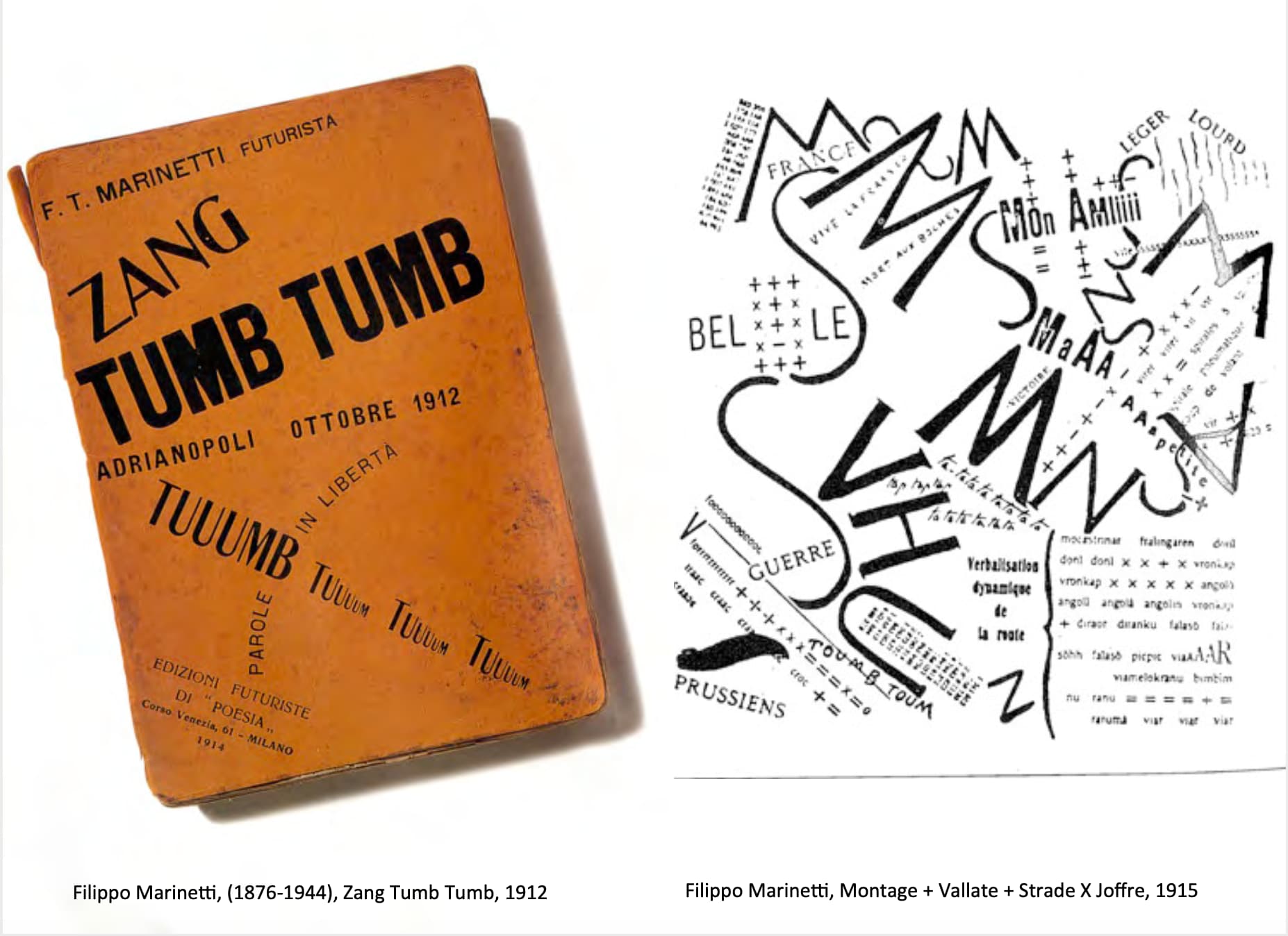
Futurist specifically filippo marinetti.
是一份宣言,《未来主义宣言》,是未来主义的founder所开始的.
We want to sing the love of danger, the habit of energy and recklessness.
Courage, daring, rebellion, will be essential elements of our poetry.
Literature exalted to this day thoughtful stillness, ecstasy and sleep. We want to exalt aggressive movement, feverish sleeplessness, running step, somersault, slap and punch.
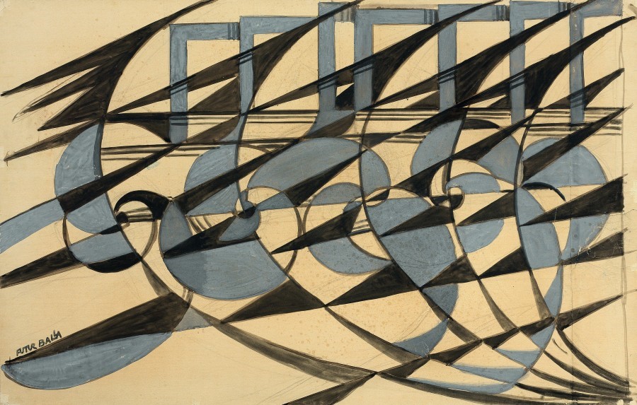
- Giacomo Balla
Dynamism of a Dog on a Leash, 1912:

1912年的,手动动态模糊,真的好天才好好笑…
老师quote:
Although it brought about some really interesting artwork and was very foundational in modern movement, the ideologies that surrounded it can be questionable.
Marinetti (那个founder) declared that art can be nothing, but violence cruelty and injustice.
Futurism espoused of the ideas of the industrial revolution and what speed and “the art of war”.
They were very much taken with all of them than you, the massion-isms of that particular time.
They extolled war as being proper and necessary in order to move on to the next phase of their reality.

- Umberto Boccioni
老师继续quote,
难说是幸运还是不幸,他们大部分的人作为第一次世界大战的回应者死在了战争中,kind of romanticized the idea of war.
Futurism was probably not the smartest approach to the way we should see the world, but very instrumental and important historically speaking.
It’s really hard to agree with people that believe that the war has a cleansing characteristic.
老师,虽然我不喜欢他们的宣言idea,但是他们的字体是真的好看(好看).
This is indeed an idea of words in freedom.
He states that the essential elements for our poetry will be courage, audacity and revolt from the Futurist Manifesto.
Dada
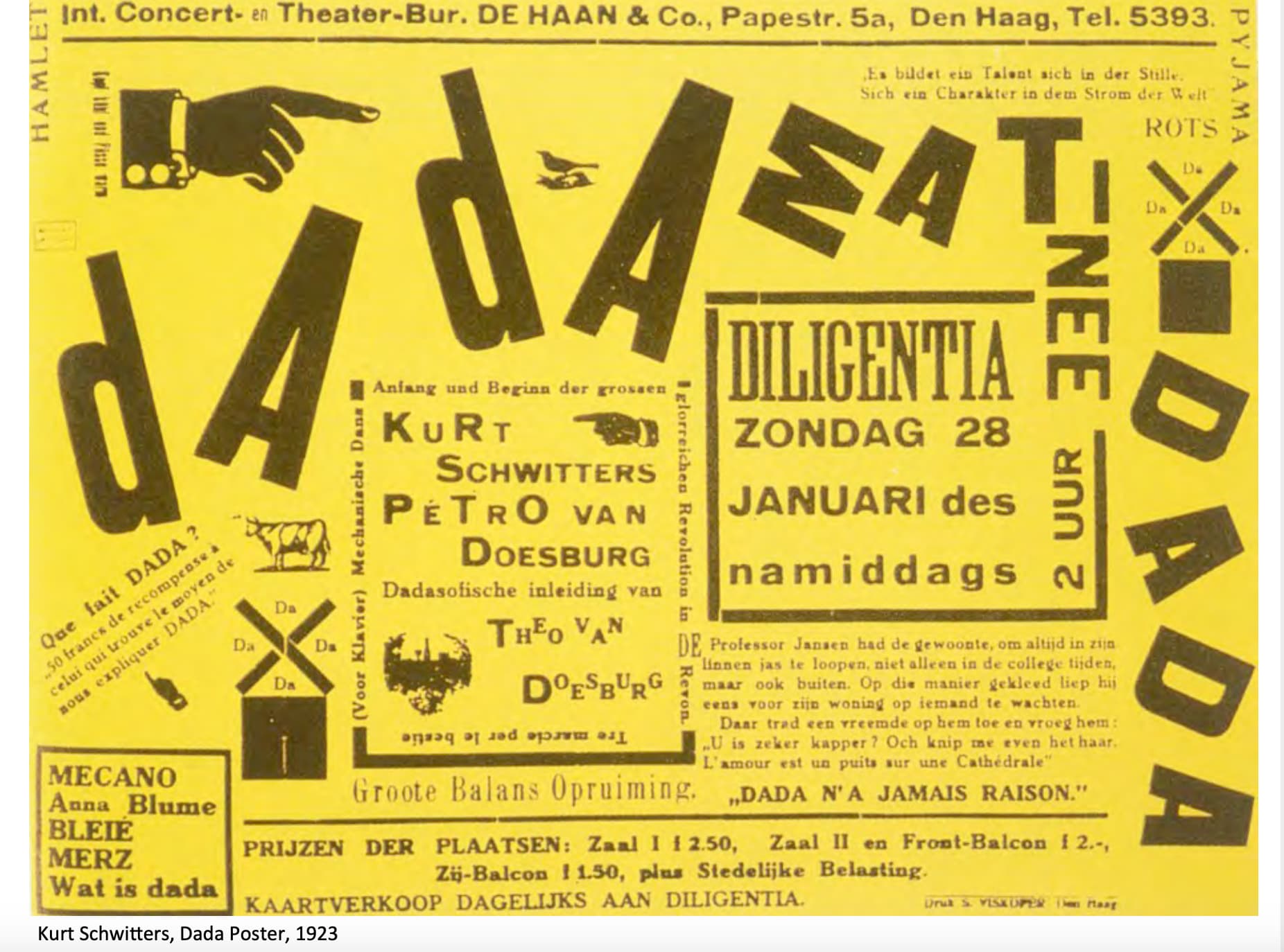
Futurists were italian, dada was a movement began in Zurich with Kurt SchwiLers during WWI. 1916-1922.
Purpose was to ridicule what its participants considered to be the meaninglessness of the modern world.
We’re the only kind of art that was considered to be art, was founded in historicism, and mythology for the most part.
Generally had to be very grandiose and kind of had to tell a story.
但是Dada派的idea like, I don’t necessarily want to tell a story, nor do I want to necessarily have something admiring, like one particular idea or historical figure or mythological story.
They wanted to be free to talk about whatever it is they wanted to.
Expressionism

Subject matter - including victim of poverty, hunger and war.
老师讲到这…
有些批评家表示这些主题没有人会care.
他其中的一副作品还因为纳粹拿来宣传【德国以外的人如何贫穷,如何杀害他们的城民】而被禁.
Surrealism
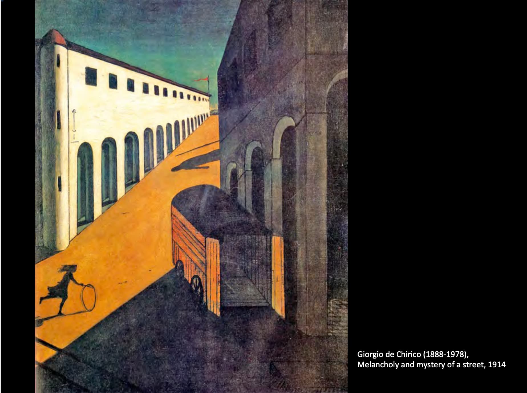
Metaphysical - odd use of perspective, deep shadows, Juxtaposition of elements not normally associated with each other.
Starting to move away from realism 因为相机的发明.
Photo Montage
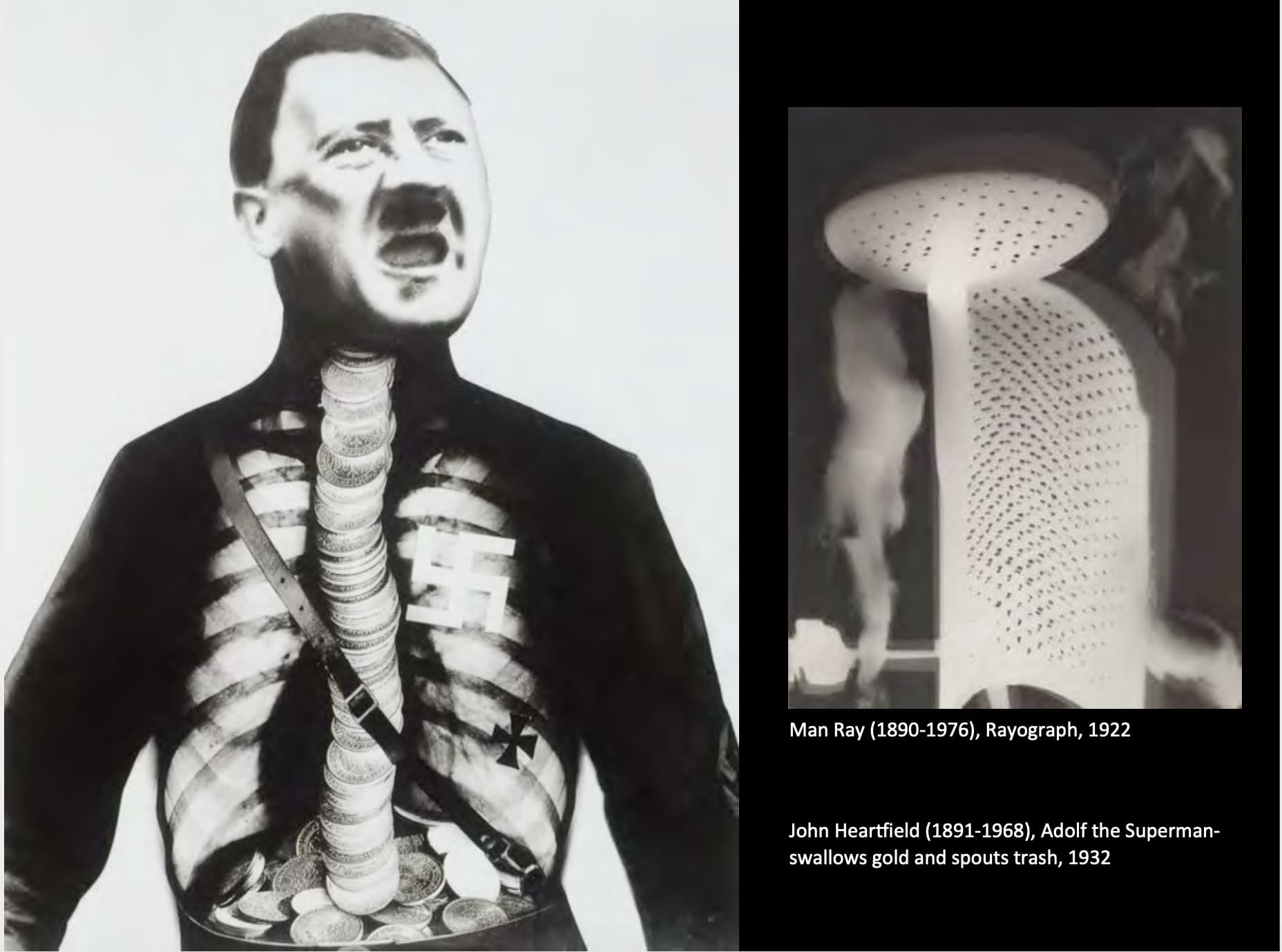
当老师介绍Heartfield的时候, he joined Berlin Dada club and Communist party of Germany.
我:……?
然后去读了下Wiki.
John Heartfield was a 20th century German visual artist who pioneered the use of art as a political weapon. Some of his most famous photomontages were anti-Nazi and anti-fascist statements.
好厉害啊…各种各样的意味.
毕竟完全没预计美术史会很普通的谈论政治主题艺术,不过也是.
Constructivism and the Bauhaus: 1915‐1930
Suprematist
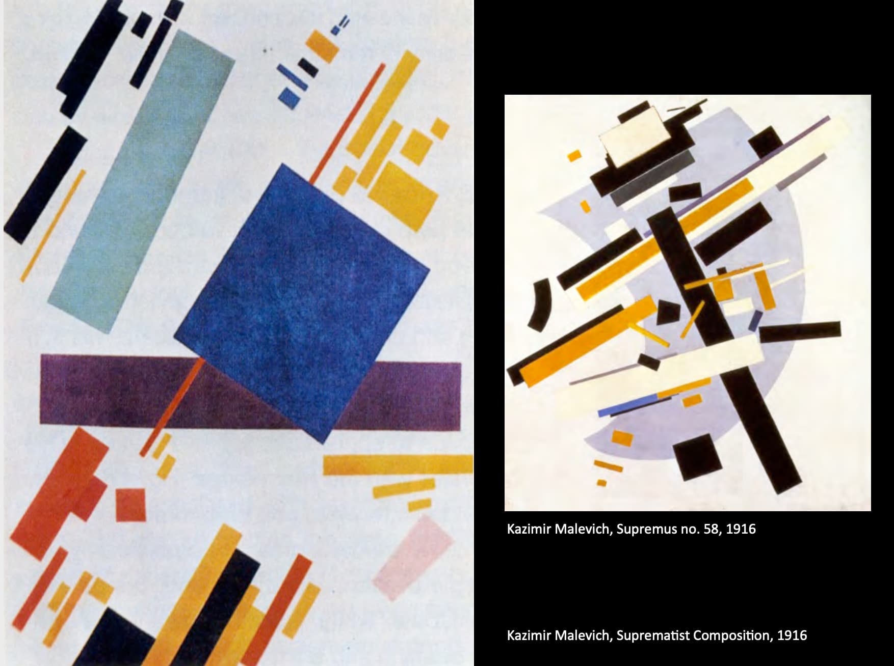
- Kazimir Malevich
Published his manifesto called from Cubism to Suprematism.
Created a Suprematist grammar based on fundamental geometric forms, particularly the square and the circle.
Suprematism believe that extreme reduction in, “The object in itself is meaningless, the ideas of the conscious mind are worthless.”
What they wanted was a non objective representation, “The expression of feeling seeking no practical values, no ideas and no promised land.”
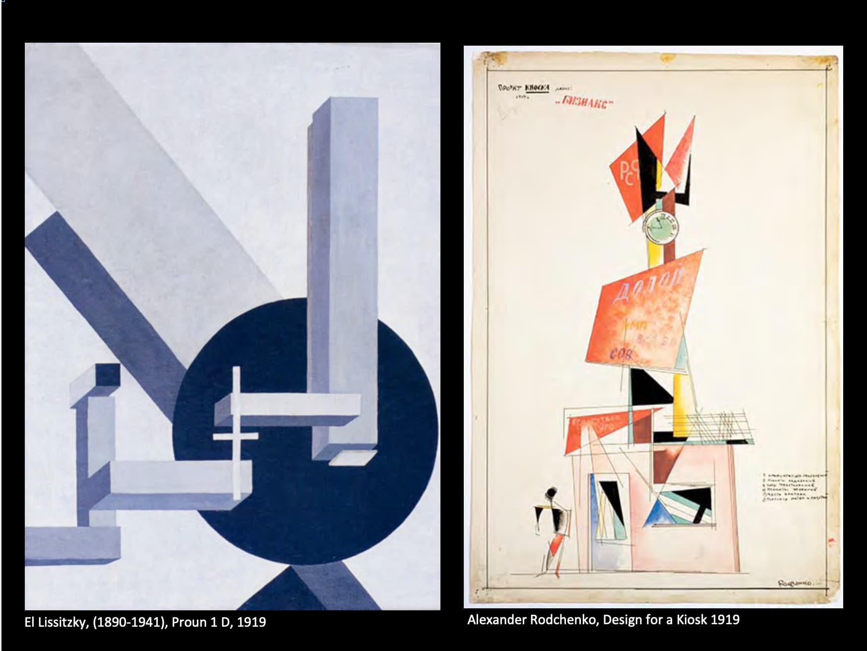

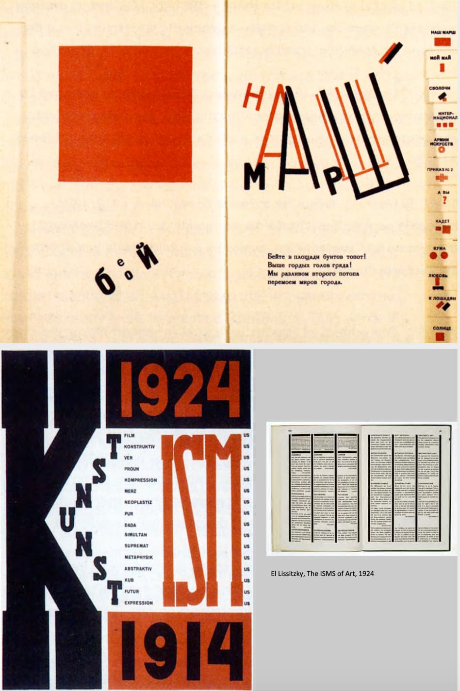
- El Lissitzky
They wanted to use a limited palette, including fully saturated hues with the occasional accent colours or tone or shade. But primary colours and uses of black, white and gray.
The supremacy of pure feeling in creative art.

El Lissitzky对graphic design的印象相当大,于是贴了很多图片.
Lissitzky’s entire career was laced with the belief that the artist could be an agent for change.
He saw 1917 Russian Revolution as a new beginning for mankind, communinsm and social engineer would create a new order technology which would provide for society’s needs and the designer, artist,
He called himself a constructor, would forge a unity between art and technology by constructing a new world of object too provide mankind with a richer society and environment.
很苏联.
有趣的时候这时候同时期是futurist宣言去他妈的旧秩序.Dada在追求虚无(?)和绝对自由(?).
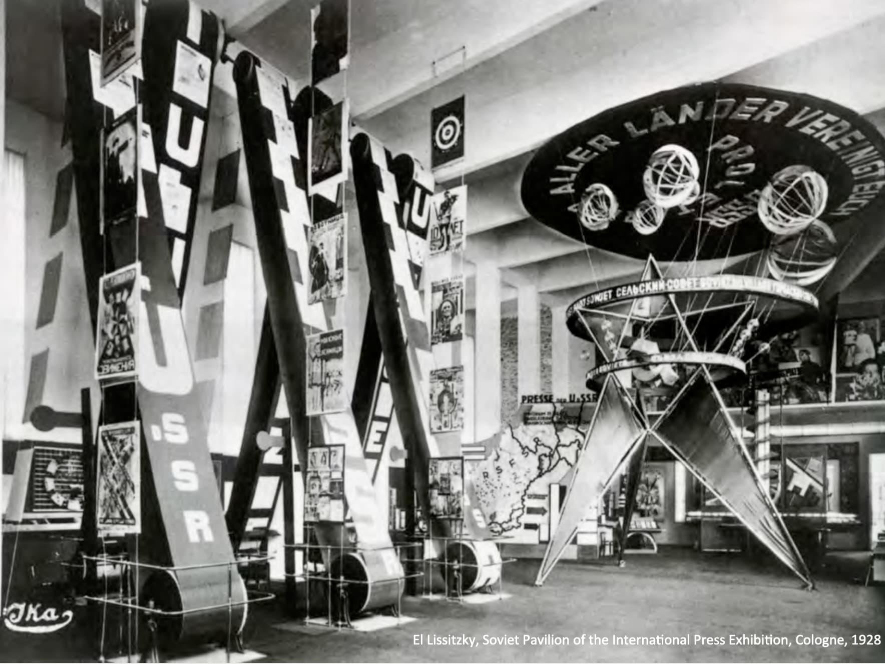
这个展览是宣传苏联电影为主题,还有一些制作的动画.所有的东西都可以动,很上世纪科幻.
好牛逼…
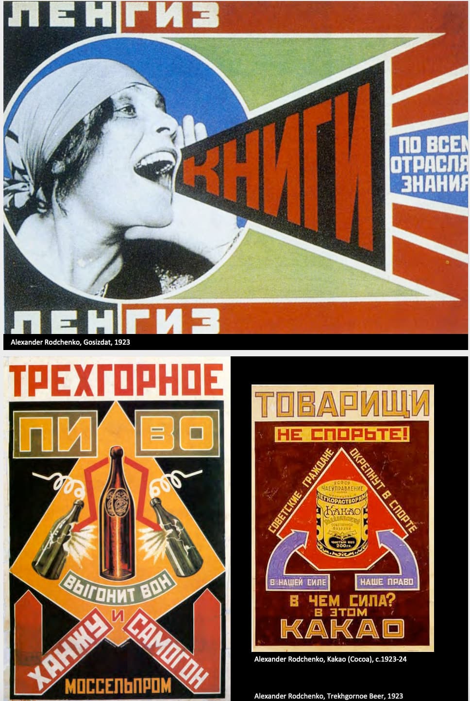
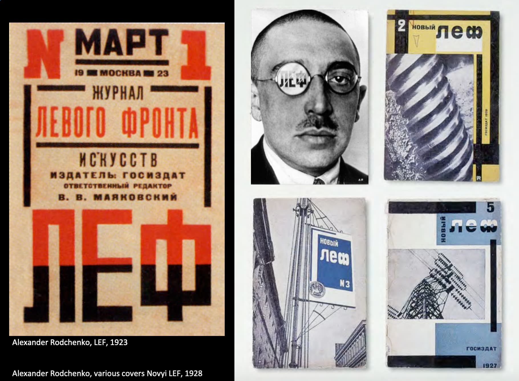
- Alexander Rodchenko
这时期是苏联经济崩溃后的复苏.
This relatively free period featured exciting experimentation in all fields.
Rodchenko做了很多的广告.
Developed a style strident slogans and aggressive compositions.
Strong ease of diagonals, bold colours, and in this case symmetrical layout.
Re-examine the ideology and practices of so-called leftist(左翼) art.
To abandon individualism to increase arts value for developing communism.
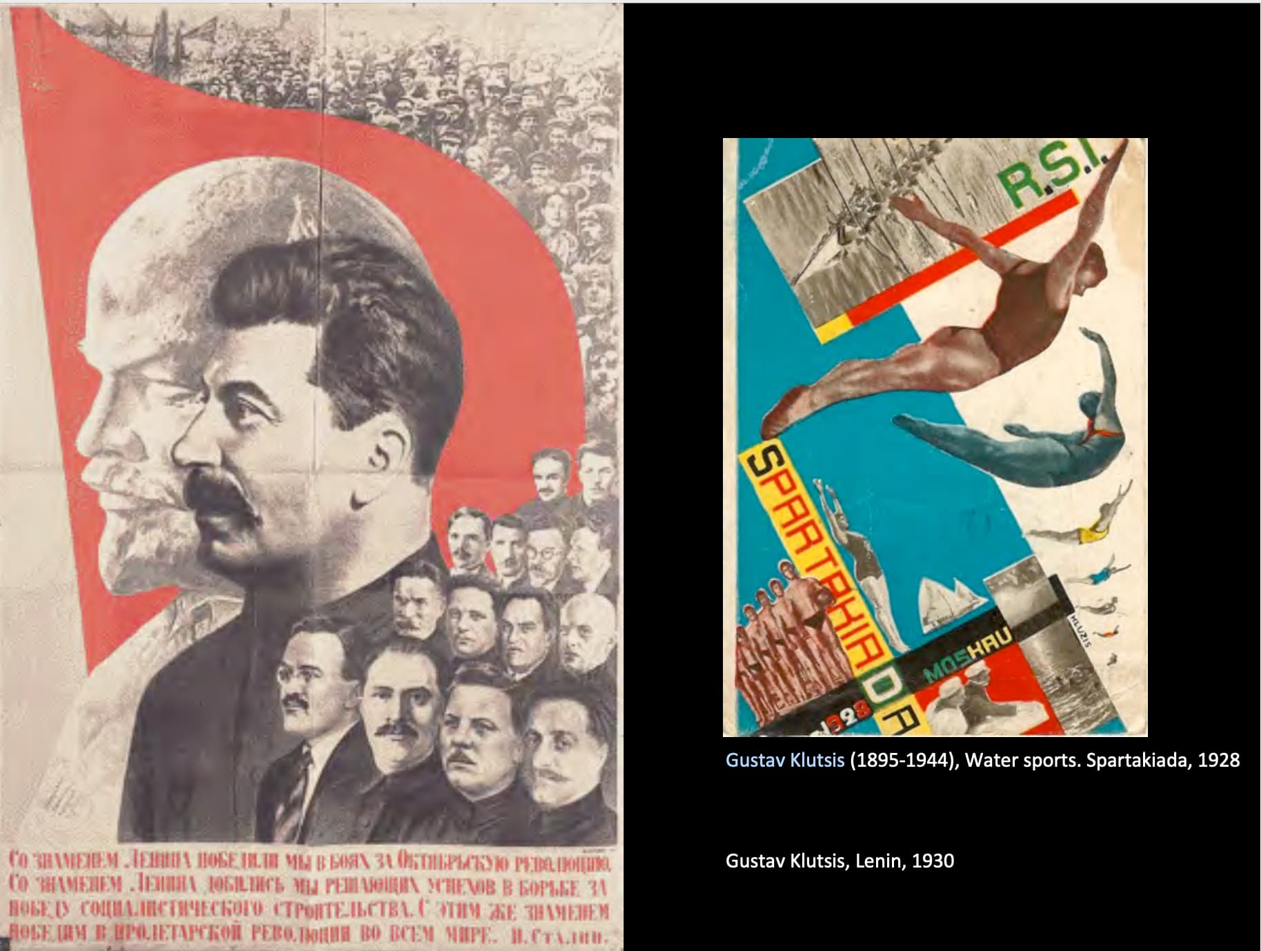
- Gustav Klutsis
Quote:
The old discipline in the visual arts drawing painting, and graphic arts with their obsolete technique and working methods are insufficient to satisfy the demands of the revolution as concerns the tasks of agitation and propaganda on a massive scale, art must be on the same level of socialist industry.
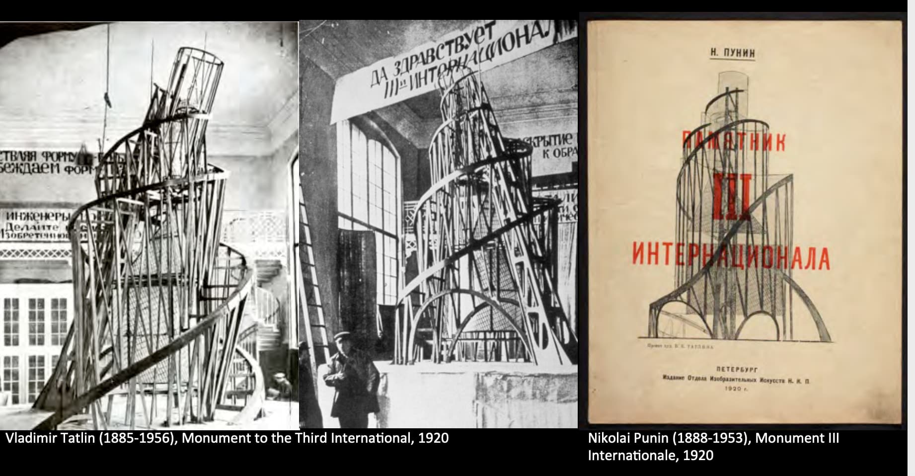
It has three rotating levels, the first level is annual rotating cube that has the housing of the halls of Party Congress.
Second has monthly rotation housing has the Party Bureaucracy.
Third is a cylinder housing a newspaper on the top and would rotate daily.
这个好牛逼的塔其实并没有真正被造出来,遗憾,好尼玛酷.
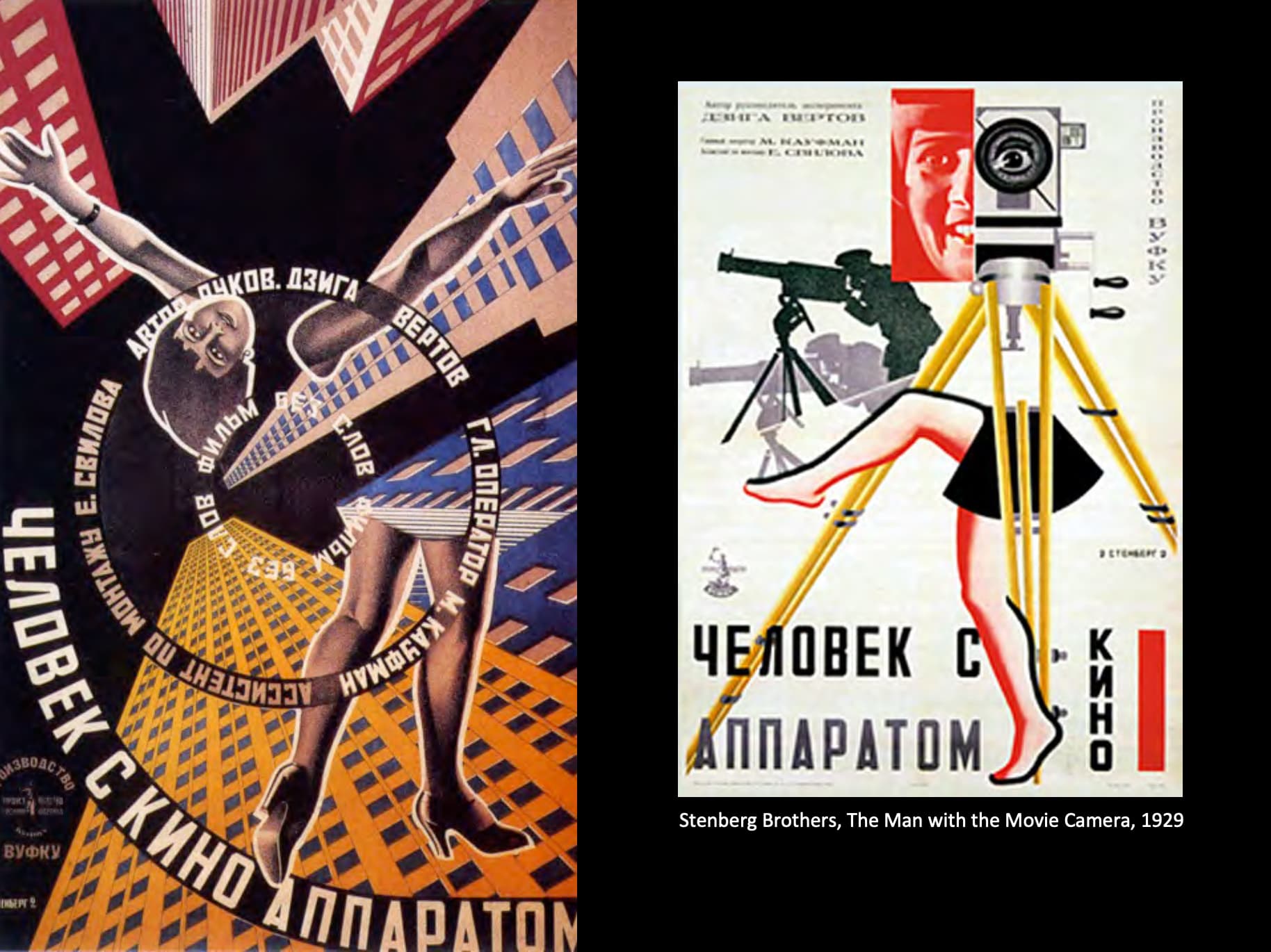
Russian Avant‐Garde Film.
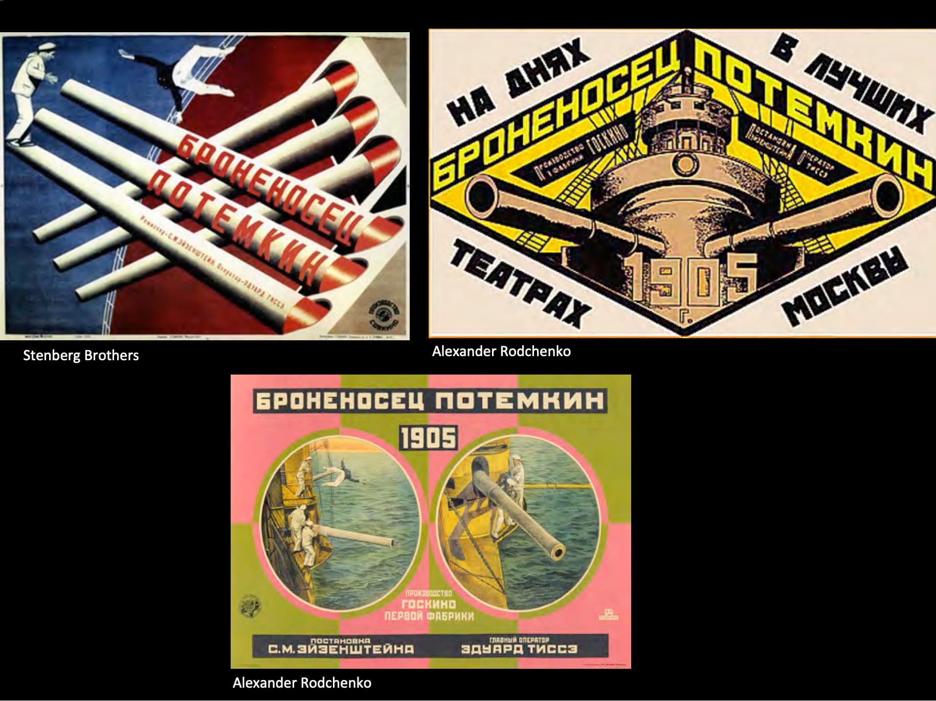
电影的名字与link在ref note里.
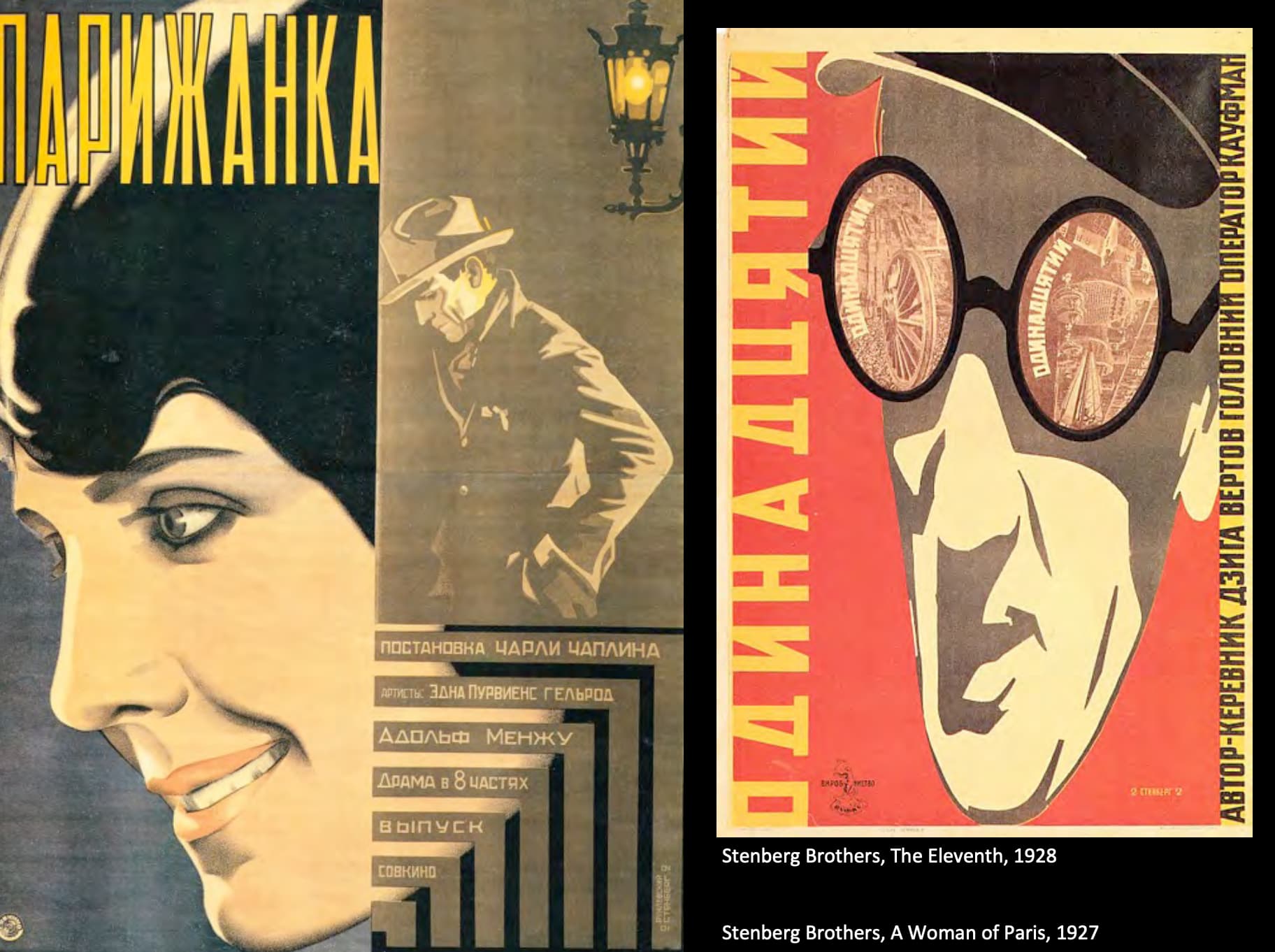
我们回到了Stenberg Brothers,他们做的电影海报.
果然他们也被划分在了Constructivism里…
但因为老视频/苏联艺术太阴间了我不打算看.
De Stijl
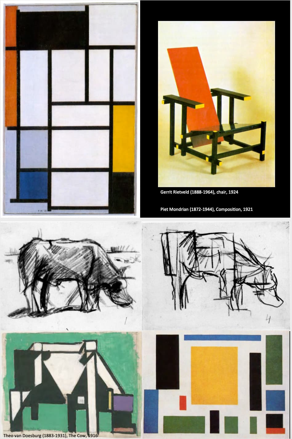
De Stijl的字面翻译是the style.
The new utopian ideal of spiritual harmony and order and universal principles.
They saw themselves as agents of social change, they advocate for pure abstraction and universality, by reduction to the essential form and colour.
Restrict what they were creating, two primary colours, red, yellow, blue and black.
Even curves were not allowed.
Their art guided by some universal harmony, the simplified visual composition to the vertical and horizontal only primary colour.
This idea will ignore the particulars of appearance.
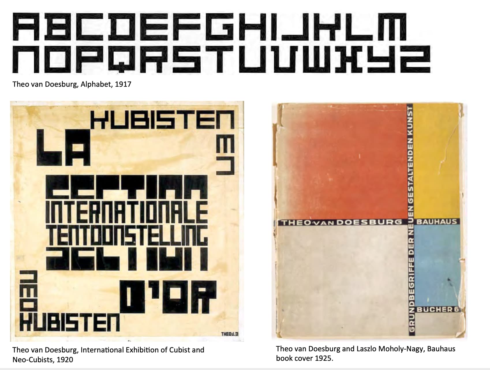
完全只有横和竖的字体.像K,Q,V这样的字母很有意思.
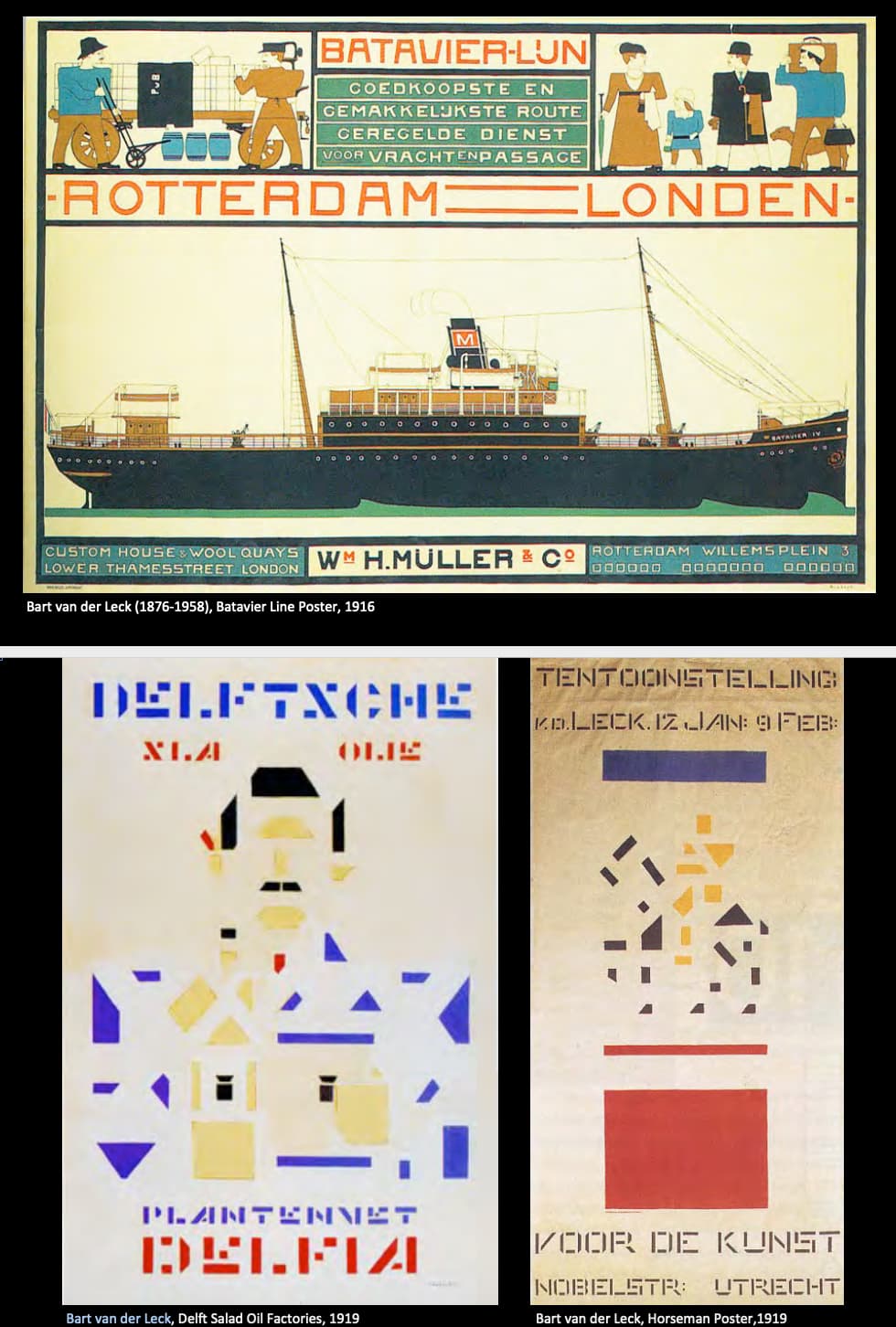
- Bart van der Leck
原本是De Stijl的重要人之一,但之后脱离.顺便一提悲伤的是这两幅De Stijl的商业作品被甲方拒绝了.
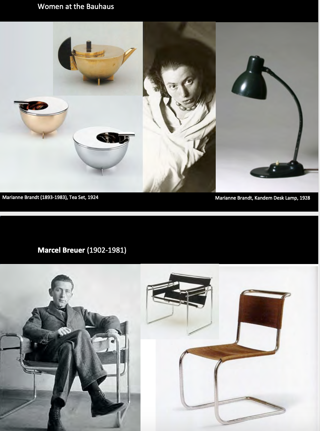
Bauhaus School
Bauhaus is founding combining the fine and applied arts, as well as creating a total work of art in which all arts were included.
This included architecture, graphic design, interior design, industrial design, typography and art and design education.
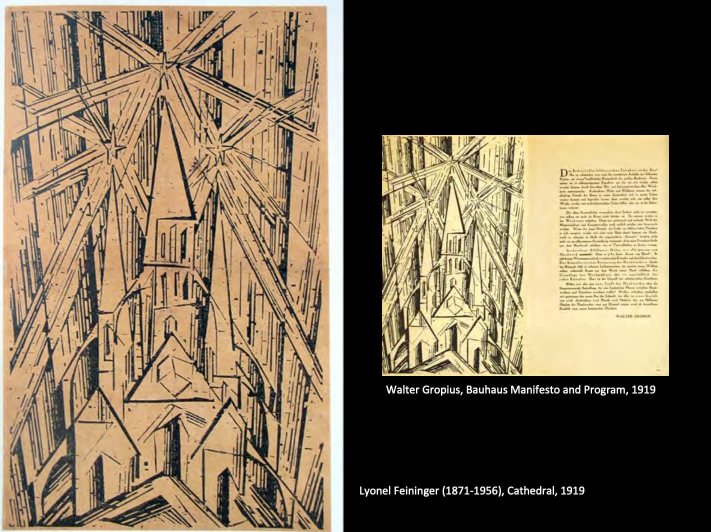
Let us create a new Guild of Craftsman without the class distinctions that raise arrogant barrier between craftsman and artist together.
Together, let us desire conceive and create a new building of the future which will embrace architecture, sculpture and painting into one unity which will one day rise toward heaven.
Form the hands of million workers like the crystal symbol, of a new faith.
The symbol used in Bauhaus.
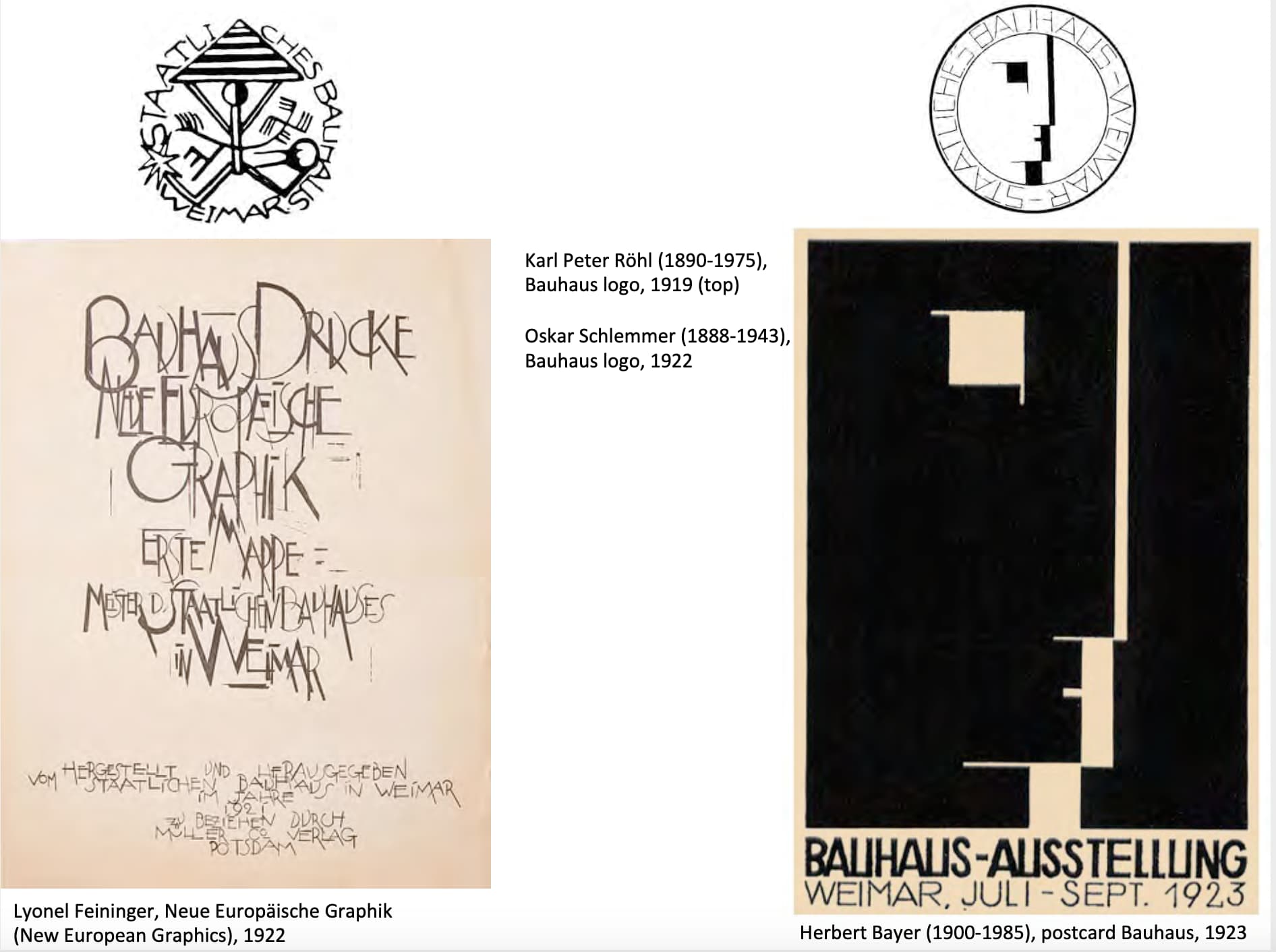
老师:右图refer to中国的阴阳构图.咦是这样的吗.
Body refers to the Germanic “tree of life” rune.
Dualistic relationship between the feathered form on the left and the swastika on the right: – pyramid being lifted up represents the arts that are united in the “grand building”.
Exhibition for public founding from government.
Theme: Art and technology and one unity. Technology does not need art but art does need technology.
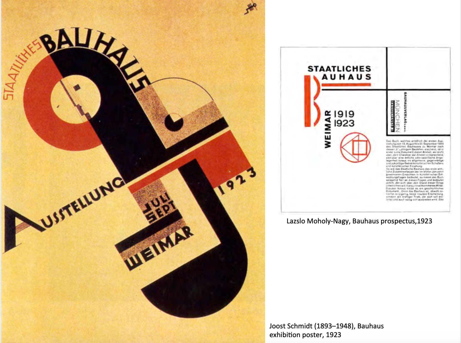
In 1923, under the influence of the De Stijl and Russian Constructivism, the Bauhus move towards to a curriculum that emphasizes functionalism and a machine aesthetic based on reductive geometric abstraction.
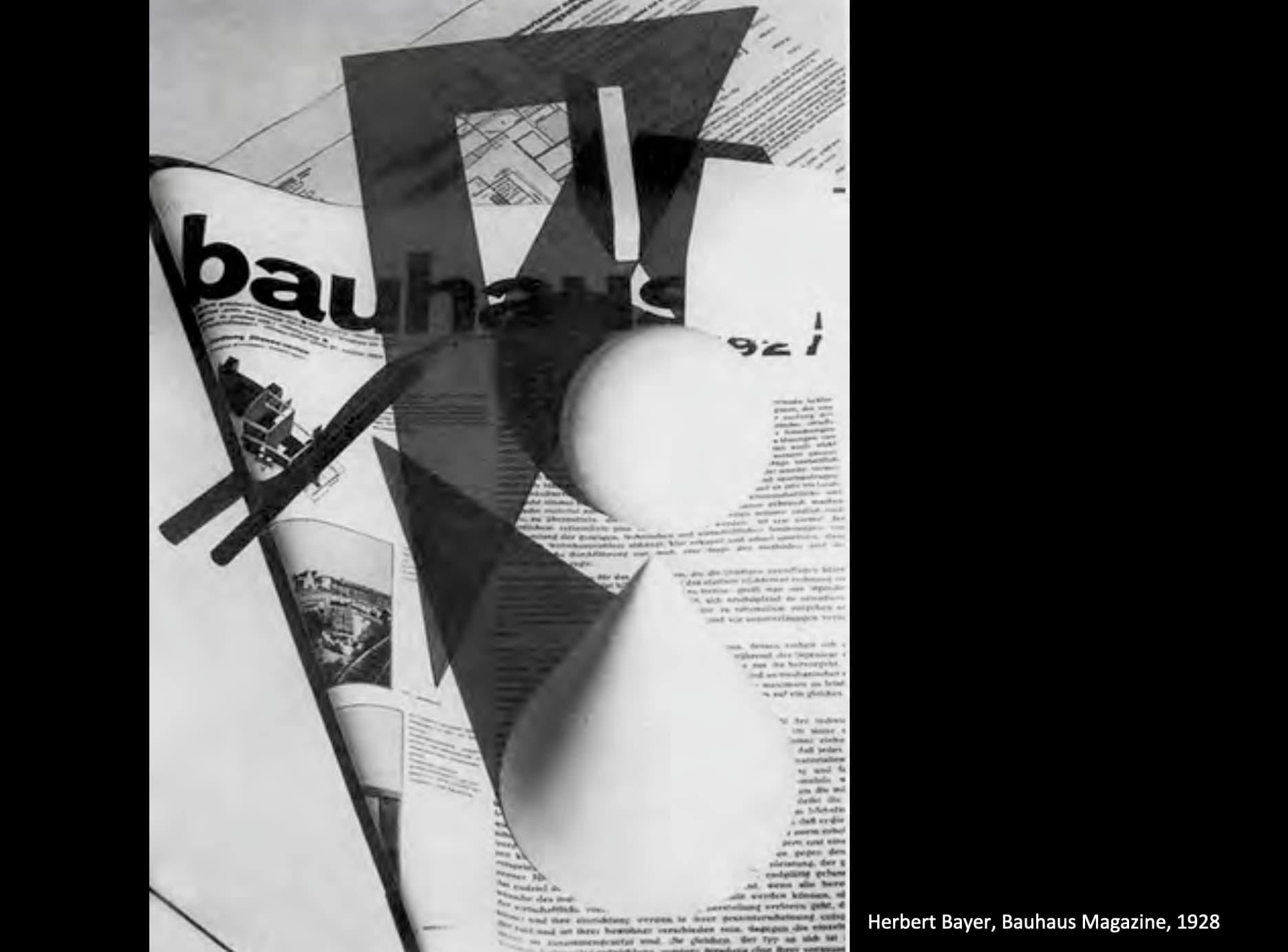
A new emphasis on typography that focused on clarity of the use of only Sanserif typefaces of which became the standard for promotional material for the school.

In spirit of the reductive minimalism, Bayer developed of these crisp visual style and adopted the use of all lowercase censor of typefaces for most publications.
Bayer was commissioned by the government too produce these new banknotes to deal with rampant inflation.
有趣的是这灯型的设计是一百年之前了,但跟ikea能买到的没啥两样.

有趣的是上面这款字体并没有upper case.
Bayer asserted that uppercase letters were superfluous in an age of scientific management and a scientific case letter set should be easier to learn and read as well as proving substantially cheaper for the printer (这里应该指老式打字机,只需要做一半的按键).
Typographers basis by Albers:
San serif typeface was indispensable for three reasons.
- It was the only type capable of expressing the spirit of the machine age, so these forms were increasingly viewed as more of an instrument of logical planning than as representative of a Platonic beauty.
- San serif lacked any nationalist associations unlike black letter. It could serve as a unifying force in a post War era.
- It’s simple clarity an impersonal character where the best match for photography.
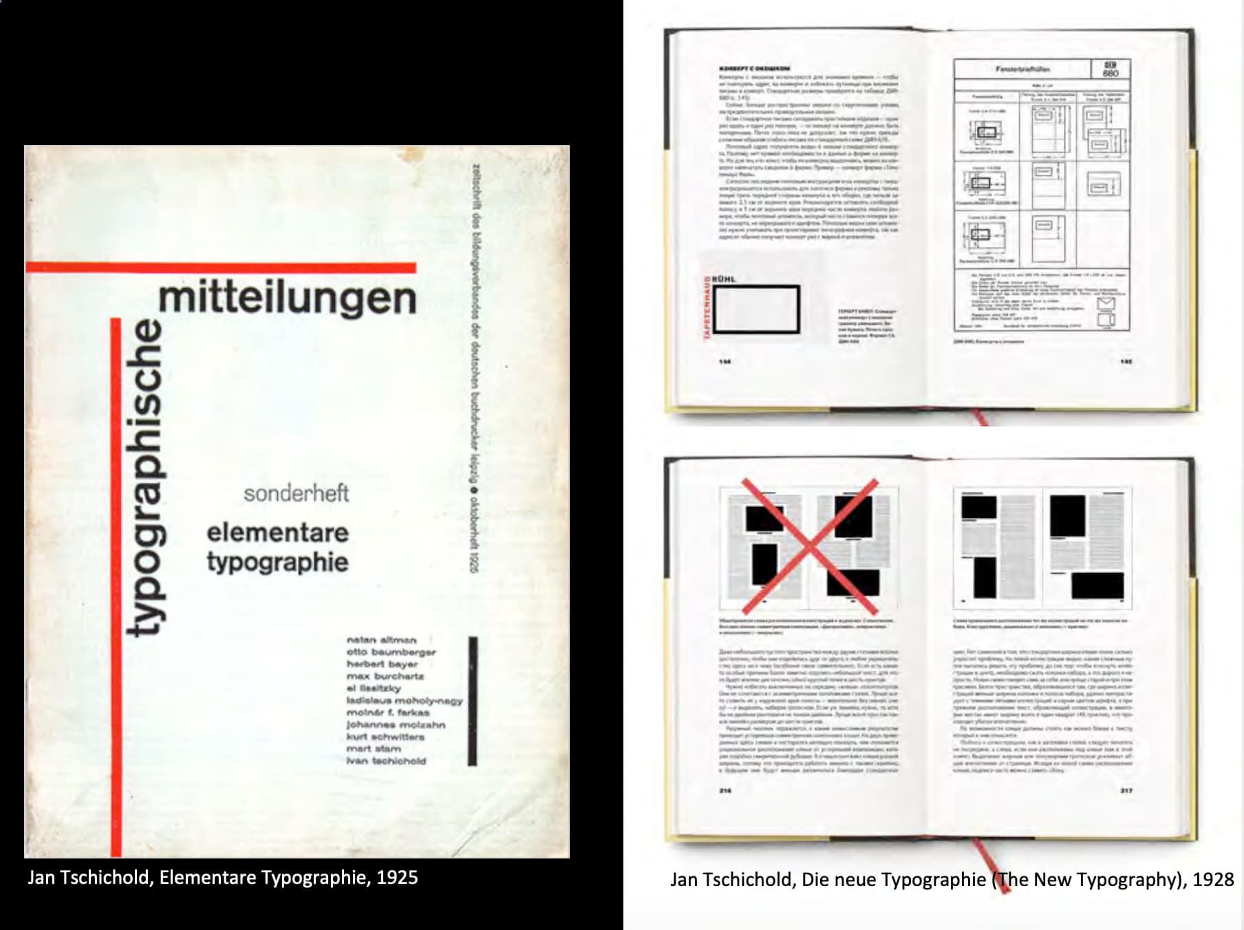
This book set out of a series of stern foundational principles for good design.
- Use of San serif typefaces
- standardized paper sizes
- photography rather than drawn illustration
- asymmetrical rather centred layouts
Quick colour theory

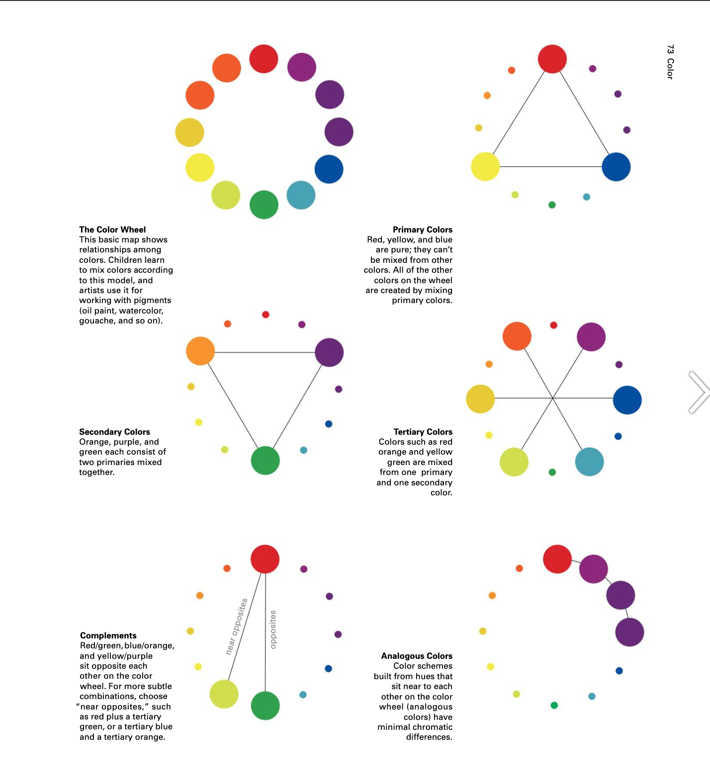

Value应该指的是黑白关系.
Hue是色相.

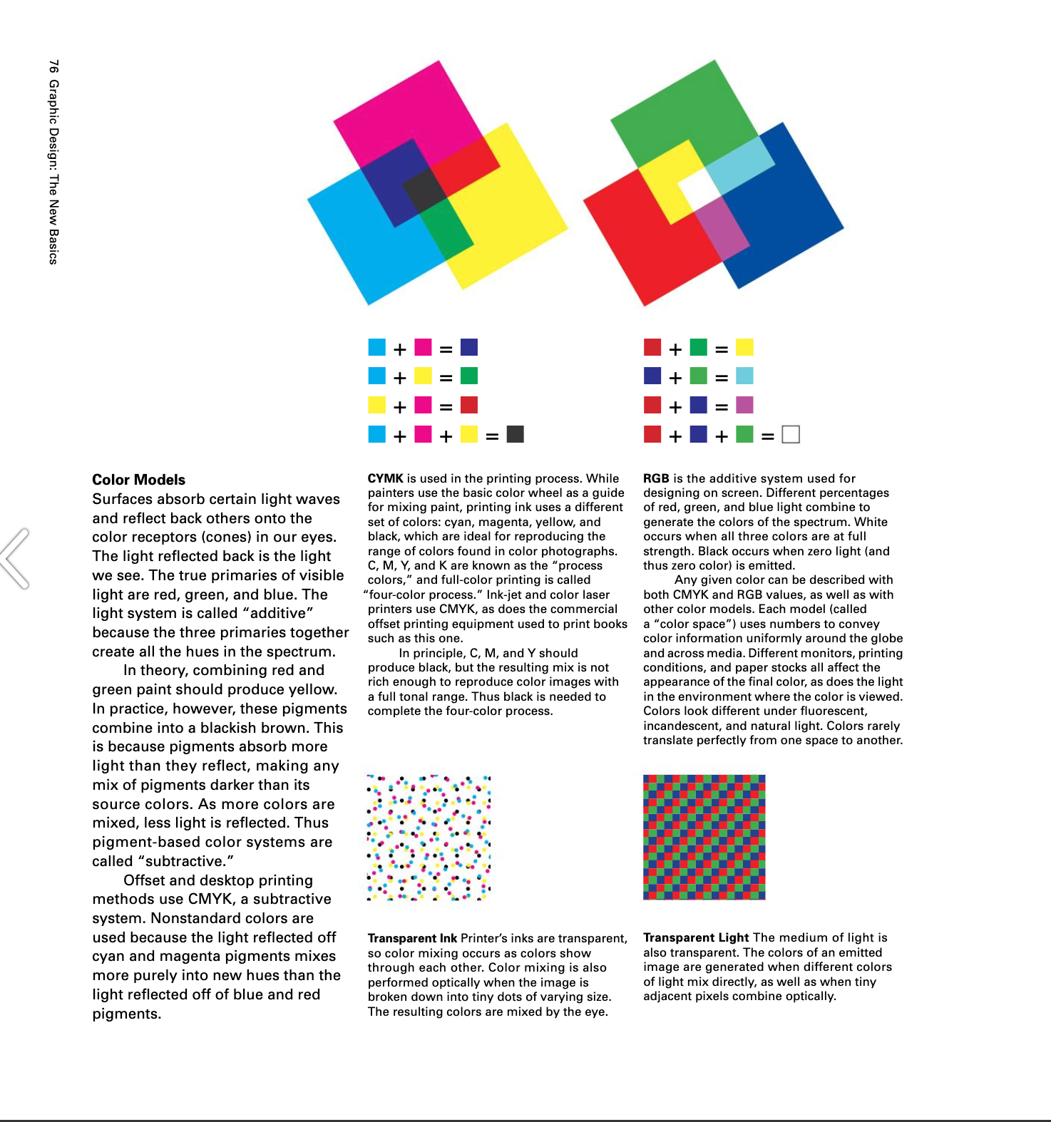
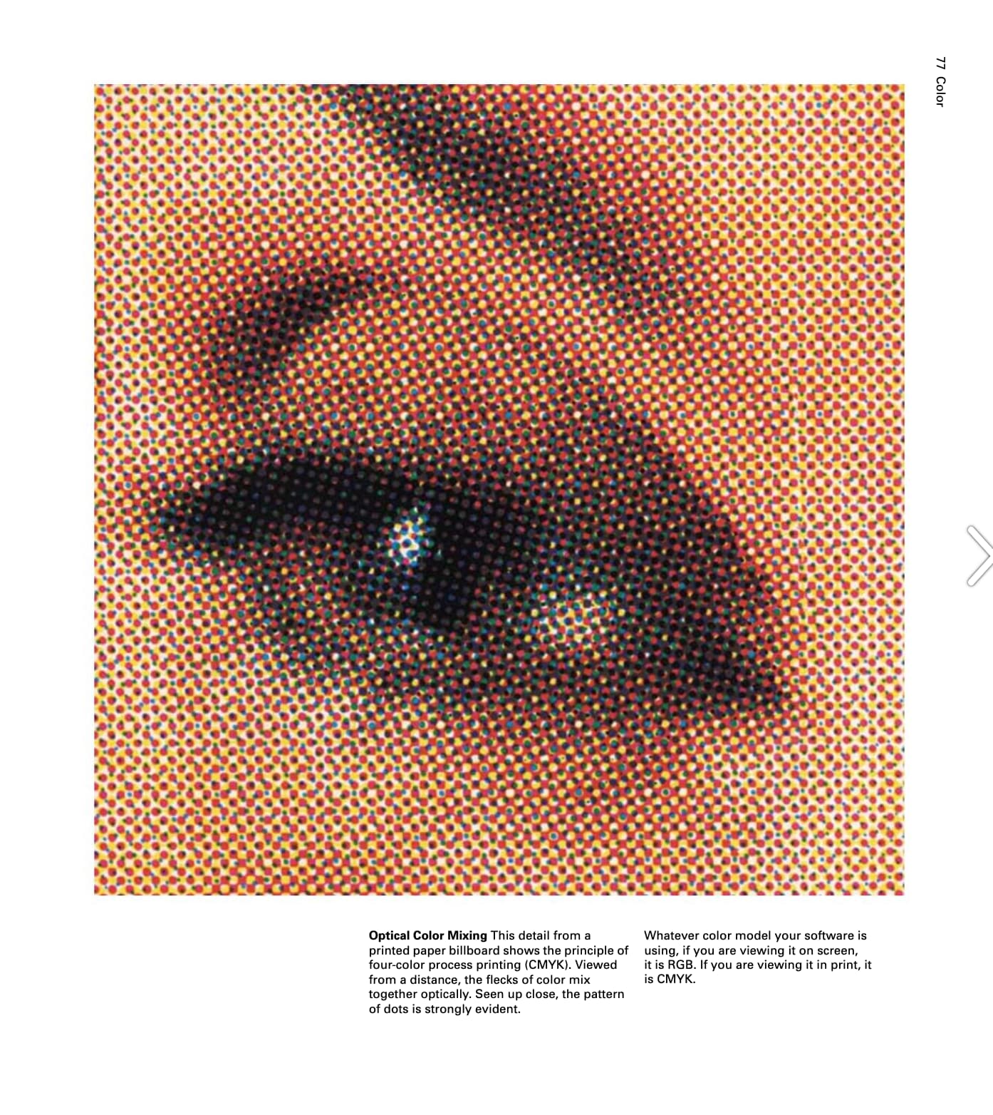

老师Demo的indesign colour theme tool.
屏幕下方的色卡是colour theme tool generate的.
Adobe一直好牛逼…
Logo history
以下两节section的笔记有些不同.
一节老师准备讲课,因为太长于是删了.一节作业来不及.
对着笔记尝试用量子阅读,总结的部分会少.
Corporate Identities and Visual Systems

Albrecht Durer, signature, 1502
William Rittenhouse, watermark, 1690
Aldus Manutius, Aldine Press, 1494
Joannes de Colonia, printer’s mark,1481
Guild Hall, trademarks, undated
Logo的诞生:
- The need to identify the maker to ensure quality and repeat customers
The watermark(WR) made by William Rittenhouse in the first American paper mill founded in Philadelphia in 1690.
A printer’s mark originated with the master printer Aldus Manutius, who started his famous Aldine Press in Venice in 1494.
Printer’s Devices: Many early printers used the combination of the orb and the cross, a signifier of the earth and Christianity. Joannes de Colonia, Venice, 1481
Trademarks: During the Middle Ages European trade guilds began using marks to identify the origin and content of their products.
- The term “hallmark” comes from the identification marks that metal artisans stamped into metal when exhibiting wares.
(这个很有意思.)
- In the image the anchor refers to the town where the product was made, the lion signifies the type of metal (sterling silver) and the letter B is a date letter that refers to the year the item was marked.

Bass Red Triangle, 1875
Michelin Man poster by “O’Galop” of Bibendum, 1898
- The need to formalized trademarks parallels the rise in mass production methods of the 19th century.
(跟字体受工业革命影响一样.)
In 1875, in England, the Trademark Act established the commercial worth of trademarks in a controlled central registry, the recognition of trademarks as exclusive property and outlined the first legal protection of trademarks within the UK and internationally.
The Bass Red Triangle was first trademark to be registered under the act. One of the most distinctive, identifiable and historically significant logos and brands in the world, it was dropped when Bass was purchased by Coors.
Instead of identifying local craftsmen, trademarks were used by large companies who shipped their products farther afield. These corporate trademarks transported the reputations and standards of quality of their makers.

讲回Bauhaus.
Josef Hoffmann (1870–1956), Tobacco case, Vienna, 1912. Josef Hoffmann, flatware service, Vienna, ca. 1904–1908 Josef Hoffmann, Samowar, 1904.
Wiener Werstätte, various marks, 1903
Joseph Hoffmann, logo, 1903
The work of architect Josef Hoffmann and the Wiener Werstätte, or Vienna Workshops formed in Austria in 1903.
This co-operative of artisans and artists united with the goal of making products that merged pure and applied arts.
Designer Joseph Hoffmann used a geometric shape, the square, as the foundation for a set of marks to identify the organization.
A monogram of the letters WW was used on printed matter.
A stylized rose was used to identify products from the workshops.
By 1913 the Wiener Werstätte symbol was officially registered as a Trademark.
Despite the communal spirit of the Wiener Werkstätte there were accommodations for individual recognition.
Products were imprinted with both the workshop symbol and marks identifying each designer and craftsman involved in the production.
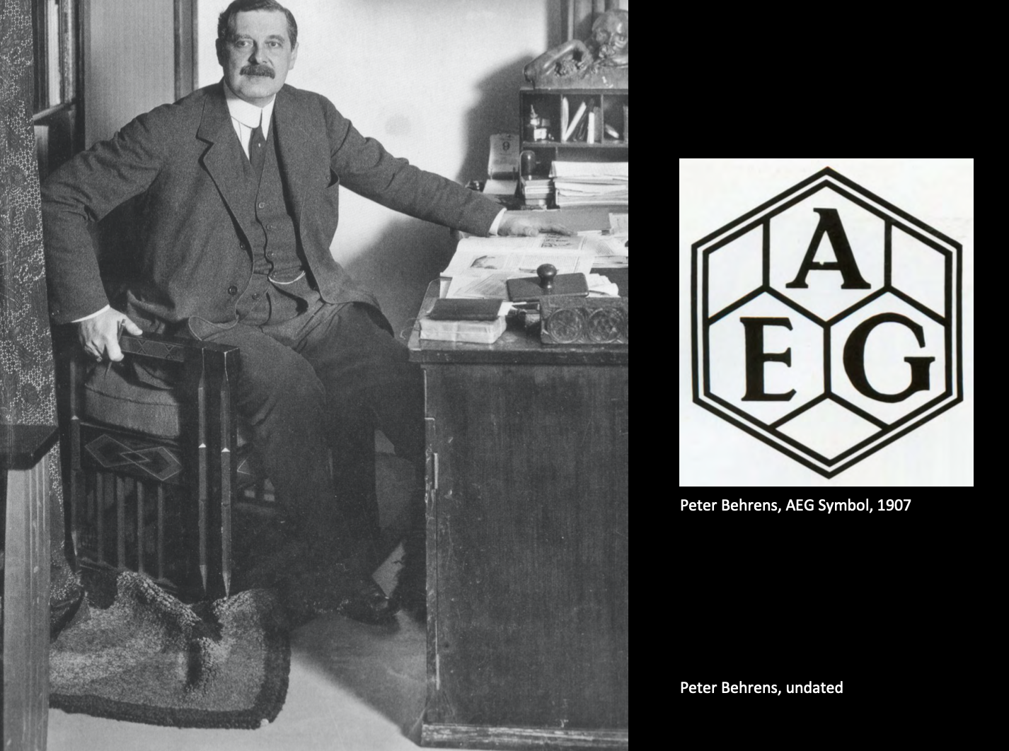
Peter Behrens was a German architect and designer who was part of the Jugendstil style, who collaborated on designing the Berlin journal “Pan”
In 1907, AEG a German company bought the electrical rights from Thomas Edison, Peter Behrens was hired as the artistic adviser to AEG.
Used the geometric hexagon (6 sided) symbol as the anchor for an entire design scheme applied to the print work, products and architecture.
Behren’s design program for AEG is recognized as the first complete corporate identity system, which included; factories, retail stores, products, promotional material, catalogues, posters, logo and a typeface.
According to Meggs, “The AEG graphic identity program made consistent use of three linchpin elements that would be present in corporate identity programs as the genre evolved half a century later: a logo, a typeface and a consistent layout of elements following standardized formats.”
Typeface Behrens Antiqua: three important goals in designing this new face:
- It differentiated AEG communications from all other printed matter;
- Its forms were universal rather then individualized (handscript);
- It strove for a character that could evoke connotations of quality, consistence, & performance
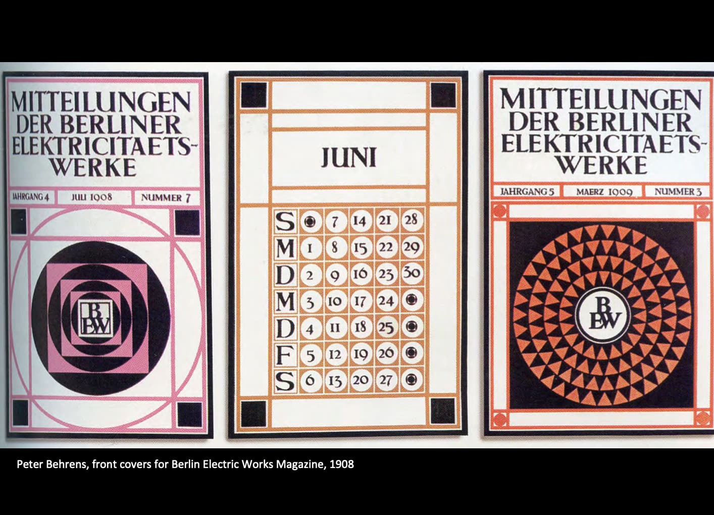
The consistent use of graphic devices gave AEG graphics a unified image.
These elements were a modular divisions of space using Dutch architect J.L.M. Lauwerik’s (1864- 1932) grid.
- geometric systems
- framing the space with a medium weight rule;
- central placement of static elements;
- exclusive use of Behrens-Antiqua type;
- use of colours was consistent black and another colour;
- and simple, objective photographs and drawings with subjects isolated from their environments
- modular systems and harmony and proportion

Walter Ballmer, logo redesign, 1970
The company was founded as a typewriter manufacturer in 1908 in Ivrea, near Turin, by Camillo Olivetti. The firm was mainly developed by his son Adriano Olivetti. Olivetti opened its first overseas manufacturing plant in 1930.
Olivetti was famous for the attention it gave to design:
Preoccupation with design developed into a comprehensive corporate philosophy, which embraced everything from the shape of a space bar to the colour scheme for an advertising poster.

- For Olivetti, the designer is not simply a “stylist” responsible for the aesthetics of the object, but a specialist who works side by side with the developer to make sure that the object’s characteristics and functional attributes are conveyed in as direct and genuine a manner as possible.
In short, design is a question of substance, not just of form; it is the tool the company uses, through its products, graphics and architecture, to convey an image that is not simply appearance, but a tangible reflection of a way of being and operating.
- Jonathan Martin, International Directory of Company Histories
In 1952, the Museum of Modern Art held an exhibit titled “Olivetti: Design in Industry”。
Logo design is another area to which Olivetti has always paid close attention, from the early versions designed by founder Camillo Olivetti, through the re-workings of Giovanni Pintori to the current trademark, designed in 1970 by Walter Ballmer.
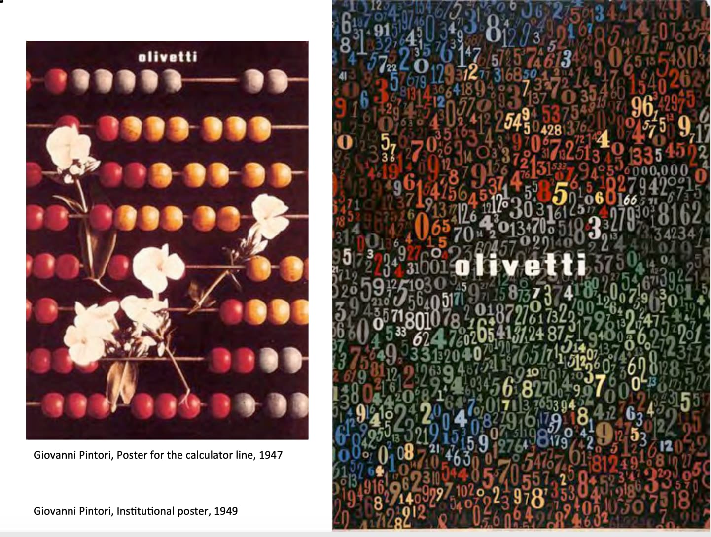
Advertising and institutional graphics.
As early as the 1930s, the Development & Advertising Office, over the years, a number of painters, graphics artists, scholars and architects have been involved in the development of graphics art and advertising communication to match the Olivetti style and the characteristics of its products.
Giovanni Pintori, who worked with Olivetti between 1938 and 1968, his work complemented that of the product designers and architects who were planning Olivetti’s buildings and also designing graphics, exhibition stands or gift objects.

Shape and Color of the Olivetti Logo:

The Olivetti logotype attains its cohesiveness from the compact packing of the eight letters, with their small ascenders of equal length.
The dots of the i’s are somewhat reminiscent of a typewriter key, while the radiused corners of the lowercase characters renders a more playful and approachable visual aspect.
In addition, the stylistic treatment of the letter e adds distinctive originality and freshness to this memorable logotype.
The logotype uses Pantone Process Blue as well as Black color.
The new Olivetti logo, featuring red color, is a slight extension of the classic Olivetti logotype.
其中我指大概懂了圆角的确看上去很快乐.

Raymond Loewy was an industrial designer, and the first to be featured on the cover of Time Magazine, on October 31, 1949.
Born in France, he spent most of his professional career in the United States.
Left an indelible mark on America’s history of visual styling, his streamline stylings and modern aesthetic was applied to graphic design, architecture, industrial design, packaging and packaging.
Among his work were the Shell and former BP logos, the Greyhound bus, the Coca-Cola bottle, the Pennsylvania Railroad GG1 and S-1 locomotives, the Lucky Strike package, Coldspot refrigerators, the Studebaker Avanti and Champion, and the Air Force One.
His career spanned seven decades.
- the streamline style
- from the early 1930s through into the 1950s, a streamline style flourished.
- its most important characteristic are the closed, streamlined forms that strongly suggest speed, symbolic of the dynamism of modern times. the sharp corners and transitions of objects were rounded off. knobs, handles and hand grips were recessed.
- speed lines were created by introducing ribs or gleaming chrome strips.

The Exxon Logo:
He proposed ‘exxon’ and came up with seventy-six rough pencil sketches based on the word, placing the visual emphasis on the double ‘x.’
The two x’s subliminally recalled the ‘s’s’ in esso and thus helped ease the transition from the old name to the new.
Shell Oil:
In 1967, the shell company approached loewy with a design problem
Its emblem was difficult to distinguish from a distance, or in poor lighting. the logo is still in use today.
The pecten (shell’s version) has gone through some facelifts over the years. In fact the first pecten wasn’t a pecten (scallop shell) at all.
Tt was a mussel shell introduced in 1900 and replaced in 1904 by the first version of the scallop shell motif.
The pecten symbol currently in use worldwide was designed in 1971 by loewy. the design and testing process completed by loewy’s firm took more than four years.
One of the tests involved hanging various prototype pectens on poles where they could be viewed by drivers passing on a nearby british motorway.
Drivers were later contacted for their opinions on the prototypes.
Regarding his logo designs Lowrie is quoted as saying, “I’m looking for a very high index of visual retention.
We want anyone who has seen the logotype, even fleetingly, to never forget it.”

CBS had a branding position based on the principles of intelligence, elegance, taste, and even beauty.
William Golden was the perfect art director for CBS in the late thirties, which was a time of rapid growth and technological development.
Before working for CBS Golden worked for Dr. Agha at Vogue, who was clearly a mentor that unlocked the creative talents.
- the CBS logo applied to print applications
- incorporated into a typographic treatment
- or used in conjunction with the wordmark
The symbol is still in use today.
According to the NY Art Director’s Club, tribute) “Golden created an impeccable standard in corporate advertising and promotion, establishing a design environment that was as inspiring as it was intellectual, uncomplicated as it was profound, and inventive.
Known for his clarity of a designer’s vision.
He considered the content of a communication and the inherent logic of a problem as fixed factors.
If the message is borne lightly, logically and tastefully, and produced faultlessly, it will reach eyes, ears and even hearts with a more penetrating effect.”

Paul Rand (1914-1996) remains one of the most famous graphic designers in the world.
An American graphic designer, best known for his corporate logo designs, including the logos for IBM, UPS, Enron, Westinghouse, ABC, and Steve Jobs’ NeXT.
Rand was educated at the Pratt Institute (1929–1932), Parsons The New School for Design (1932–33), and the Art Students League (1933–1934).
He worked in all aspects of graphic design and advertising agencies and started to gain national acclaim by his late 20s.
One of his early instructors, Laszlo Moholy-Nagy noted:
Among these young Americans it seems to be that Paul Rand is one of the best and most capable [. . .] He is a painter, lecturer, industrial designer, [and] advertising artist who draws his knowledge and creativeness from the resources of this country.
He is an idealist and a realist, using the language of the poet and
business man.
He thinks in terms of need and function. He is able to analyze his problems but his fantasy is boundless.
He played a pivotal role in the evolution of graphic design and advertising during the 1940s and 50s and he is renowned for his corporate logo designs.
In 1954, Rand became the design consultant to numerous large and influential companies—IBM, Westinghouse, and UPS.
Interview with graphic designer, Paul Rand-Part 1 of 3
Interview with graphic designer, Paul Rand-Part 3 of 3

Rand wrote: “A trademark is not merely a device to adorn a letterhead, to stamp on a product, or to insert at the base of an advertisement; nor one whose sole prerogative is to imprint itself by dint of constant repetition on the mind of the consumer public.
The trademark is a potential illustrative feature of unappreciated vigor and efficacy; and when used as such escapes its customary fate of being a boring restatement of the identity of the product’s maker.”
The role of the logo is to point, to designate—in as simple a manner as possible.
A design that is complex, like a fussy illustration or an arcane abstraction, harbors a self-destruct mechanism. Simple ideas, as well as simple designs are, ironically, the products of circuitous mental purposes.
Simplicity is difficult to achieve, yet worth the effort.
The effectiveness of a good logo depends on:
- distinctiveness
- visibility
- usability
- memorability
- universality
- durability
- timelessness

The 1964 summer games in Tokyo was the first use of a comprehensive identity system, setting a standard for all subsequent games.
22 symbols based on pictographs representing the sports created a standardize signage system:
- designed for a multi-lingual audience and strove for a universal language
- information pictographs were also created
- used for interior and exterior building signage, wayfinding systems, advertising
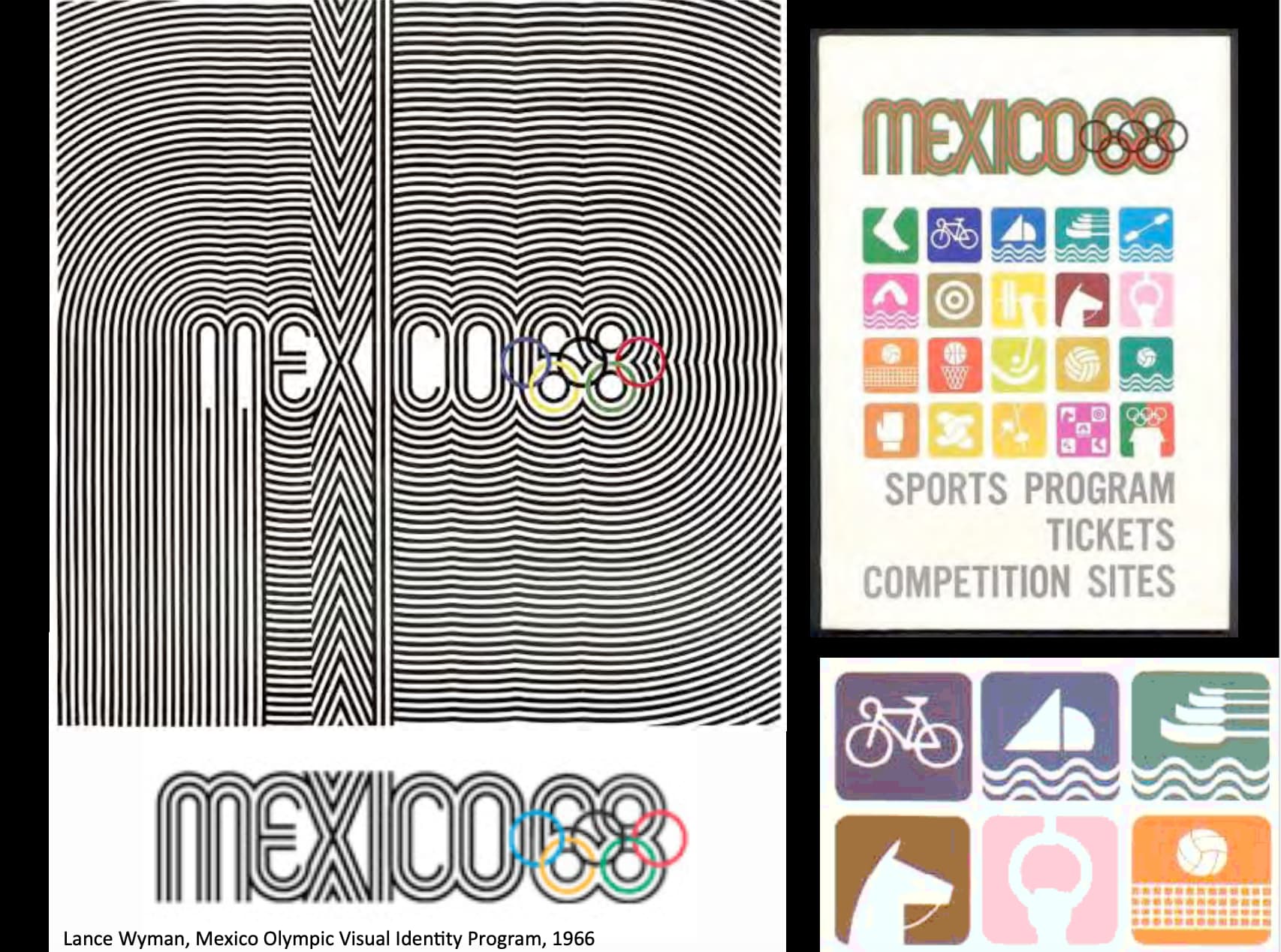
“In 1966 I went to Mexico City with Peter Murdoch to participate in a competition to design the graphics for the 1968 Mexico Olympic Games. The Mexico68 logotype that I designed was instrumental in winning the competition.”
The resulting design program, a multidimensional integration of logos, typography and color, developed to communicate to a multilingual audience.
Combined Mexico’s cultural heritage Aztec artifacts and Mexican folk art led to two features in the design program, the use of repeated multiple lines to form patterns and the use of bright hues.
Reflecting Mexician arts and crafts, adobe homes, paper flowers, marketplaces and clothing sang with pure colour.
The system encompassed pictographic symbols for athletic and cultural events, site identification, directional signs, information posters, maps, postage stamps, film titles, and TV spots.
According to Meggs:
“Wyman’s goal was to create a completly unified design system easily understood by people of all language backgrounds and flexible enough to meet a vast range of applications.
Measured in terms of graphic originality, innovation functional application, and its value to thousands of visitors to the Mexican Olympiad, the graphic design system developed by Wyman and his associates in Mexico was one of the most successful in the evolution of visual identification.”
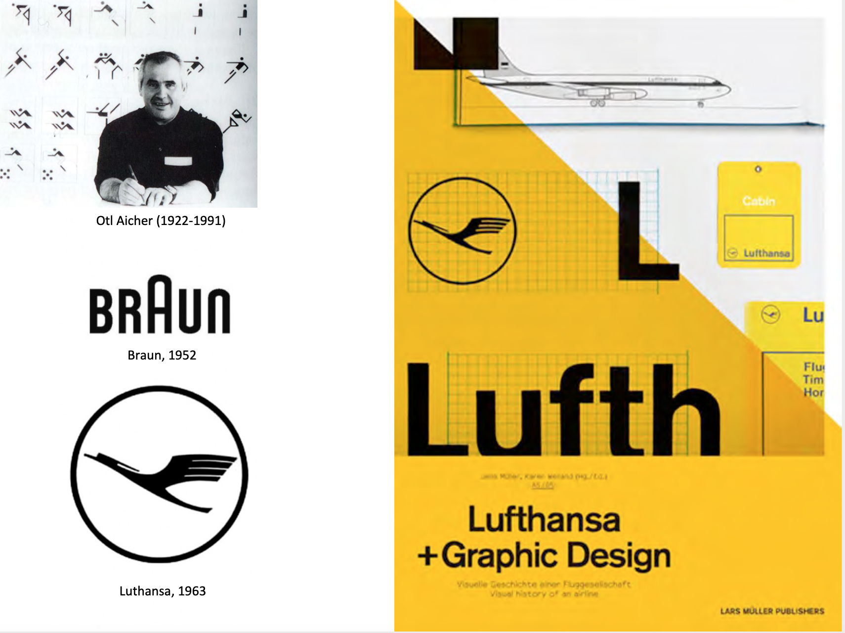
Otl Aicher was a German designer whose work has been enormously influential.
Like Rand, he understood the need for simplicity and clarity in his work. Yet, rather than making a simple mark to represent a company, he created entire visual systems that were minutely controlled.
In the city of Ulm, Germany Aicher along with Max Bill and Inge Scholl founded a school University of Design of HfG with a curiculm based largely on Bauhaus principles also included semiotics the study of signs and symbols that convey meaning.
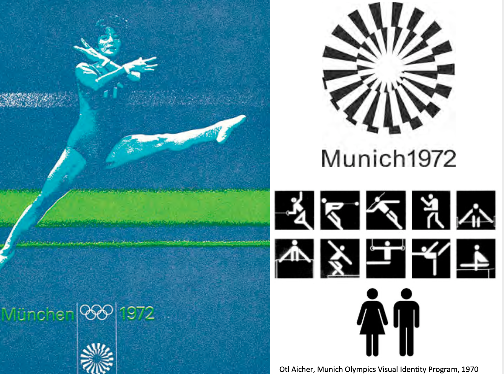
Aicher may be best known for being the lead designer for the 1972 Munich Olympics.
Aicher’s knack for visual systems caught the attention of the 1972 Munich Olympics, he was hired as head designer.
The consistency of the visual system for the 1972 games, makes Munich one of the most memorably designed Olympics.
Univers typeface was used in different weights and sizes.
To overcome language barriers, Aicher created a series of simplistic pictograms representing each event.
Variations on and iterations of these pictograms have been present in the Olympic Games ever since.
He created a new set of pictograms that paved the way for the ubiquitous stick figures currently used in public signs.
Pictographs that emphasized the movement of that sport which were used in identification signage and way finding system.
The geometry of these forms were in contrast to the high contrast photographic based promotional posters.
Colour palette consisted of four cool and two warm colours.

Saul Bass was a graphic designer and Academy Award-winning filmmaker, but he is best known for his design on animated motion picture title sequences, which is thought of as the best such work ever seen.
Bass was responsible for some of the best-remembered, most iconic logos in North America.
For Bass a logo must be readily understood yet posses elements of metaphor and ambiguity that will attract the viewer again and again.
According to Bass:
“In theory, a corporate trademark represents the key visual phrase that conveys the essence of what is useful for a corporation to communicate about itself.
I find corporations almost as fascinating as people. Every company I have ever worked for has a unique aura.
The secret and the challenge are learning how to express and make comprehensible the subtext.”
Bass had a remarkable ability to express the nucleus of a design with images that become glyphs, or elemental pictorial signs that exert great graphic power.

The titles he created for “The Man With The Golden Arm,” “Anatomy Of A Murder,” “West Side Story,” “Walk on the Wild Side,” and “Around The World In Eighty Days” are still considered by many as examples of a visual and conceptual sensibility rarely matched in Hollywood films before or since.

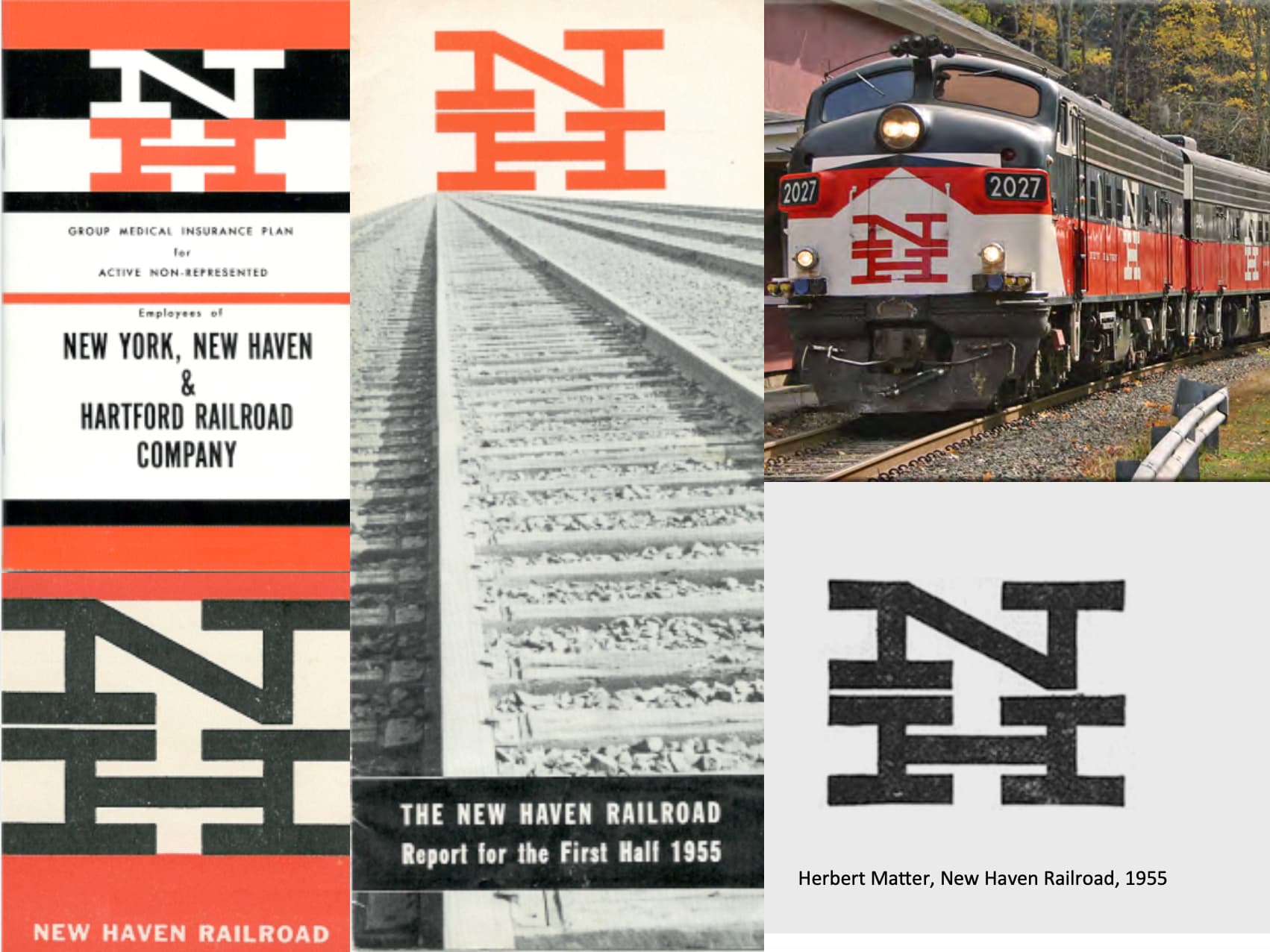
CN commissioned New York designer James Valkus to study the problem of a new identity for the railroad and come up with a solution.
After reviewing CN end-to-end, Valkus became convinced that what CN needed was not just a new trademark but a complete overhaul of its visual image - from locomotive paint schemes and building exteriors right down to the sugar packets used on passenger trains.

Part of the International Typographic Style, his work can be characterised as being spare, essential, intellectually elegant, strong, timeless.
My work has been pretty much consistent, from the beginning, but I think it has undergone a continous refinement, to become more and more essential.
Like the initiators of the Swiss Grid Style, Vignelli, believes that;
- Design is a socially worthwhile and serious vocation.
- There is no room for eccentricity and/or idiosyncrasy. Design should be grounded on universal artistic principles
- The designer is a visual communicator and not an artist. The designer acts as an objective and reliable transmitter of important information between members of society.
- The goal of design is to achieve clarity and order.

According to Megg’s the design challenge for the LA Olympic Games consisted of;
“how to temporary transform these far flung facilities to create a unified celebratory feeling, express the international character of the games, and invent a designed environment that would work effiently both on site and for the global TV audience.
Design elements were divers within a fixed range and included a colour palette of magneta, cyan, yellow, and a secondary palette of lighter tints of yellow, green, violet and blue.
The graphic elements consisted of stars and strips based on the American flag combined with the star in motion motif.
These elements were freely pulled apart and rearranged for the numerous graphic applications.

Over the years they have produced over 100 corporate symbols for high-profile corporations According to the partners
“In defining the approach, the criteria necessarily change from client to client. But such characteristics as memorability, appropriateness, legibility and flexibility are almost always desirable.
Media must also be considered, of course: a mark that will flash by on a screen has different requirements than one that will be mounted to the side of a building.
Less obvious is the level of exposure the mark will receive is also pivotal–if a mark will have wide exposure, more liberties can be taken with it.
The contexts in which the mark will be seen, and the audiences it will address, may demand specific symbolic meanings, visual languages, and social attitudes.
Together these considerations provide a set of restrictions and requirements that is specific to each client.
They become the performance criteria that helps guide the design style and limit the territory that needs to be explored.”

1), If you come back and tell me our colors need to be pink and green just give me very good reason to do it and
2), If I’m standing on a street corner, I need to see a FedEx truck from five blocks away. Meaning that the brand expression needed to be large, impactful and differentiating.
If you put a lower-case ‘x’ to the right of a capital ‘E’(Ex) you can begin to see a hint of an arrow, though it is clumsy and extremely abstract.
I thought that, if I could develop this concept of an ‘arrow’ it could be promoted as a symbol for speed and precision, both FedEx communicative attributes.
The power of the hidden arrow is simply that it is a ‘hidden bonus.’ It is a positive-reverse optical kind of thing: either you see it or you don’t. Importantly, not getting the punch line by not seeing the arrow, does not reduce the impact of the logo’s essential communication. The power of the logo and the FedEx marketing supporting the logo is strong enough to convey clearly FedEx brand positioning. On the other hand, if you do see the arrow, or someone points it out to you, you won’t forget it.

Logos with hidden visual components.
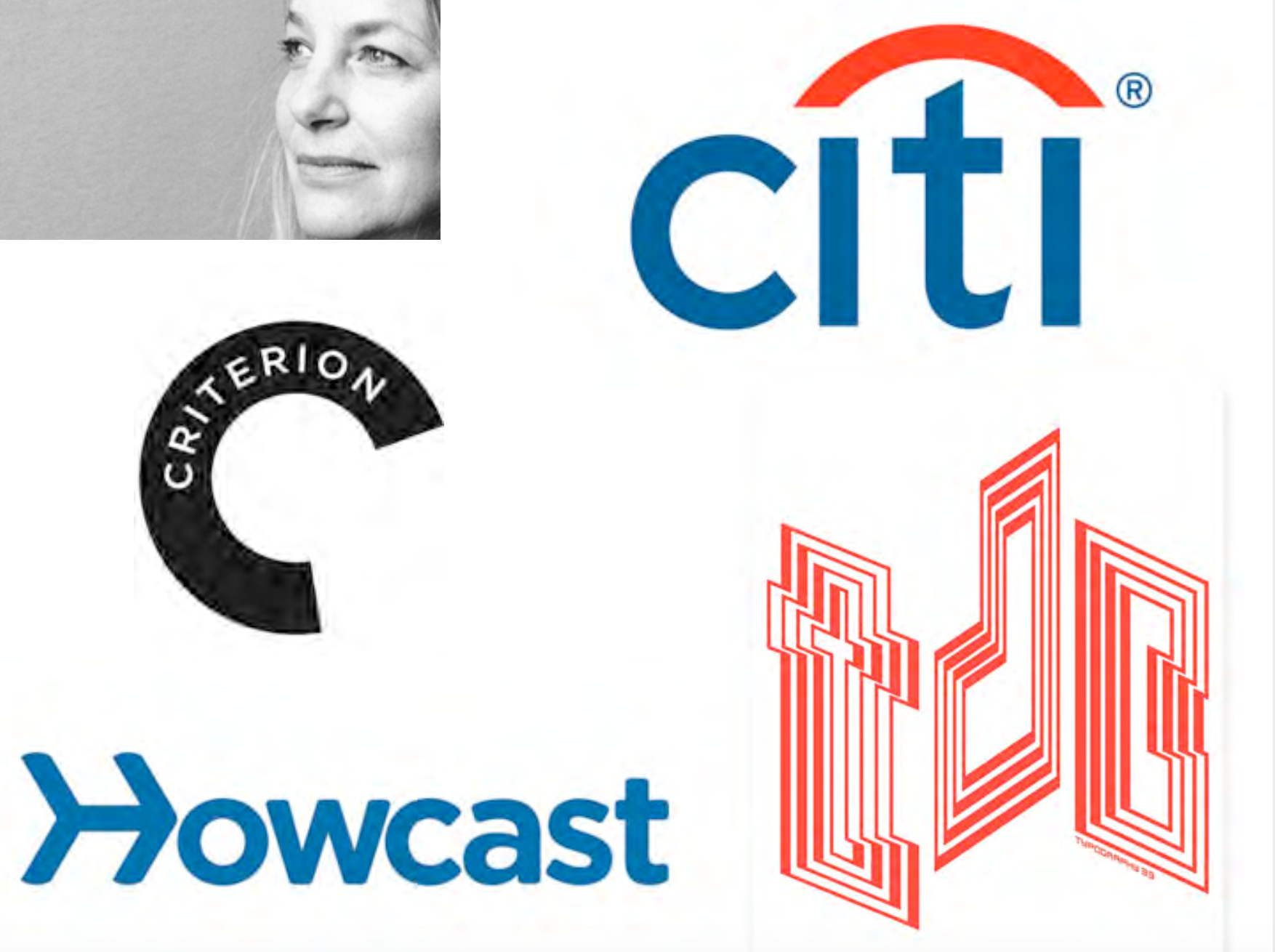
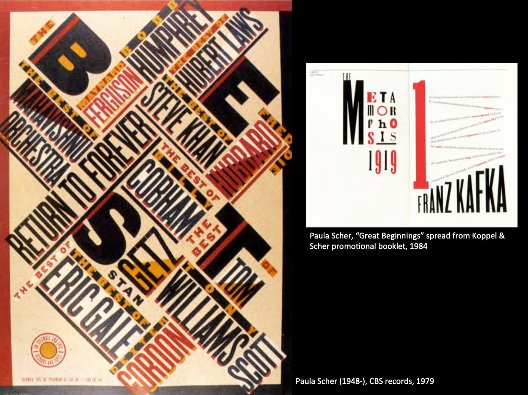
Paula Scher
Drawing from what Tom Wolfe has called the “big closet” of art and design history, classic and pop iconography, literature, music and film, Paula creates images that speak to contemporary audiences with emotional impact and appeal.
Logo is just one element of your overall brand messaging, and needs to be considered in context of the whole.
Strong photography is what really brings life to the logo.
Drama is the singular emotional response.
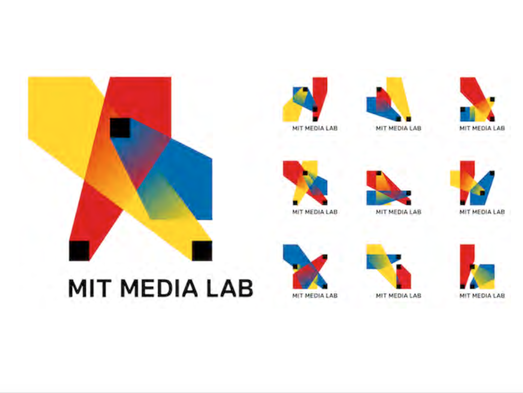
To honor 25 years of backseat-driving robots and vision-scanning iPhones and touchscreen- keyboard-3-D-display hybrids, the MIT Media Lab tapped Brooklyn-based designers E Roon Kang and Richard The to dream up a fresh visual identity. The result is an algorithmic logo that generates a different image for each of the Lab’s employees.
An algorithm can create 40,000 logo shapes in 12 different color combinations, providing the media lab an estimated 25 years’ worth of personalized business cards.
竟然是运算出来的,真是MIT的风格…运算出来的也好好看啊,这就是科技的美感吗(?).

最后拿ocad的logo收尾真是有趣呢.
竟然还有如此复杂的logo使用规则.
在logo中正好可以alter不同的图片这个设计真的很有趣!
1970 to Present
Modernism
Modernism, the term describes the modernist movement, in the late 19th and early 20th centuries.

Modernism was a revolt against the conservative values of neo-classicism, realism and a rejection of tradition.
A symbol of the movement’s approach was from the American poet Ezra Pound 1934 statement of “Make it new!”
The building selected for display were chosen to demonstrate three formal principles:
- Volume over mass
- Regularity over symmetry
- Rejection of applied ornament

In postwar climate there was an optimiztic believe by politicians, urban planner and architects that they could fix the problems with inner city slum conditions.
In 1951 the Pruitt-Igoe housing project was designed by Minoru Yamasaki.
At the time it was built it epitomized American postwar confidence in urban planning, and social housing, technology, forward-thinking ideas, progressive and modern.
Example of modern designers who believed that modern design had a moral underpinning that would help people improve their circumstances and that they had the answer to complex urban issues and that the solution was to built clean, contemporary, neutral structures and environments.
然而Became a centre for poverty, crime, drugs and prostitution and that people did not take ownership of their environment.
By 1972, it was being demolished, having become a symbol of the failure of government intervention into social housing problems, the utopian intentions of ideologically driven architects and designers and as some more astute observers would have it, the end of modernism.
Post Modernism
Postmodernism is movement evolved in reaction to modernism, it questioned the tendency in contemporary culture to accept only objective truth.
Postmodernism postulates that many, if not all, apparent realities are only social constructs and are therefore subject to change and re-interpretation.
It holds realities to be plural and relative, and to be dependent on whom the interested parties are and of what their interests consist. It supports the belief that there is no absolute truth and that the way in which different people perceive the world is subjective.
Postmodernism in architecture is marked by the re-emergence of surface ornament, reference to surrounding buildings in urban architecture, historical reference in decorative forms.
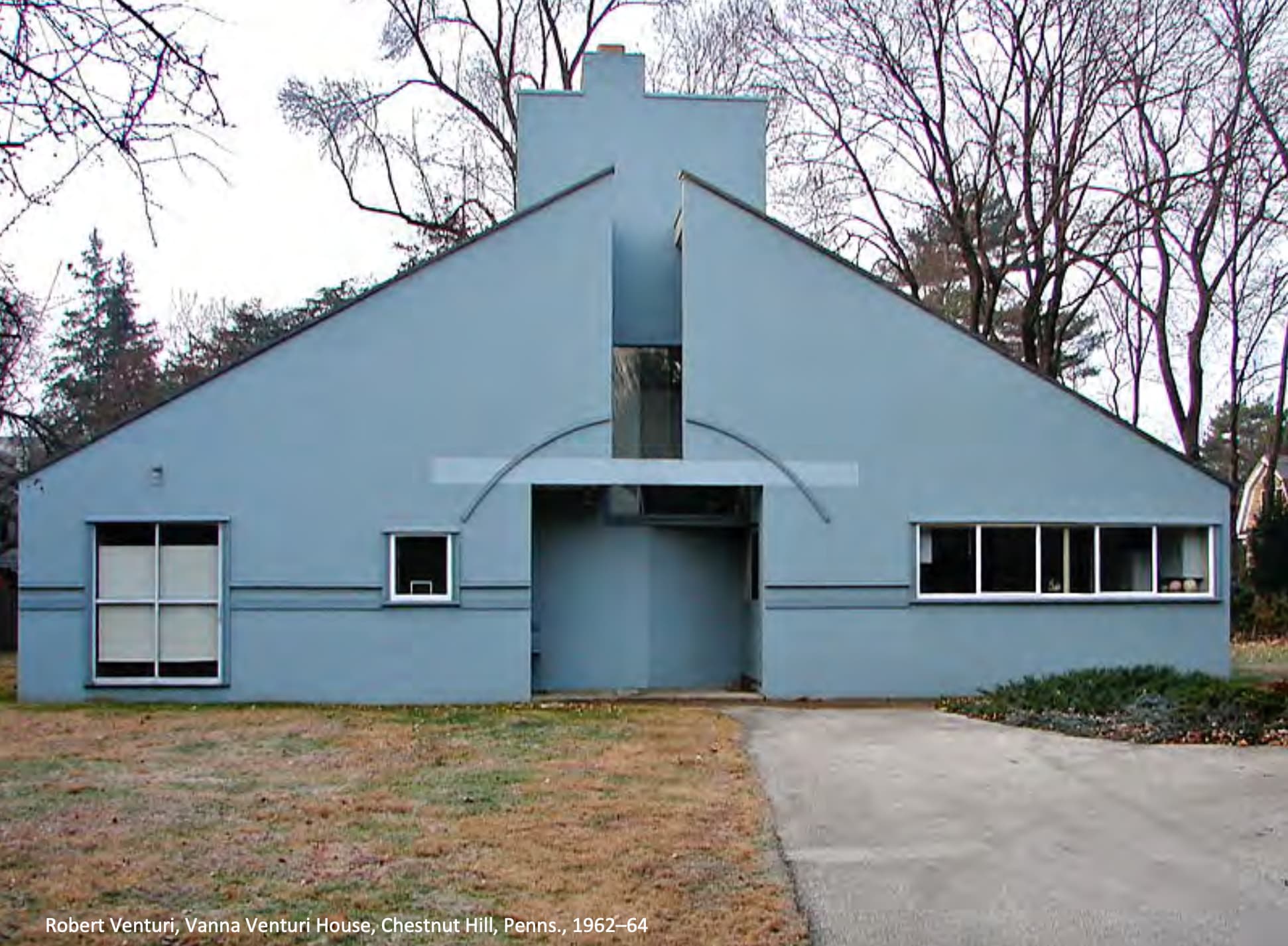
He published, “Complexity and Contradiction in Architecture” in 1966.
The book demonstrated an approach to understanding architectural composition and complexity, and the resulting richness and interest, drawing from both vernacular and high-style sources.
He is also known for coining the maxim “Less is a bore” a postmodern antidote to Mies van der Rohe’s famous modernist dictum “Less is more”.
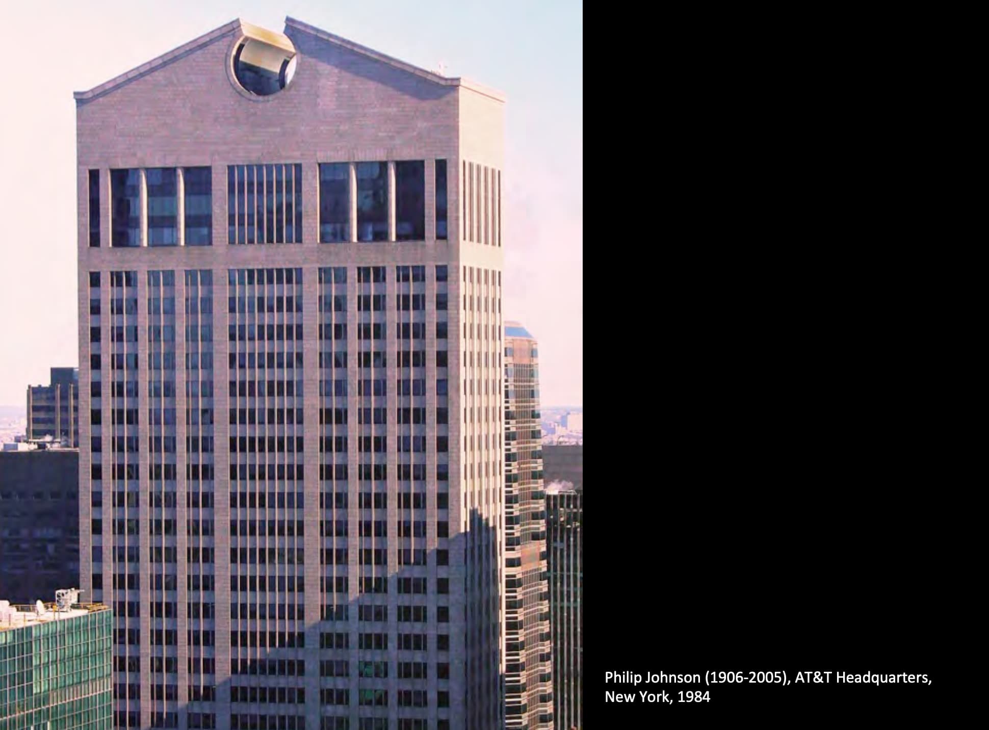
Johnson who was one of the curators for the Exhibition of Modern Architecture at the MoMA in 1932 and a big supporter of Mies van de Rohe moves away from the International style and embraces postmodern themes, forms and materials.
Johnson references (architecturally) historic elements. However, he does so with a twist. The irony comes when it is noted that the building is clad in a warm coloured stone contemporary materials, oversized historic elements with contemporary materials.
The irony comes to: here is no real purpose of that shape other than to reference.

International Style

International Typographic Style:
- use of sans serif typeface
- use of just one font
- use of hierarchy through size and weight
- use of grids on single page items and multiple page documents
- use of photography
- creative use of placement of items to create negative space
- anyone from any country could design and understand, it was neutral and universally
The stylistic influences of European Modernism and The International Style on North American graphic design was immense.
But the social utopianism that was associated with it never reached NA.
Ironically this style was used by postwar global capitalists to promote their large multi-national corporations.
The simplicity of this style worked well as a unifying language of corporate identification across continents.
Reactions to Modernism in Graphic Design
说回mid 1960s因为counter culture的影响.
Postmodern designers borrowed indiscriminately from past style without adopting the ideology or aesthetic principles.
Designing for an audience that would be unaware of the historic references so it new and innovative.
Punk

Music played a major role in defining the culture of the 1960s along with album covers and magazines such as Rolling Stone.
Punk bands created fast, hard-edged music, typically with short songs, stripped-down instrumentation, and often political, anti-establishment lyrics.
Punk design graphics was dominated by D.I.Y. (do it yourself) techniques, outrageous subject matter, collage, photocopied imagery, defaced images, and basically any technique that broke the rules or seized the viewer’s attention.
Punk was developed and worked outside the graphic design industry and system.
Punk是一种民间艺术(?).
New Wave

在Punk同一时期,算system里的流行是New wave.
In design, New Wave refers to an approach to typography that actively defies strict grid-based arrangement conventions.
Characteristics include inconsistent letter spacing, varying type weights within single words and type set at unusual angles.
Weingart is a Swiss graphic designer and typographer, who studied at the Basel School of Design with Emil Ruder and Armin Hofmann (leaders of the International Typography Style).
When he began designing, the classical ‘Swiss typography’ was the dominate style for designers.
Weingart started to repel against the conservative design dogma and strict limitations that stifled his playful, inquisitive, experimental temperament and he reacted strongly against it.
He recognized too many good qualities in Swiss typography to renounce it altogether,so he used the positive qualities of Swiss typography as a base from which to pursue new typographic frontiers.
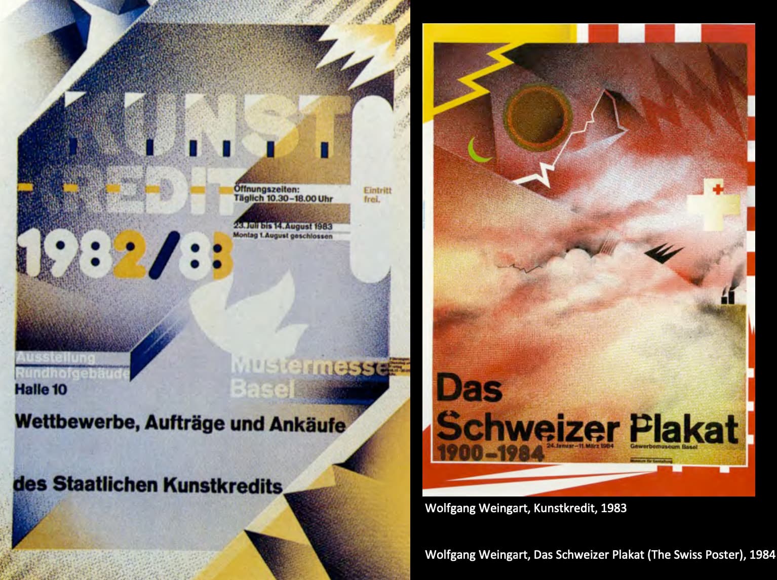
“type must not always be set flush left/ragged right, nor in only two type sizes, nor in necessarily right-angle arrangements, nor printed in either black or red. Typography must not be dry, tightly ordered or rigid. Type may be set center axis, ragged left/ragged right, perhaps sometimes in chaos. But even then, typography should have a hidden structure and visual order.”
Typographic innovations include:
- letterspaced sans serif type
- bold-stair stepped rules
- ruled lines punctuating and energizing space
- diagonal type
- the use italic type and/or weight changes within words and type reversed from a set of bars
Weingart found that the more complex the media (regarding visual treatment and technical production), the greater is our need for the mastery of basic formal design principles and production techniques, before we can responsibly and effectively handle the media.
Working with traditional and new media which included:
- hand-composed lead type and the letterpress;
- transparent film collages made with a repro-camera;
- graphic images made on the computer;
and lastly, new creations made possible by combinations of all of the above.
The sluggishness of lead type combined with the magic of film craziness and the infinite graphic possibilities of computers are perhaps the language of a new world of typography.

According to Friedman, ‘New Wave” had to do with being reductive – reducing messages in their essentials, relieving the typographic composition of extraneous information, producing a communication which purports to be universal.
Simplicity, precision and purity of form were the goals, and while I found that agenda important, it was also limiting.
So we experimented with ways of working against those limitations by including more information, different levels of information.
Legibility is based on order, convention, simplicity and on the reader as a passive recipient.
Readability/Unpredictability is the ability of a design to attract or seduce you, in an intense, virtually cluttered world, into reading it in the first place.
It is usually based on disorder, originality and complexity.

Greiman is recognized as one of the first designers to embrace computer technology as a design tool, and she is also credited with establishing the ‘New Wave’ design style in the US during the late 70s and early 80s.
Not only influenced by the International Style, but also by Weingart’s use of the New Wave style.

By the mid 1970s some of this complexity began to embellish basic American “Swiss” graphic design in the form of bars and rules and playful mixing of type sizes, weights and faces in an essentially formalist agenda.
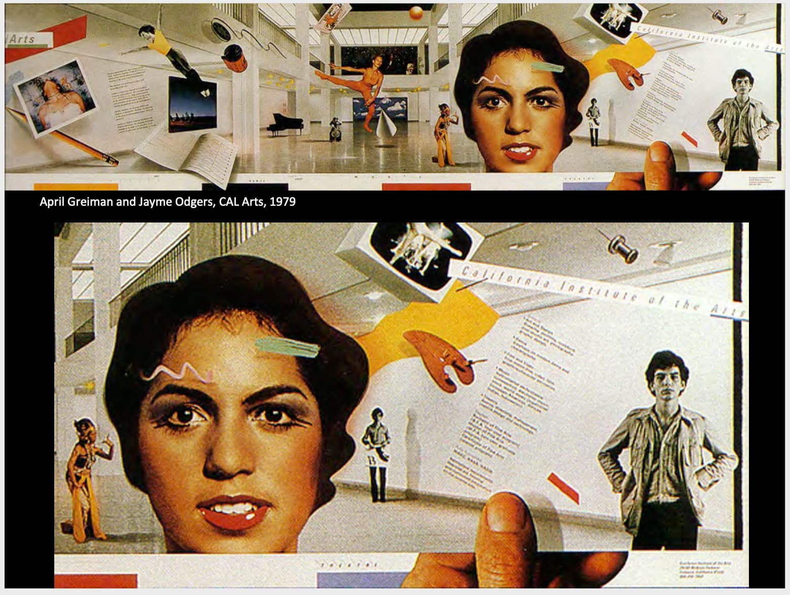
She began to experiment with ‘hybrid imagery’ a term referred to the synthesis of digital technology with traditional hand-drawn practices it was work that advertised it technology
“I love this notion which exists in physics as well—that the observer is the observed, and the observed is the observer. The tools and technologies begin to dictate what and how you see something, or how the outcome is predictable.”

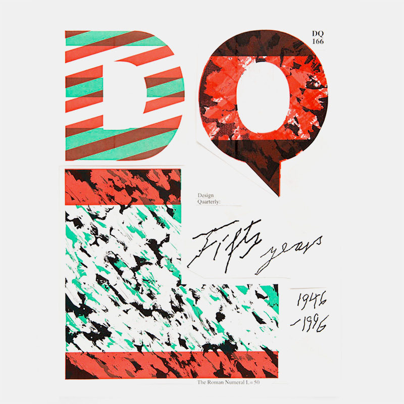
Before the appearance of “Design Quarterly” designers widely considered bit-mapped type and imagery not only unorthodox but unacceptable, straying too far from the clean, crisp precision of the International Style.
The computer itself was viewed as cold and unfriendly, wildly expensive, and a harbinger of the demise of fine design.
After the publication many designers felt compelled to reconsider the role of the computer in design practice and it triggered countless debates about computers, context, and creativity.

Other pioneers of the computer and digital font creation were Rudy VanderLans and Zuzana Licko.
Emigre was one of the first publications to use Macintosh computers and had a large influence on graphic designers. Its variety of layouts, use of guest designers, and opinionated articles also had an effect on other design publications.
Licko contsructed more fonts with bold, simple geometry, such as Matrix and Modula. Their cold, rational appearance served to anchor VanderLans’s free-spirited layouts.
Licko believed that the new technology could be the basis of a new aesthetic, she did not want to use the technology to continue to create in the old style, but that the compute and its limitations be the inventor of new forms.

Every issue was different. Sometimes several articles would run through the pages concurrently, each text differentiated by font, size, leading, and column width.
Their work was viewed as a threat to Modernist ideals and an affront to universal notions of beauty.
Emigre played with preconceived notions and industry standards of how type and magazine layouts are meant to be viewed, experienced and read.

- Alternating letters in different styles and weights
- Each letter in Graves name references to some aspect of his architectural language most notable the v which is modeled on the Portland’s building oversized painted keystone
- exaggerated geometric forms, bright vibrant colours which sometimes clashed, bold geometric and organic patterns, use of plastic materials with an allusion to historic styles
- emphasis on the decorative with surface and style becoming ends in themselves

He declared his intent to give meaning and messages “a tangible and inherent artistic value.
We see a new modernism evolving.
One not based on sterile minimalism and an absence of humanity, but one that is rich in cultural vocabulary and personal expression. “
Inspired by Russian Constructivism.
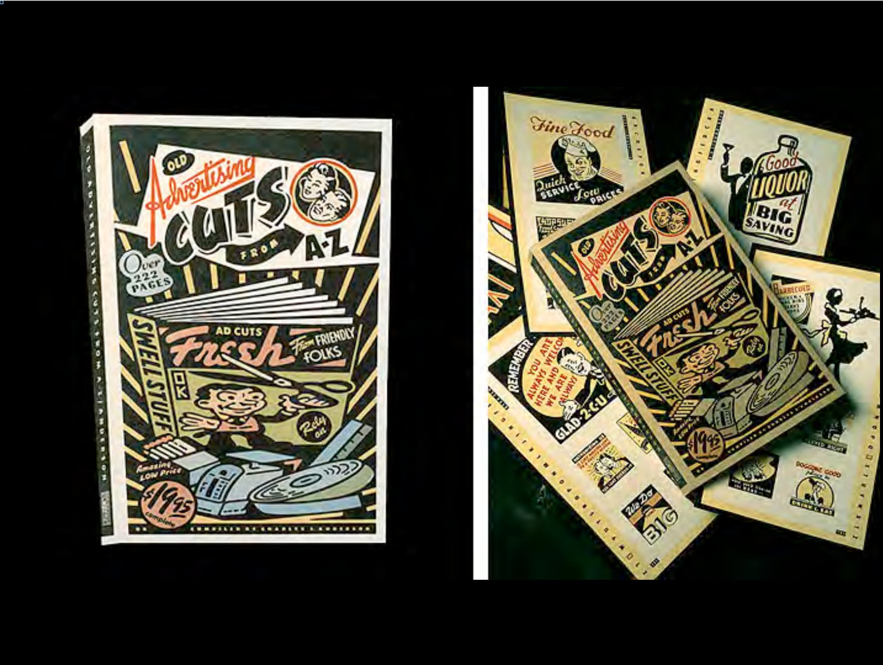
Retro style - veteran designers were appalled that once banished typefaces and letter spacing were once again being used.

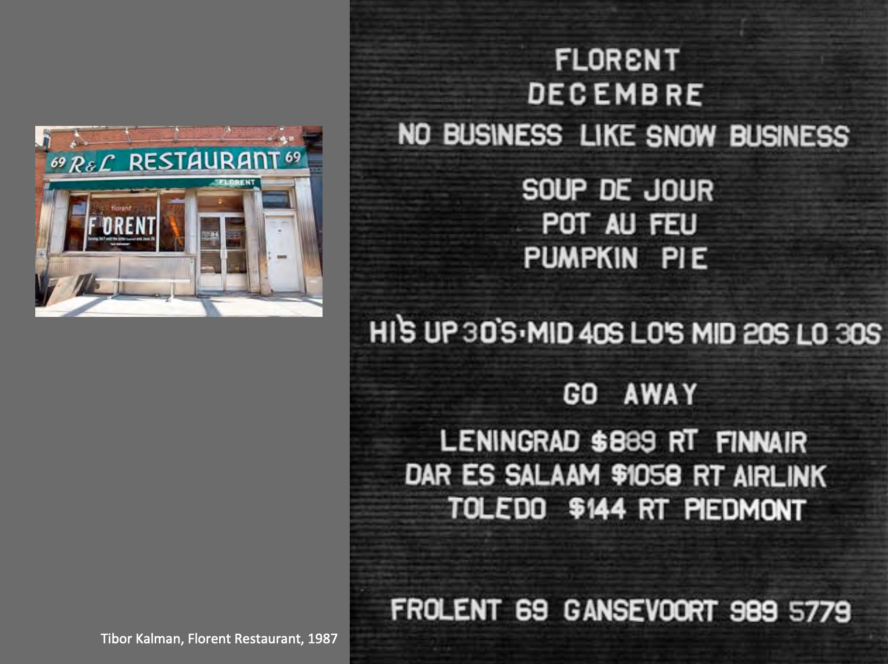
Tibor Kalman was the self-styled bad boy of the graphic design profession and a harsh critic of formulaic design.
He wanted designers to take greater responsibility for how their work influenced the surrounding culture.
Mr. Kalman described himself as more a social activist than a designer and constantly sought to use his work to promote causes like environmentalism and economic equality.
He opposed products that he considered harmful to the workers who made them, the environment or the consumer and never hesitated to tell his clients what he thought.
一位拒绝只当打工人的designer,which is quite interesting…
Deconstruction
Deconstruction is a style featuring fragmented shapes, extreme angles, and aggressively asymmetrical arrangements.
These formal devices are easily transferred from architecture to graphic design.
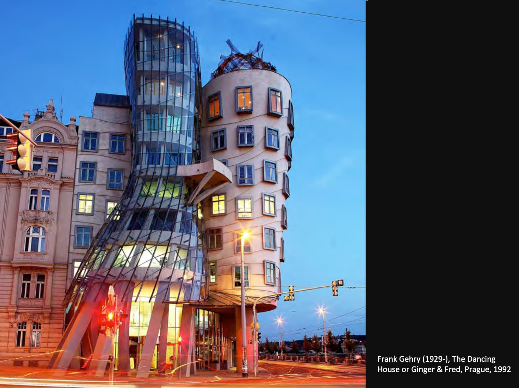
Deconstruction in architecture started in the 1980s in the work of Frank Gehry, Daniel Libeskind, Rem Koolhaas and others.
Deconstruction rejected the project of modern criticism: to uncover the meaning of a literary work by studying the way its form and content communicate essential humanistic messages.
Deconstruction, like critical strategies based on Marxism, feminism, semiotics, and anthropology, focuses not on the themes and imagery of its objects but rather on the linguistic and institutional systems that frame the production of texts.
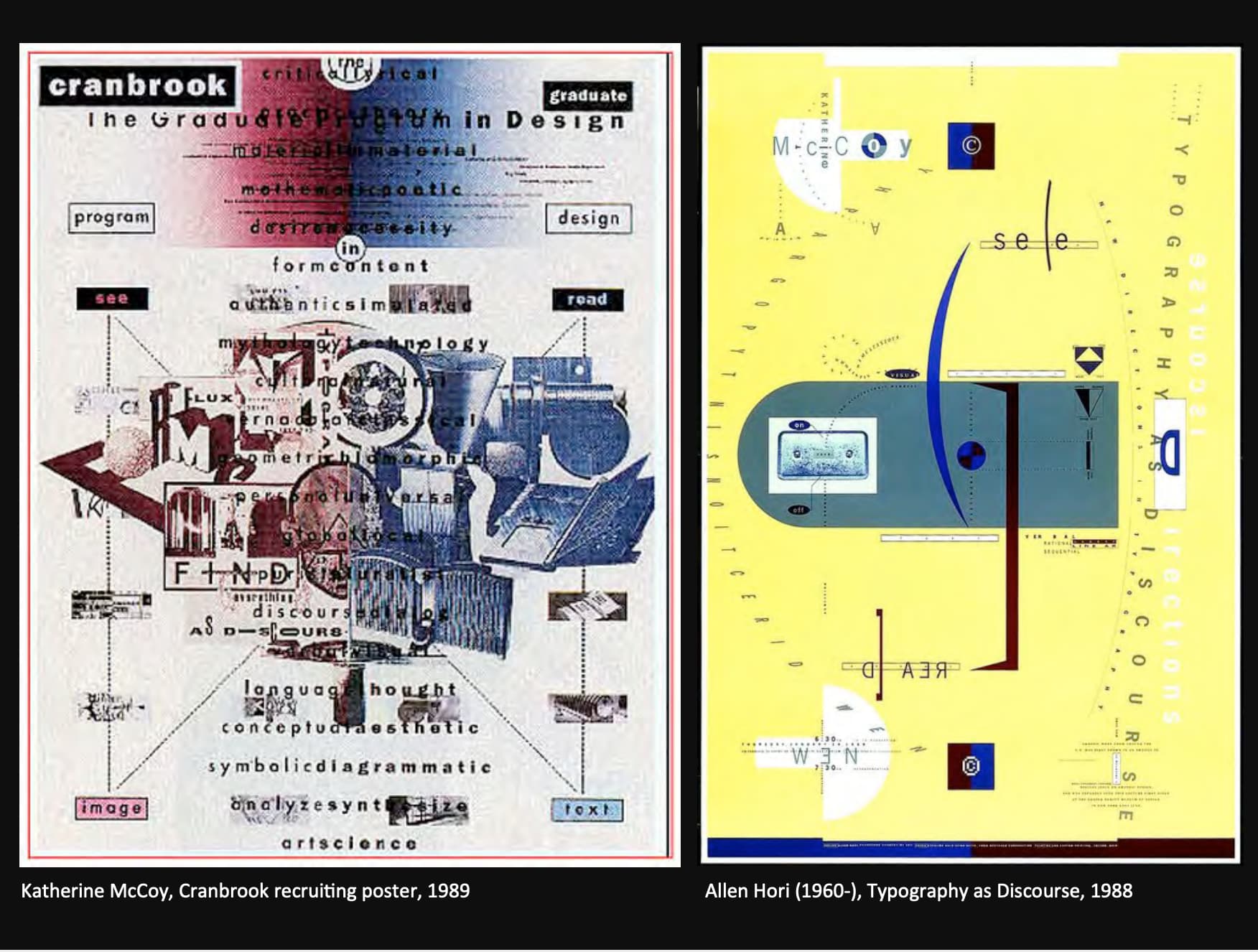
In graphic design deconstructivism started in the mid-late 1980’s and continuing into the late 1990’s and is strongly typographically driven.
Further developments of the deconstructivist typography in the 1990’s shifted the typographic practice towards a spatial, non-linear process:
‘Communication is no longer linear, but involves instead the provision of many entry and exit points.’
The page is no longer to be just “read” but also “perceived”, beyond the pure textual content, into all of its associative conjunctions: We are meant to “feel” rather than “read” a page.
“Reading of text and the viewing of image should not be conceived of as discrete practices. Rather, reading and viewing overlap and interact syngergistically in order to create a holistic effect that features both modes of interpretation.”

The whole atmosphere of a particular page decided by its subject, and the type functions as a method of illustration as well as delivers a mood. It also emphasizes the interrelationship between the text and the pictures by overlapping them.

Fragment and disjoined typographic treatment, scale, axis, value, spacing are all played with using (ironically) Helvetica .
Brody’s initial aim was to search for new typographical expressions for the age of electronic media, and evolved into a format for designers to become publishers and by assuming a more active role as opposed to simply filling orders.
“I see my role,” he says, “partly as a catalyst for thought and for questioning. A lot of our work is an open-ended statement which often is not completed until the person who looks at it has reached his or her own conclusion.”

Ray Gun magazine pushed the limits of visual design, typography and layout breaking down all the rules and re-assembling them.
The result was a chaotic, abstract style that at times was impossible to read, but had a distinct look and a lasting impression.
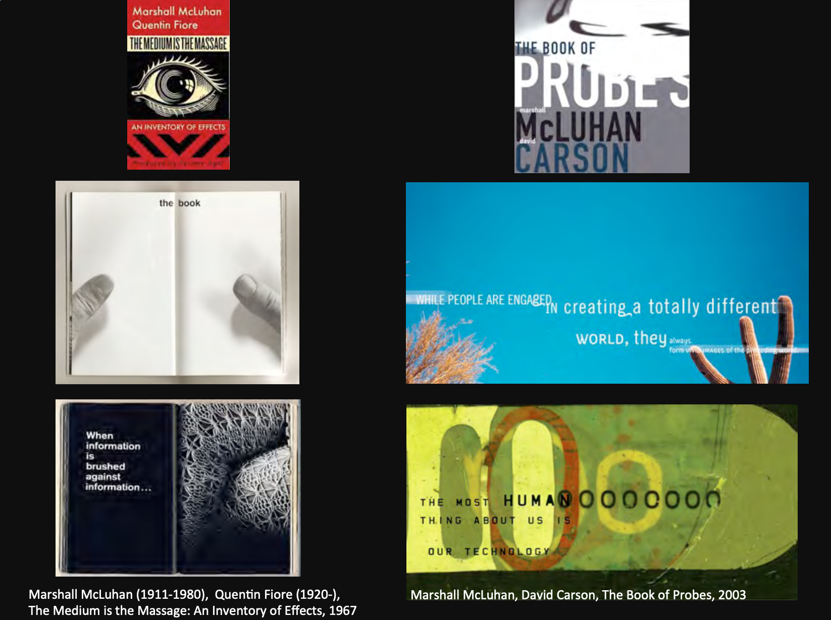
Fiore adopted a pattern in which an image demonstrating a media effect was presented with a textual synopsis on the facing page.
The reader experiences a repeated shifting of analytic registers—from “reading” typographic print to “scanning” photographic facsimiles—reinforcing McLuhan’s overarching argument in this book: namely, that each medium produces a different “massage” or “effect” on the human sensorium.

Stefan Sagmeister: Happiness by design
“Design that needed guts from the creator and still carries the ghost of these guts in the final execution.”.
Graphic designers are part of the commercial/economic systems that create a cycle of desire, consumption, obsolesence and dissatisfaction with products and services.
The concept of The Citizen Designer stems from a number of designers who wish to use the tools of graphic design to expand its traditional boundries to engage with bigger and more pressing social/economic/environmental issues.
Ref notes
Construcstvism.
Rodchenko and Popova 2
Rodchenko and Popova 3
Man Ray - Le Retour A La Raison (1923)
提前说一声这个视频挺阴间的.苏联艺术…level好高…
Russian Avant‐Garde Film.
Ballet mecanique (1924) Fernand Leger - Part 1
Sergei Eisenstein, BaLleship Potemkin, 1925
The Bauhaus