为storytelling collective网站的课,更新中.
因为节约时间(偷懒)大部分是copy&paste(再放送).
By now, you should have completed your draft. It’s OK if your draft is, well, a draft — that’s what this next part is for!
Editing and Proofreading
“Editing” is a loaded term with lots of meaning. Editors often talk about what we do in three big groupings:
Developmental Editing
This is the most involved form of editing and typically sees the editor working directly with the authors, producers, and other creative team members from the project’s inception.
Developmental editors act more like an additional author who brings an editor’s skillset to the team.
Often these editors might be credited as a narrative or creative consultant.
Developmental editing is not as common in the RPG industry as it is in novels or larger non-fiction publications, especially when a publisher uses freelance writers.
Copy Editing
Copy editing is the practice of making deep changes and cuts around a publication’s organization, tone, and style.
An editor’s primary goals during copy editing are to ensure coherent organization, adherence to style and content guidelines, and consistency in presentation.
This stage of editing is absolutely crucial to the typical RPG supplement and often encompasses several editing passes.
At larger publishers it is common for multiple editors to work in tandem during this phase and can account for some of the longest periods in a publication’s production lifecycle.
Since RPG publishers often have many products within a single game line, consistent organization between individual publications builds a brand identity.
Proofreading
Proofreading deals with the really mechanical bits of writing: spelling, punctuation, grammar, and the like.
These are often the most noticeable editing misses and the subject of comments from readers.
The editing team’s primary goals during proofreading are to ensure a high level of language accuracy and consistency.
Proofreading is the bare minimum standard of editing a publication.
If you are not proofreading, you are not editing, to put it simply.
An editor often proofreads while doing any sort of work in the manuscript, from early copy edits to final post-layout editing.
Larger publishers often employ separate proofreaders to come in at the very end of a project, when the editing team has likely built up some fatigue with the product.
Taking time for proofreading passes shows your readers a level of care and thoughtfulness in the work and can do wonders to shake off the “amateur” or similar labels.
Style Guides, Not Style Bibles
Style guides are books or smaller in-house documents that address specific language concerns, including: capitalization, spelling, how to reference other works, when to use numerals versus words, presenting tables and sidebars, and so on.
You might be familiar with large style guides used in academic settings, such as those from the Modern Language Association, the American Psychological Association, or the Chicago Manual of Style.
Style Guides in RPGs
Even when self-publishing a title, it is useful to select a guide (MLA and Chicago are the most common) and supplement it with a personal guide as specific concerns come up.
If you are publishing for an existing game line, especially larger games that have community content programs, the publisher has likely made the style guide available.
Style guides are just that: guidelines. Unless you are working with a publisher who asks for adherence to a style guide, you should feel free to wiggle around.
The only word of warning here is to make sure you always wiggle in the same direction. As is often the case in all things editing, consistency is key.
Bringing an Editor on Board
You might already know a talented editor or have the means to bring a freelancer onto your project.
If so, consider yourself lucky! Most RPG writers are not able to bring in professional editing for their first project (or first many projects).
Let’s address a few big questions around working with editors.
What’s This Going to Cost?
Editors’ rates can vary based on their experience and the level of editing (copy editing, proofreading) required, as well as other factors.
Most editors outside of RPGs charge an hourly rate with an expected amount of words per hour, but the RPG industry has historically priced these services using per-word rates.
It has also become more common to offer revenue sharing or a combination of a flat fee and royalties.
The Editorial Freelancers Association estimates basic copy editing to range between 30 and 40 USD an hour with an expected pace of between 5 and 10 manuscript pages (roughly 500 words per page) per hour.
You can find the EFA’s estimates here, which are useful for getting an idea for what professional editors might charge.
Please note that these rates are from an American professional organization, but other countries have similar organizations.
What Do I Need to Have Ready?
Just like with rates, each editor might have different preferences for what you should deliver.
Many ask to be sent a whole manuscript at once, rather than smaller sections over time.
It is also common to not work from a file that has been laid out: a Word file or similar is typically best for editors.
Also let the editor know which style guide you’re working from and provide them with any supplemental style guide you might have created.
Tips for Self-Editing
Hiring a professional editor for your first project is not always a possibility—it wasn’t for me!
Editing your own work is not ideal; you become very close to your writing during the creation process and can often overlook mistakes you would otherwise notice.
If you can, always try to get someone to read your work and point out any typos, missed words, and awkward phrases.
If you find yourself editing your own work, here are a few tips to make the most of it:
- Read your work in different media and formats. For example, print off sections and edit it by hand with a pen and edit both as a plain text manuscript and post layout.
- Read your work out loud to yourself or an attentive listener. Often we glaze over an awkward phrase while reading but catch it immediately when spoken.
- If you typically listen to music while working, take an editing pass in silence.
- Read your work out of order: skip a paragraph or entire section, or skip ahead several pages then come back.
The idea is to approach your work in new ways.
Anything you can do to experience the text in a different way can bring new errors to the surface.
It might feel strange at first—I was really resistant to these techniques—but it is amazing how much you spot using them.
Designing for Accessibility
If you plan to do this type of work long-term, we recommend investing time and potentially money in some software for proper tagging and document order (Adobe InDesign, Acrobat, or Foxit PDF Editor).
But if you don’t yet have the means or are only doing this as a small hobby, then providing supplemental documentation that screen readers can use is the simplest way to ensure access.
Because accessibility is such a vast and nuanced subject, we are going to concentrate on guiding you toward creating a second document that is a screen reader-friendly PDF consisting of mostly text and minimal layout flourishes.
We call this your Simplified doc, which you can upload along with your Stylized doc which surely looks great but may not be accessible to screen readers.
First, you need a word processing program that can export tagged PDFs.
Simply being able to download a PDF, like in Google Docs, won’t work. We need to export a tagged PDF.
An appropriate program could be Microsoft Word, or an open-source alternative like LibreOffice.
You can create tagged PDFs in some design programs like Adobe InDesign or Foxit PDF editor, but as we are focusing on making a Simplified doc, we will stick to word processors for now.
We heartily encourage you to spend some time and investigate your favorite programs for how they handle accessibility, and where possible we will be providing links to in-depth guides for popular programs for you to explore.
Having somewhere where your plain text can be applied to both your design program and your program for exporting a tagged PDF will help to ensure both your Simplified doc and your Stylized doc have the same content and the process is easier for you.
The Simplified doc is not an afterthought, but one of equal importance and worthy of equal effort.
Common Tags
Headings are the most important way to indicate different areas in your content.
When properly tagged, they’re the most common way for screen reader users to quickly navigate through a document.
If someone wants to indicate that the reader is starting a new chapter or section, they might put the introduction text in all capital letters, or make the text bigger, or change the font to something interesting that stands out.
This visually draws the focus and tells the reader that it is a heading, but this doesn’t communicate anything to a screen reader user.
So we need to make sure our headings work as tagged headings in our Simplified doc.
This same tagging function works similarly for hyperlinks, bookmarks, tables, and lists.
When creating this Simplified document, you must put all text under a tag.
It might look right on the surface, but if it’s not tagged properly, the screen reader won’t convey the information correctly.
This is also true for text body, which should be set as text body.
In Word and LibreOffice, using bulleted lists or numbered lists automatically tags the item as a list and can communicate such to a screen reader user, even telling them how many items to expect in the list as they continue reading.
Tables will require a little more consideration.
Refrain from using spaces and tab indents creatively to construct a visual idea of a table layout.
Whenever possible, use the built-in Table tools in your text editor.
If you aren’t fond of how it looks there are plenty of customization options for line shading, borders, cell colors, and even removing the grid of a table altogether.
There are two very important things to remember when creating a table if you want a screen reader user to understand its content and intent:
In your table and cells options, you will have choices about labeling your table itself and labeling column and row headers, though this will vary based on the program you are using.
If you’re struggling to find this make sure that your cursor is within your table and right-click to bring up the options.

Indicating that the top row is in fact a set of column headings, or that the left-most column is a set of row headings, is invaluable for screen reader users when navigating tables — especially when they have more than a handful of data points.
It will allow the user the option to have the row or column name read out to them as they are moving around in the body of the table.
These menus also allow you to give a name or title to your table which is read out as the first thing when a screen reader user comes upon it — valuable and time-saving information.
You can also highlight your table and select “Table heading” and “Table contents” tags straight from the Styles menu.
Layout
When providing a Simplified doc, please refrain from using multiple columns of text in the classic trade dress style that most major ttRPG publishers use.
Some programs can give you accessibility tools to tell a screen reader, “Start reading this second column to the right after you’ve finished the section on the left,” but unless those tools are implemented a screen reader will try to read the text across the page from left to right, or even ignore the second column completely.
There are some exceptions when columns can be detected, but with the vast permutations of editor software, layout software, devices, platforms, and screen readers, it is best to go the simple and safe route.
Your Stylized Doc can definitely have columns, but keep your Simplified doc as top-down linear as possible.
In addition, think about places where your font is maybe harder to read in your Stylized doc, or if the colour of the text is similar to the colour of the background — especially for colours difficult for colour blind people to differentiate between.
Any place where it might be hard for someone to read the text can benefit from the Simplified doc.
Writing Image Descriptions
Any time you have an image, you should provide alt-text for it.
While this alt-text should be evocative, it is an objective, concise, and literal description of the image.
If the image contains information explored elsewhere in the main text, such as a deity’s symbol which is described in text in another section, the description doesn’t need to be given again.
But the image should still be described, as below:
【Image: a dragon】
Alt-text if the symbols on the dragon’s wings have been explained in the main text of the adventure:
A model of a black dragon on a white background.
Its dark scales shimmer with gold which covers its claws, spines, teeth, and ridges.
Gold drips from its feet, and its wings are gilded in the many symbols of [Deity-Name].
The main text might read somewhere: [Deity-Name]’s symbols are lavish floral patterns with twisting vines and circular seals.
Alt-text if the symbols are not to be explained in the text of the adventure:
A model of a black dragon on a white background.
Its dark scales shimmer with gold which covers its claws, spines, teeth, and ridges.
Gold drips from its feet, and its wings are gilded with lavish patterns of vines, flowers, and circular seals.
But beware of slipping into narrative or extrapolative descriptions.
Avoid using “you see” or “standing before you” statements as these convey a second-person perspective.
Image descriptions should be written in third-person perspective and share literally what is there to be seen on the page.
Don’t describe extrapolations we wouldn’t understand from simply looking at the image.
In the design program, you are using to create your Stylized doc you may also be able to use the alt-text feature to append a message to an image, which is read to screen reader users and totally invisible to your sighted readers.
Just make sure the alt-text is included as an image description in your Simplified doc as well if the former isn’t fully tagged.
Maps
For maps, consider typing out a basic description of the layout using cardinal directions and measurements in standardized increments of your game system (like the 5-foot increments used by D&D 5th Edition).
While it isn’t always necessary to describe maps in great detail, make sure any critical visible information in your map is conveyed to your readers through the text.
Your audience here will be blind or visually impaired GMs, not players.
You don’t want to hide anything from the GM.
Think about why you drew your map, what you wanted it to include, and everything of importance you wanted people to see on it as it pertains to the combat or mystery.
Think about when you’re running theater of the mind combat and your players ask you about what they see, what’s in their surroundings, so that they can use their environment to their advantage.
Content and Trigger Warnings
While some content in your story may be a non-issue to you and your friends, this may not be the case for others.
For example, if your adventure portrays a devastating experience for the NPCs or the PCs, there is a chance that for someone reading your adventure it might not be fantasy at all.
It can be difficult to judge what content is potentially triggering, but if you believe that some of your content might be sensitive in any way we recommend inserting a list of content and trigger warnings.
Do not think of trigger warnings as spoilers.
This could be included in your opening, intro, prologue, and should also be on your product’s landing page or wherever else you host your product.
Think of it more like keywords people may wish to avoid.
It is always better that someone is able to make an informed decision as to whether your content is right for them than it is to avoid “spoilers.”
While this isn’t directly a tool for allowing more people to access your content, many of those who see you including such a list will feel some security when purchasing your product and will be more likely to purchase your next one, and those who don’t need such warnings simply don’t have to read the list.
Screen readers and testing
In the editing stage, you can try testing it yourself with a free screen reader such as NVDA. Most operating systems have an inbuilt screen reader, such as Windows Narrator or VoiceOver on modern Apple devices. Android also provides Talkback.
But please be mindful that some sites are not fully accessible. It’s better to make sure your caveat about it being tested and having a Simplified document is included in the main synopsis, or wherever it is easiest for people to find in a text — not image — format.
Primer to Playtesting
Once you have a solid draft of your one-shot — or even a solid outline! — you’re ready to start playtesting.
This is an exciting part of the process.
Playtesting is an important part of the publishing process and allows you to detect errors in the flow or logic of your adventure and identify mechanical errors. There are two main “goals” for playtesting:
Playtesting ideas:
Do the ideas and “paths” established in this module make sense for GMs and players?
Playtesting content and design:
Is the module easy to read and run? Does the design help or hinder the GM’s process? Do the stats and the mechanics work?
Additionally, there are three ways to run a playtest:
- GMing it yourself
- Observing another GM running the module
- Having a GM send you notes after running the module
When to Start
You may start playtesting from just an outline if you are running the game yourself, but often you will begin recruiting for playtesting after you have a draft that you are comfortable others can run.
You do not need to wait for editing or to have any art you plan to use in place, though having at least sketches of maps can be very helpful.
Finding Playtesters
Start your search for playtesters within your own gaming groups; your players and groups at the local game store are a good place to start.
Another option is to use the many online communities.
The RPG Writer Workshop Discord is a great place to look.
There are also many other Discord groups you can find. You could use Roll20 or Fantasy Ground’s tools to search for groups.
Facebook, Reddit, and other Social Media sites are great too.
Feedback
This can be a good chance to prepare yourself for critical criticism you may get once your adventure is released.
While that can be a very intimidating thought, you shouldn’t let it stand in the way of your goals.
Try to filter out the unproductive parts of criticism to find any valuable nuggets (sometimes there aren’t any).
For the purposes of your playtest, it is best to provide a one-page overview of your adventure, the adventure draft itself, and a feedback questionnaire.
Providing structure to the feedback helps focus your testers on things you are most concerned about.
Just be careful to leave at least one spot for freeform reporting as well.
Facilitating a Playtest
If you are running a playtest for your own work or someone else’s story:
- Don’t “lead” the players.
- Don’t interrupt or over-explain.
- Take notes.
Implementing Changes from Playtests
Like editing, playtesting is intended to improve your module, so don’t take it personally if you receive criticism.
It’s also important to note that you don’t have to make every single change presented to you; not all groups play games the same way, and one person’s experience might be totally different from another’s.
You should try to step away from your ego and do what you can to implement helpful suggestions.
Playtests usually reveal minor issues and rarely require major overhauls; however, if you do have major rewrites, take it as a learning experience!
Code your feedback
Compile all of your notes in one document and make a list of “codes” to help you sort your research. For example:
1 = Chapter 1 comments
2 = Chapter 2 comments
3 = Chapter 3 comments
4 = Comments about NPCs
5 = Comments about Lore
6 = Comments about the Maps
Then, read through the notes you’ve received and assign each individual comment the relative code.
You might have a lot of notes assigned with the number “3,” meaning that the bulk of your updates pertain to the third chapter of your module.
Coding your research helps you prioritize your changes.
Playtesting is a never-ending process.
Your job is not to make everyone happy or to make the best game ever created.
Your responsibility is to stay true to your vision and create something readable, fun, and memorable for those who play your games. That’s it!
Layout on a Budget
Focussing on other adventures or sourcebooks for your chosen path or genre, make note of the visual elements which are commonly used in official sourcebooks or by other creators in the scene.
What elements seem to be used most often, and how do they invoke the piece’s genre?
The industry standard layout design software is Adobe InDesign.
However, this is an expensive piece of software and is not affordable for many creators (including me!).
Here are some great alternatives that are low-or-no cost:
- Affinity Publisher
- Canva
- Google Docs
The Grid
Many layout designers base the design of their page around a grid.
A grid breaks the page up into a number of columns and rows, and placing elements along the grid helps to appropriately space, organise, and balance your page.
Here are some examples of different styles of grid which you’ll often see in publication:
- A novel is usually laid out in a manuscript grid which consists of a single column of text.
- Newspapers typically follow a 5-column grid
- Magazines can vary greatly, though often have 3 columns on a page and can vary hugely between rows used
- The Dungeons and Dragons 5th Edition Player’s Handbook is designed using a 2-column grid.
Some preparation tips
Try setting a solid design goal; your intention for the final visual design of your adventure.
Something like “I want this to look like a 5e product,” or “I want this to look like a teen magazine” are good goals to stick to—and these are examples of goals I’ve personally set myself.
Set design limitations.
Choose a set colour scheme, and decide on what style of images (if any) you want to use - will your images be photographs, or illustrations?
Having a mixture of too many contrasting elements will make your final product look confused and incohesive, so it’s good to begin filtering down your options now.
Visual Hierarchy
Visual hierarchy is the principle of arranging elements to show their importance, and can be achieved through placement, font size, colour, alignment, and contrast.
Text Blocking
Blocking the text means that it takes up more space on the page, because there is white space around each section, and it makes the design feel more dynamic.
I use this technique a lot, because it helps to cut down on spaces where images should go while still giving the feeling that the page has several elements on it.
Font
A thematic font will help to bring your document to life, while injecting some of the flavour of your adventure’s genre.
Using a mix of two (or more) fonts is a great way to add visual variety to your product, and helps to define different hierarchies of text for the reader.
Fonts can generally be split into two very broad categories: display fonts, and body fonts.
A display font is intended for use as a title or heading font, and is designed to stand out.
These fonts can vary between practical and novelty fonts, and will add a huge amount of flavour and visual appeal to your design.
It’s important to remember that display fonts are not intended for use for long sections of text, and can often result in poor legibility when applied to anything more than titles or headers.
A body font, or text type, is designed to be read in large quantities at small sizes; that is to say, a body font is intended to be legible within paragraphs and easily allow the reader to focus on the ideas presented by the text, rather than the text itself.
That’s not to say, though, that your body font can’t lend itself to the overall design of the page:
An invaluable tool for inspiration and to see fonts at work in real-world publications is the website Fonts In Use; it shows a huge variety of font combinations, and has pictures of the designed pages that used those fonts.
Some sources of fonts are:
Some sources of stock art are:
Some sources of public domain art are:
- The British Library’s Catalogue of Illuminated Manuscripts
- The British Library’s Flickr collection
- National Gallery of Art’s Open Access collection
- MoMa’s Public Domain Images
- Pixabay
- OpenClipArt
- Unsplash
Templates
Most software has templates available to help make your design process easier.
Templates made specifically for TTRPGs are available in DriveThruRPG and DMsGuild for several different layout programmes, so you might prefer to find and use one of these rather than starting from scratch.
Print bleed and quiet space
If you’re designing a document for print, it’s important to check with the printer you plan to use and obtain their guidelines on bleed and quiet space.
Bleed refers to a border around your page which “overflows” the page area; this ensures that when the printed pages are cut, the background colour or image goes all the way to the edge of the page.
Quiet space is an area within the border of the page where you should avoid placing elements, especially those which you do not wish to be cut off. This is due to the page cutting and binding process used by printers.
Widows, orphans, and runt words
These words and lines might not be noticeable at first, but ensuring your text doesn’t fall in this way will add to the professional feel of your page and help to ensure readers don’t miss sections of text:
A widow is a paragraph-ending line which has fallen to the beginning of the next page or column, and is therefore separated from the text that came before it.
An orphan is a paragraph-opening line which is stuck alone at the bottom of the next page or column, and is therefore separated from the text that comes after it.
A runt is a single, short word which occupies a line by itself at the end of a paragraph.

Cover
Set a theme.
The first thing you should think about is a theme. Determine what kind of “aura” you want your cover to give, depending on the theme of your adventure.
Is it a cozy homemade journal? A haunting grimoire? A fancy and ornate compendium? Not all covers need to have images.
For fantasy modules, it can be effective to have a fantasy-esque tome cover for your module.
Determine a fitting palette.
Color is one of the most important visual ways of portraying emotion.
Pick a main color (which usually covers most of the surface) and secondary colors (used in accents and text) to form your cover’s palette.
Avoid mixing warm and cold tones since it will make your final product confusing, unless you’re using a contrasting color on an accent that highlights important information (for example, using red on a dark blueish backdrop).
Avoid black and white.
Marketing
There are many different types of marketers, including (but not limited to):
Growth marketers: Growing and scaling a company/product.
Content marketers: Using multimedia content (writing, audio, video, etc.) to promote and sell products/services.
Creative strategists: Using a holistic view on writing + design + user experience.
Data marketers: Using numbers, trends, and data to inform marketing investments and decisions.
Digital marketers: Using digital tools and resources to market.
Market researchers: Researching audiences, markets, and trends to inform brands and companies.
Creative success comes in many forms, but a good formula to follow is:
Produce quality work consistently and promote that work consistently.
Many creatives struggle with marketing because it feels “smarmy” or disingenuous.
It helps to think of marketing as outreach; people can’t find you unless you find them!
What is a marketing plan?
Every plan consists of the following steps:
Planning. Planning and making your marketing materials.
Implementing. Publishing, sending, and distributing your marketing materials.
Measuring. Tracking the results of your marketing.
Reflecting. Looking at your measurements to see what’s working and what’s not.
Reiterating. Making updates and changes to your marketing based on the data.
What should your plan entail?
Network organically and authentically.
Join communities with other creators. Share and support their work. Be enthusiastic and supportive.
No one appreciates feeling “used”; develop meaningful relationships with your fellow writers and don’t just climb your way to the top.
When you build these connections, you’ll find people excited about your work, which can also lead to collaborations or new opportunities.
Brand yourself.
Do you want to publish under your own name, or create a pen name/brand identity?
Whatever you decide to do, determine what you want your “brand” to evoke. (This is a great use for moodboarding!)
Set up social media profiles.
You don’t have to have an account on every platform.
Choose one to three social networks that you feel are most worth your time and are the best way to connect with your readership.
Use the same name/brand across your social media profiles so people can easily find you.
Set up a website.
Your website can be simple; write a short bio and post links to your work once you start publishing.
Set up an e-newsletter.
Use a service like MailChimp to collect email addresses from people interested in your work.
You don’t need to email your list all the time; contact them when you have new work to share.
Host a giveaway.
Giveaways are fun and easy to host! You can even partner with another creator to offer a compelling prize to those who share or promote you work.
Send out complimentary copies to reviewers.
Reviewers who have blogs and YouTube channels regularly cover and review new tabletop RPG titles.
On publishing day, it’s worth sending out copies to the reviewers whose thoughts you respect.
Create a basic marketing plan and calendar.
Marketing works best when you can stick to a regular schedule. This might look like this:
Post to social media every other Tuesday.
Email newsletter list once a month.
Check Facebook groups three times a week to see what others are working on.
Building an audience and mailing list for your tabletop game.
Google Primer.
Marketing Basics: The 101 Guide to Everything You Need to Know.
Being a Good Community Creator
Safety Tools & Content Warnings
If you play games regularly, it’s likely you’ve encountered safety tools.
Just in case, the TTRPG Safety Toolkit is a great resource explaining what they are and how to use them in your game.
Remember that your game might be the first game anyone plays, and it’s therefore up to you to introduce them to safety tools.
Describing safety tools can be as long as a chapter in lengthy games or as short as a sentence in one-page games.
Content warnings are a type of safety tool that we as designers use to keep our readers safe and let DMs/GMs/Guides/etc. decide if our game is right for their table.
Some tables are eager to play games that help them work through trauma but a survivor might be triggered by reading that content without a warning, or even reading it at all.
Someone running games for children is unlikely to be looking for grimdark NSFW adventures.
You never know when someone might have a phobia and need to skip your adventure or sections of it.
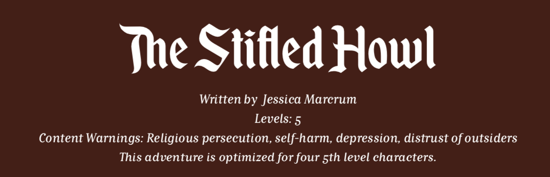
In this case, the warning lets anyone who has experienced religious persecution or has a history of depression and self-harm know what they’re getting into.
It additionally lets everyone else know what heavier themes the adventure deals with and lets them pass on that if they’re looking for something a little lighter.
Hiring vs. Collaborating
When hiring someone, there are a few simple steps to keep in mind:
Make sure they do the kind of work you’re looking for.
Don’t assume an illustrator does logos or a graphic designer does paintings.State your needs clearly and ask for their rates.
For example, are you looking for a full page illustration or spot art?
If you’re hiring an editor, sensitivity reader, or layout designer, tell them how long your piece is.When they tell you their rates, if you cannot afford them, you may be able to ask if they are open for negotiation.
For example, artists sometimes reduce their rates if they keep the rights to their art and can sell it later as stock art.
Creators of all sorts are sometimes willing to participate in revenue share if they’re interested in the project.
Keep in mind that they are under no obligation to do this.If they are unwilling or unable to negotiate, thank them for their time and move on.
Please do not harass them for being too pricey just because they know their worth.If you agree to work together, have clear deadlines and goals in mind.
A contract will help immensely.
In short:
Hiring someone means you pay them for their work, either of you may own the rights to their work, you likely receive full royalties.
This is expensive up-front, but may earn you more in the long-run.
Collaborating means you are working on something as a team, everyone owns their own work and has a right to use it elsewhere, you share royalties at an agreed rate.
This can be free up-front, but royalties may be very small.
When responding to a call for writers, do the following:
Make sure you are eligible for the project as spelled out by their call for writers.
Remain professional when responding to the call. While some project leads are more informal, first impressions are everything.
Treat a project as if it has an NDA (non-disclosure agreement) even if that’s not explicitly stated.
Your project lead will appreciate you asking before sharing details of the project before it’s complete.
Compensation
This topic is sensitive and can be daunting to discuss with others upfront, but it is fair and important to do so no matter how awkward it might make you feel. There are three methods of compensation this course recommends, all of which strive to pay fair and equitable wages to other creators working on your project.
Flat-rate pay.
A set payment for work such as “X” cents per word (for writers and editors), or “X” dollars for commercial use art (for illustrators and artists), and “X” dollars per page (for graphic designers).
Royalty payments.
This is accomplished by giving a certain percentage of the project’s royalties to creators based on their contributions to the project.
Hybrid method.
This incorporates both flat pay and royalties, this method allows for smaller flat payments upfront with royalties generating additional income once the project is on sale.
Publishing Your Module
If you’ve completed your module, congratulations!
Wherever you choose to publish, make sure you’ve reviewed the licensing and guidelines for that platform. (The workshop is not responsible for any legal issues you may encounter.)
Unless you’ve developed an original game system, you’ll likely be publishing your adventure as part of a Community Content program on DriveThruRPG.
Here is a list of community content programs.
Essentially, you’ll set up a title page and upload your adventure file(s), and voila! You’ve published!